
Ever find yourself with just too much Knowledge? Knowledge Bases are all about information. But it's easy to find yourself trying to pack as much information as possible into an article.
Unfortunately, sometimes this can result in walls of text. And nobody is going to read that 🤨
Thankfully there are ways you can condense this information so it's not all in the reader's face at once. In this article we're going to cover some of the simple—and more advanced—ways you can make articles that span a lot of information easy to digest.
The Power of Tables
Tables are tricky elements to design because the layouts can differ so much. It can be tough to know how to lay out your information so it's simple to digest.
Here are some questions to ask yourself before using a table to save yourself some time:
- Are there at least 2 axes of information? Tables work best when you're comparing two different elements (e.g. fruit and their nutritional values 🍊)
- Can the information be simplified? If you can simplify information so you don't need a table, that'd work better for your readers
- Can this be a step-by-step list instead? It's easier for your readers to follow a step-by-step guide rather than reading a table if it's possible.
If you decide to use a table, you'll want to consider its design before going full-steam ahead. I've made the mistake of changing my mind three or four times while laying out the information.
Recently we added a new user role called Writer. This was an awesome addition to our platform. Still, it did cause an issue with our Managing Users article because adding a new role meant adding even more content to an already large table:
Role | Permissions |
Owner | The Owner role is automatically assigned to the creator of the account. This role can do everything, including manage billing. Owners can't be deleted, but they can transfer ownership. |
Administrator | Users with an Administrator role can do everything too. They can manage HelpDocs settings, billing, branding, and add/remove users and API keys. They can also edit all articles and content. |
Editor | An Editor can see stats and manage content, but can't edit any settings or branding. |
Read Only | Users with this role can only view content. This is usually paired with the Restrict to Logged In Users auth option. |
Since I already had a table, I had to reimagine how it'd display the relevant information in a simple, glanceable way. To do this, I decided to swap the strategy.
Instead of a wall of text about what each role could or couldn't do, I wanted it to be clearer. So I wrote down the main functions a user would want to do in HelpDocs.
Stuff like managing billing, editing certain settings, and who could do what to articles.
Once I had decided on the main functions, I listed the roles up on the top row and added a green check if that feature was available for that role ✅
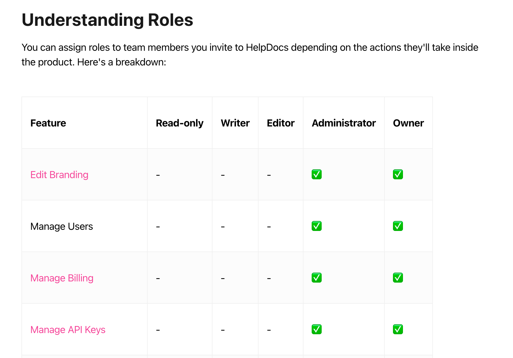
Laying out a table like this makes it much simpler for the user to understand at a glance. You've probably seen this approach for pricing tables, like this one for Figma's plans:
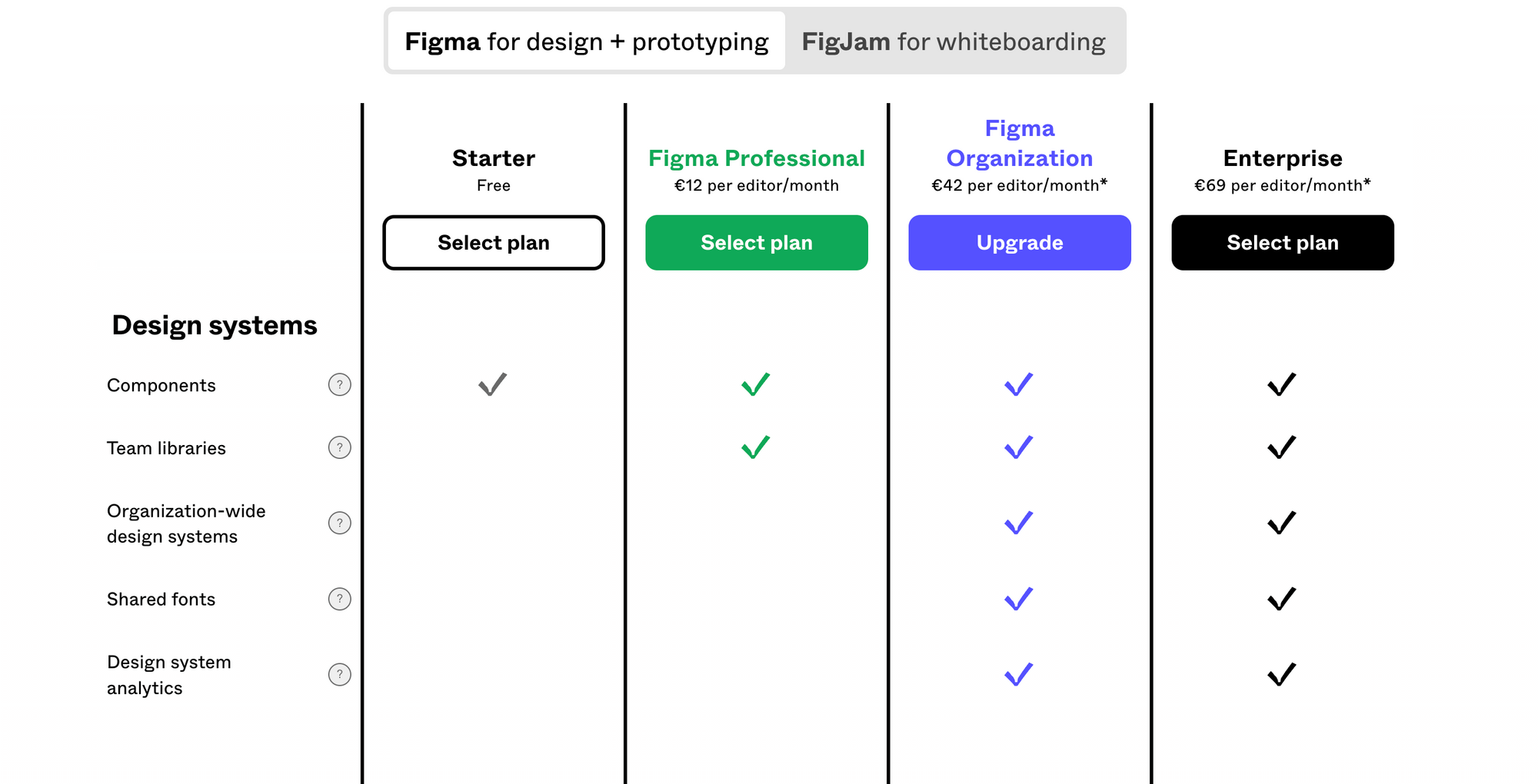
Of course, this approach isn't one-size-fits-all. You need elements to compare for this to be a good fit for your information.
Tables are great for condensing information if:
- Comparing numbers or small amounts of information
- The reader doesn't need to follow step-by-step instructions
Tables are not so great for condensing information if:
- There's a lot of text to read
- There's nothing to compare
Fold It Up
Got information that isn't super necessary? With a collapsible element—or Folds as we call them—you can wrap up lots of information so it doesn't take up space unless the reader is interested in learning about it.
A Fold in HelpDocs looks like this:

Folds allow you to dramatically shorten the length of your articles so readers aren't too overwhelmed. Here are a few ideas about how to use them to your advantage:
- Showing content that only applies to a small subset of users like super users, admins, or owners
- Adding extra content to something above the Fold, for example how to take extra care when carrying out said action
- Making teeny FAQs inside your articles if you don't want to create lots of small articles inside your Knowledge Base
Split it Up With Subcategories
Sometimes the best thing to do to reduce information overload is to split up the articles themselves. You can make it easier to navigate using a nested structure.
All Knowledge Base software will allow you to create subcategories (sometimes called subfolders). By using them efficiently, you can make navigating your help articles a whole lot easier.
For example, we have a category all about customizing your HelpDocs. That's a lot to cover since we give users the ability to add custom code and templates.
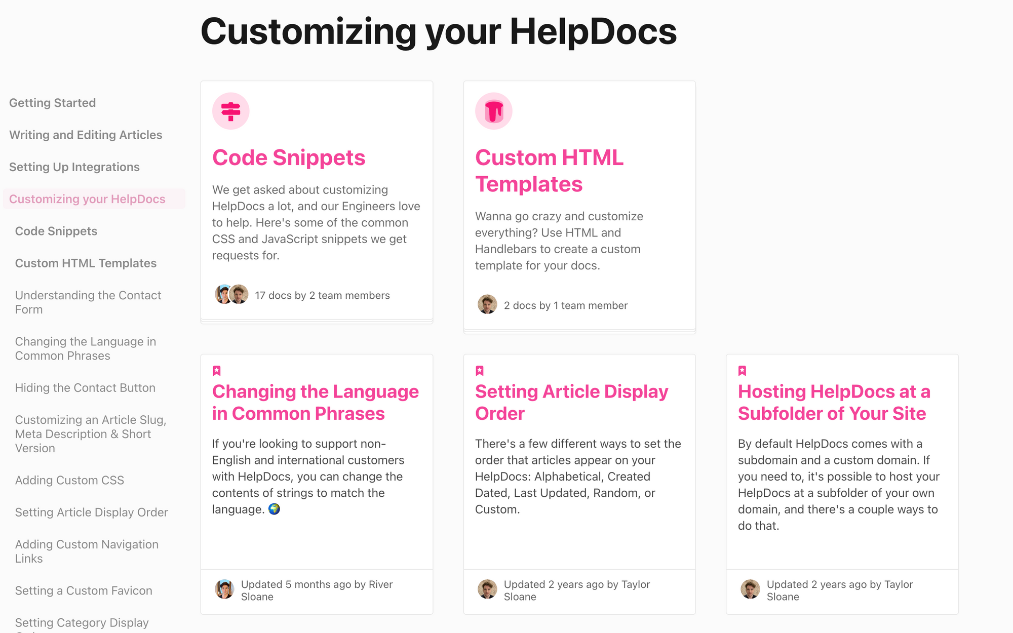
Instead of having one long article with example code snippets inside, we created a subcategory with separate articles. That way the search works easier and the information overload is reduced.
As a rule of thumb, if you find your article going over 1,000+ words, it's time to split your content into multiple articles.
Embed from Elsewhere
Sometimes you have a super complicated table or requires extra functionality to display the data properly. It's not always the best scenario to paste the information in or use the default formatting inside your Knowledge Base software.
Luckily most of the platforms include the ability to embed content form around the web. For example, you could use Airtable and create a spreadsheet that acts like a database without going all-out and creating one from scratch.
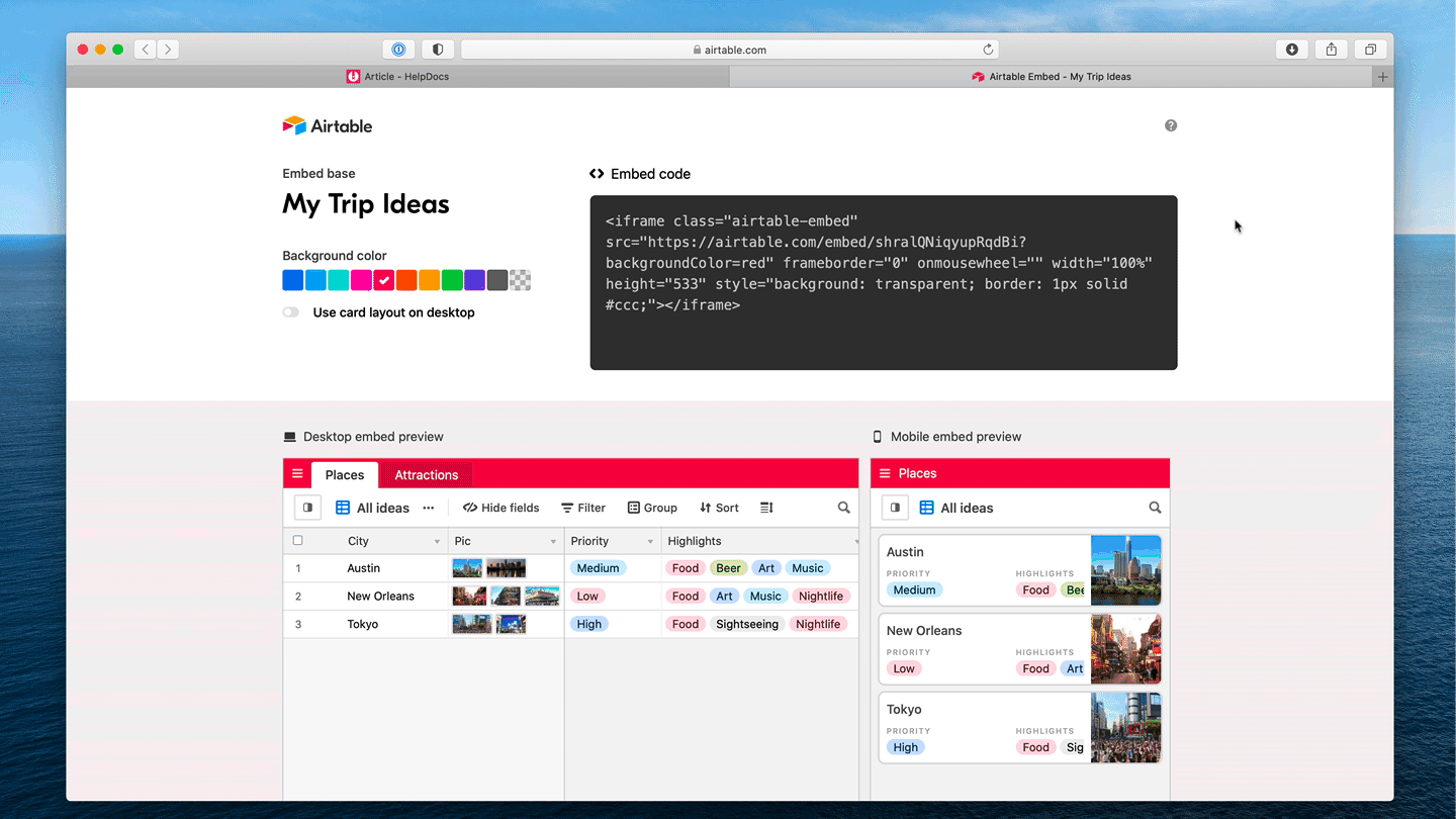
Embedding your rich content from other services unlocks more options without adding to that all-important word count.
Make it Yourself With Custom Code
Tried all the above solutions and found that it just doesn't fit? Creating a custom code solution might work for you. And it's surprisingly easy.
In HelpDocs it's super simple to add custom code inside articles—use an HTML block. But what type of HTML elements work best for condensing information?
- Tabs: Creating an HTML tab hides information and allows the reader to click on the relevant element. Smaller than a table but more information than a Fold
- Dropdown: A little more complicated to build, an HTML dropdown allows the reader to select an option and then displays information based on the selection. Keeps things small and tidy but does require more custom work
- Custom fold: If you don't want all your Fold elements to act or look the same, you can a unique one of your own just for that specific article. This article over on CSS-Tricks is super interesting and explores customizing them to match your style
- A form: Create an interactive form inside your article instead of writing a long section of content that the reader has to copy and paste
With custom code, the possibilities of condensing content and making it more interactive are pretty much limitless 🙌
Create Condensing Elements to Make Your Articles More Readable
Readers have short attention spans, so it makes sense to create content that's varied and condensed. With these top tips, you'll be keeping visitors engaged and helping answer their questions in no time.
Looking for more Knowledge Base article tips? Here's some of our other content based on creating top-notch articles:
How to Strive for a More Accessible Knowledge Base: Knowledge Bases are jam-packed full of useful information—but can everyone digest it? Dive into how and why to make your Knowledge Base a more accessible destination for customers.
The Psychology Behind Writing a Readable Knowledge Base Article: We delve behind the scenes and in our brains to see how we interpret words and turn them into something we read. We then take a look to see how we can create more readable Knowledge Base articles using this information.
Knowledge Base Article Health Check—What to Examine Before You Hit Publish: Ready to publish your article but not quite sure if it's 100%? Here are some tips to make your article shine before you hit publish.