The Psychology Behind Writing a Readable Knowledge Base Article
We delve behind the scenes and in our brains to see how we interpret words and turn them into something we read. We then take a look to see how we can create more readable Knowledge Base articles using this information.
When you start writing a Knowledge Base article I'm sure you consider how a user might read it. But do you really think about how they'll read it? 🤨
Finding Knowledge Base best practices can be tough, especially when they're based on different industries.
Like most technical writers I have a keen interest in creating efficient, predictable, and useful content. It's less about pasting a load of text on the page and more about not overwhelming the user.
If you do this too then you're already better than 99% of writers on the internet so here's to you 🍻
But it's simply not enough to just guess what people might like. You know how you read but how does the general population with a variety of reading levels, disabilities, and backgrounds read?
This is exactly why I decided to write this article. To hopefully find out a little more about how people actually read on the internet so we can all write Knowledge Base articles that are that little easier to read.
And I've wrapped it up in a little bow. Now let's get started 💝
Let's Get Physical
To learn more about making a readable article we have to go back to basics. Like, to the core of what reading actually means. We're getting real deep now I'm afraid.
Human brains see text as a physical object because it doesn't actually matter that it's on a screen—your brain doesn't give a shit about that. According to Ferris Jabr at Scientific American the words might as well be solid objects:
As far as our brains are concerned, however, text is a tangible part of the physical world we inhabit. In fact, the brain essentially regards letters as physical objects because it does not really have another way of understanding them.
This is the only way your brain can take a random curve and turn it into an "aha!" moment where you're like "wait that's a t letter for sure 😎". You're basically playing a giant game of scrabble.
And guess what that means? Each time you read you're basically writing the words because your brain is taking a group of physical (or so it thinks) shapes, putting them together, and turning them into something you can understand:
The brain literally goes through the motions of writing when reading, even if the hands are empty
Unfortunately for us technical writers this means our jobs are a lot harder. Because our brains think each word is a physical object, our brain also wants to remember where it was.
This is the same technique we use to create mental maps inside our minds. Think about the room you're in right now without looking around. You can probably imagine the various areas and objects.

So we're basically creating word maps every time we read. Which is fine until you realize that reading on the internet doesn't have many reference points 😵
It's tough to see the whole picture when you're not holding the words physically and you can only understand a slither of what you're looking at. But wait, what does this have to do with my Knowledge Base article being better? Yeah, I hear you.
It matters because you have to provide enough reference points for your readers. The more cues about their location on the page the better.
That can be done with a Table of Contents if it's a long article or even better keeping the article short enough that it's not overwhelming.
So yeah, letters inside your article are physical according to our brains and y'all have to keep things organized so we can create brain maps.
Mapping Brain Maps
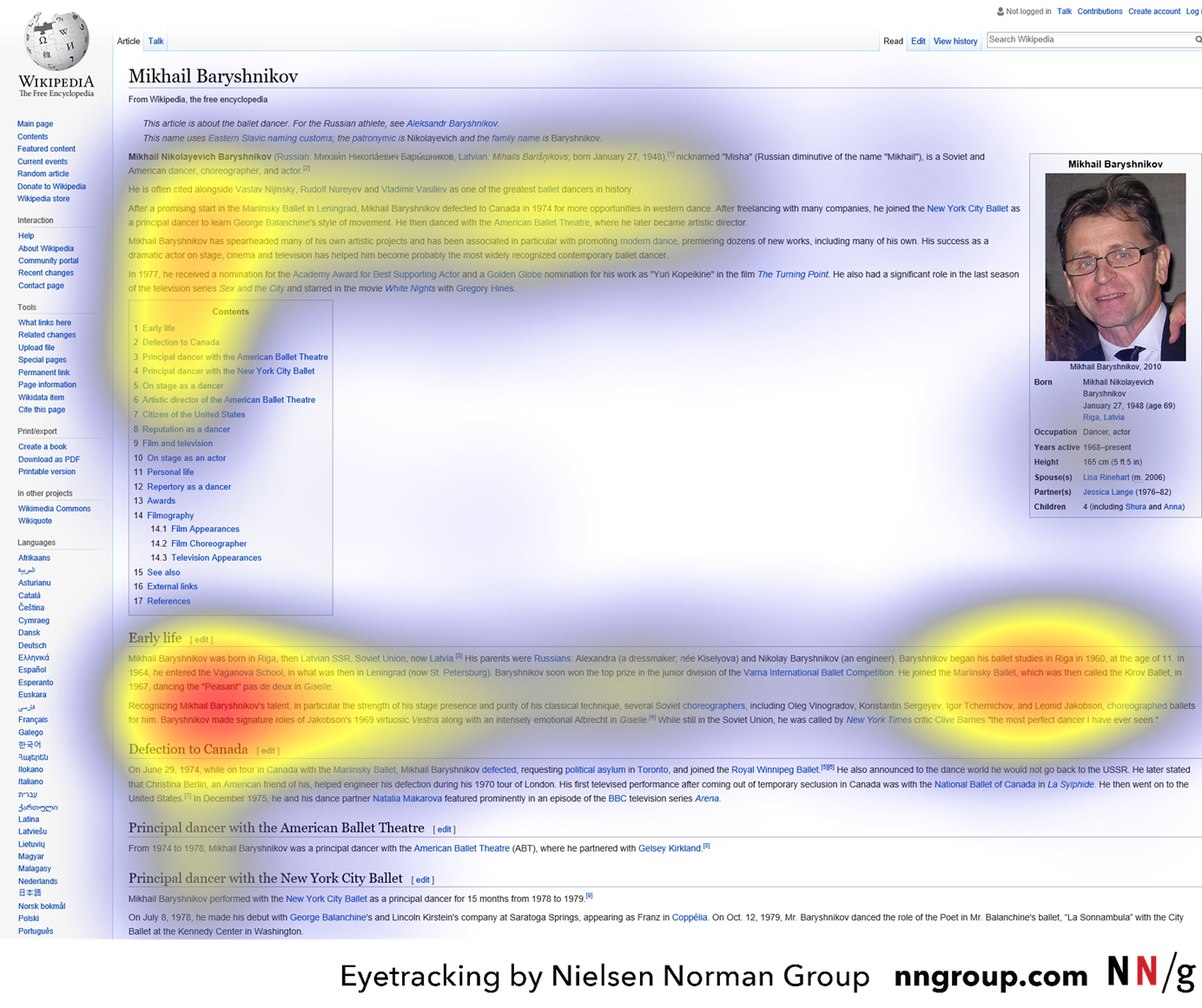
Interestingly we create these brain maps every time we read stuff on the screen. And there are patterns to it. Thankfully I didn't need to do a study myself—the wonderful folks at the Nielson Norman Group did.
Let's be honest—you're not reading every word I've written. You scannin'. What you might not know is that all humans scan similarly based on some core things:
- The task you're performing. Reading a help article is super different to dropping items in your eCommerce basket.
- Past assumptions. If you've used Wikipedia before and you got on Poképedia, you'll probably scan it the same.
- The layout of the page. Depending on the content inside the page, the scan pattern changes. If it's a huge video then it's unlikely someone will scan further down too much. If it's a Wikipedia page like in the image below it's probably gonna focus on the text.
What does this mean for your Knowledge Base article? It means you can make your articles far more readable by changing the way the content is displayed. There are 4 main patterns: F pattern, spotted pattern, layer-cake pattern, and finally commitment pattern.
The first question we need to ask ourselves is how we want our users to read our content? The point of a Knowledge Base article is to make it easy for our customers to get the information they need.
If we're painfully honest with ourselves none of our customers are coming to enjoy the content. This isn't a crime thriller. And that's totes okay. We just need to present the information and get out the way like feeding an angry bear 🐻
In the study, NN/g explain that differently styled text can capture the reader's attention. A few examples of these elements include our callouts or Folds. They pique the reader's interest so you'll not want to put too many in your article else they won't read any of your actual text.
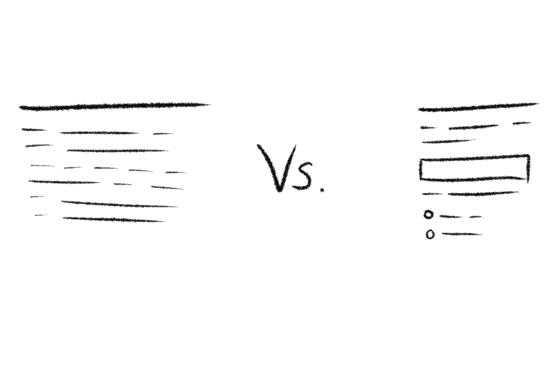
Since we don't want users to read every word the commitment pattern is out. The commitment pattern is basically the style of an online newspaper. An image at the top, a chunk of text, image, a chunk of text, image, etc.
In fact, it's a lot like this article. Maybe you are reading every word 🤭
What we can learn from this is that you'll wanna avoid large chunks of text in your Knowledge Base article. I'm sure that's a relief for you and your readers.
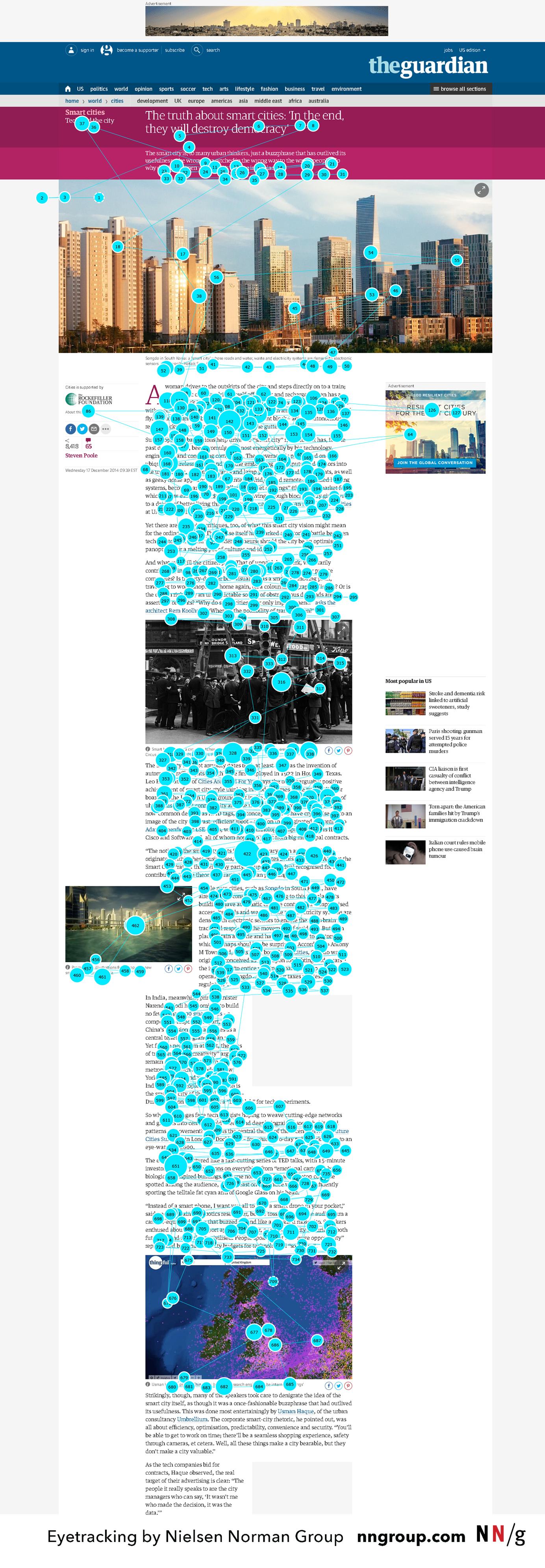
Let's take a look at a real-world example from a company you've probably heard of. Netflix.
Netflix would probably get thousands of unnecessary tickets each day without their Knowledge Base. They probably have to make their article simple, to the point, and most importantly easy to read.
I've highlighted certain sections in colored boxes and I'll explain them below:
- Red - These are small chunks of text. Like, really small. And for good reason. Small paragraphs are easier to read and digest.
- Green - This note stands out from the text above. It's basically saying "by the way this is pretty important".
- Blue - Bullet points make it easy to digest lists. Since it's listing out the various profile settings available the reader doesn't get overwhelmed.
- Purple - This is a collapsed information element just like our built-in Folds. They help the user decide whether the information is important enough to expand. These help make the whole article less lengthy and more appealing to read.
Had the article just been a lot of text without different elements then it wouldn't be very readable or useful to either the reader or Netflix.
They are following key Knowledge Base best practices here by turning the article into chunks. Let's dig into that a little more in the next section.
Chunking is the Key to a Readable Knowledge Base Article
Chunking is a way of distributing your text so readers never see a massive wall of text. People—including me—are lazy readers. We like to be excited by different elements on the page unless it's a story.
And I didn't make this thing up. It's an actual method used by writers and teachers around the world.
You can use a ton of different elements. Images, notes/callouts, tables, lists, interactive elements like accordions, dropdowns, and more. You can also split paragraphs into smaller parts of it's easier to read.
Let's take another example, this time from one of our own articles. This is from the middle of the article Finding CSS Selectors in Your Browser:
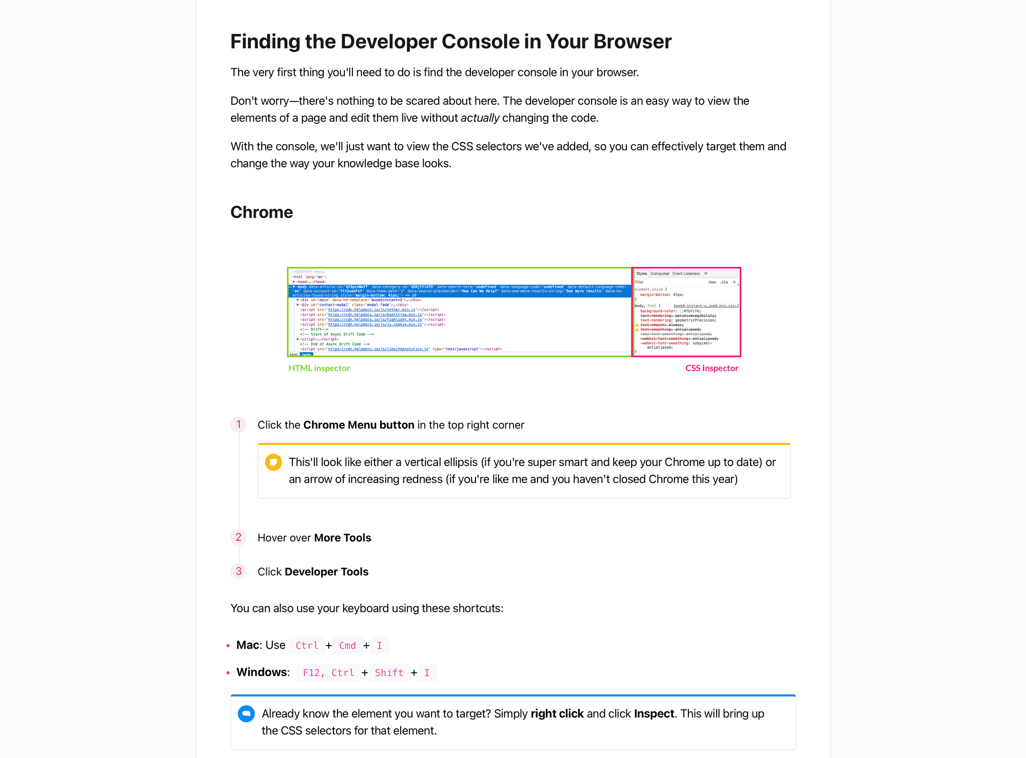
I won't label the elements in this one since I'm sure you're aware of them all. In this article we've got a section title. We've got small paragraphs. We've got a smaller title, an image, a numbered list, a callout, and bullet points.
This makes the article visually stimulating and easy to read. There are no big chunks of text to terrify the reader and the information is split out.
Without chunking, this article would be a long, boring article with a lot of words that nobody would read.
Use Your Own Brain Before Publishing
After you've written a Knowledge Base article I totally get the feeling of just wanting it published. It's hard work to get all the information, screenshots, and lay it out properly.
But the one thing you should do before hitting publish is read it yourself critically (or even better send it on Slack to a co-worker to read). Ask yourself these two things:
- Is this too much text? Basically, did you chunk the information so it was digestible? The worst thing you can do is create a massive wall of text for your reader.
- Did I read the important bits? If there are things in there you don't want your reader to miss then did you make it stand out enough?
You or your co-worker can make the article turn from a mess of words to something very useful. That's worth an extra 5 minutes I think 😌
It's All About Brains
From turning words into physical things, to creating maps of pages, to making it easier for readers to create those brain maps. Your brain goes on quite the journey when you read something on the internet. Who knew, eh?
With all this knowledge I hope you find it easier to create more readable Knowledge Base articles. Make it easier for your readers, yourself, and save yourself a ton of tickets along the way 🧠