We Rebuilt Our Onboarding From Scratch. Here's What We Learned
We rebuilt HelpDocs onboarding from scratch. Here's what worked, what flopped, and the fake loading screen that somehow made everything feel more valuable.

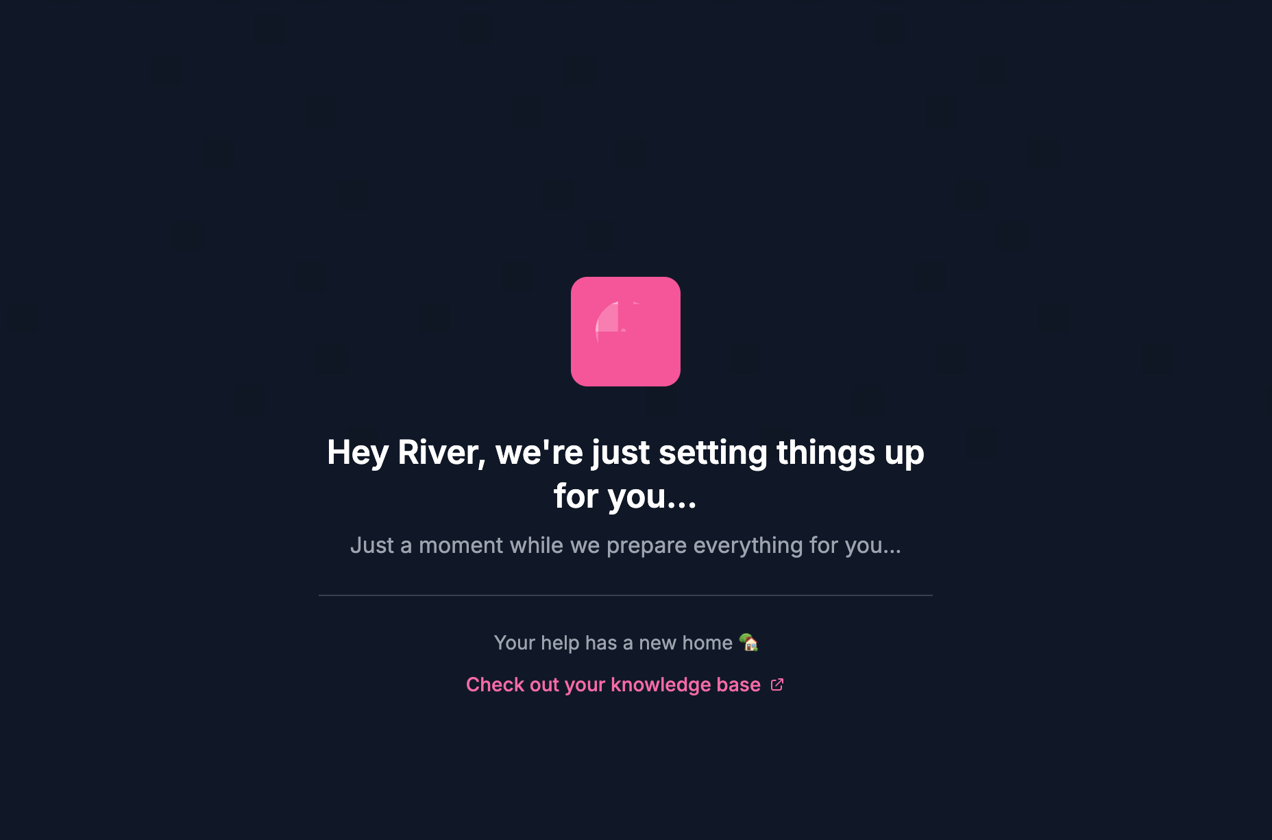
There's a loading screen in our new onboarding that says "We're just putting together everything for you." And it's a lie.
That screen doesn't do anything. It's an artificial delay we added purely to make the experience feel more valuable. And weirdly, it works.
That little deception is one of several things we learned while completely rebuilding how new users get started with HelpDocs. Some of what we discovered confirmed what we already suspected. Some of it surprised us. And some of it went against the "best practices" you'll find in just about every SaaS onboarding guide.

Become an expert in all things Knowledge Base with our monthly newsletter. No spam, just expert content, delivered.
Here's the full story.
What we had before (and why it wasn't working)
Our old onboarding was simple. Maybe too simple 👀
When someone signed up, they'd land on a single page where they could add their logo, pick a brand color, and add a navigation item. That was it.
Then we'd release them into the product and follow up with a long email sequence.
On paper, it was fine. In practice, our internal engagement scores were telling a different story.
We calculate an engagement score internally based on certain actions users take, and the numbers suggested people were feeling overwhelmed. The onboarding helped them configure things, but it didn't actually explain anything.
We were essentially handing someone the keys to a car without mentioning where the ignition was.
The email sequence wasn't helping either. It was long, impersonal, and almost nobody replied. When people did respond, the replies were usually to ask questions the emails should have answered in the first place.
Our activation metrics weren't looking great, and the onboarding had been untouched for too long. Time to rethink the whole thing.
Finding inspiration (without copying)
Before diving into a redesign, I spent time looking at products known for exceptional onboarding. Linear and BetterStack both get glowing reviews for how they welcome new users, so I dug into what made them work. What made them tick.
The common thread wasn't flashy animations or clever copy. It was usefulness.
Both products make you feel like you're accomplishing something meaningful within the first few minutes. You're not just filling out forms. You're actually getting set up in a way that matters for how you'll use the product.
That became the guiding principle: make every step useful, not just functional.
What the new onboarding looks like
Here's how someone gets started with HelpDocs now:
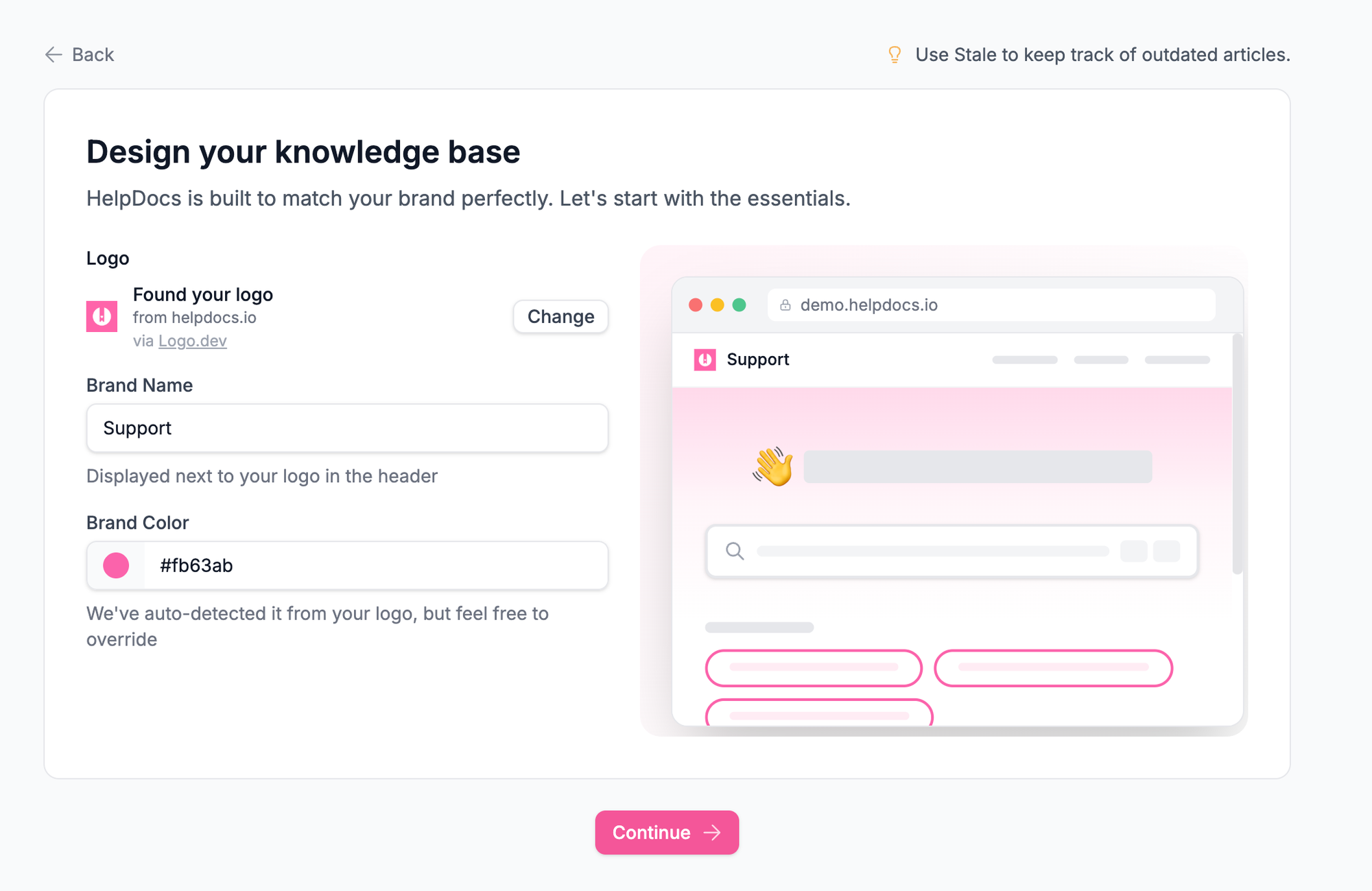
- We fetch their company logo automatically. As soon as someone signs up with a work email, we grab their logo so they don't have to upload it manually. (Quick aside: we had to switch from Clearbit to logo.dev for this since Clearbit is deprecating their API. If you're using Clearbit for logo fetching, heads up 😅)
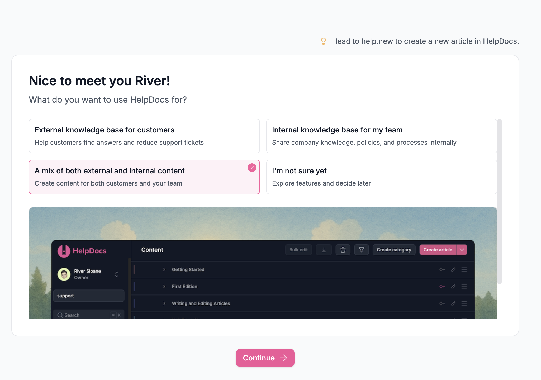
- Then we ask about their use case. Are they building a knowledge base for external customers, internal teams, a mix of both, or are they not sure yet?
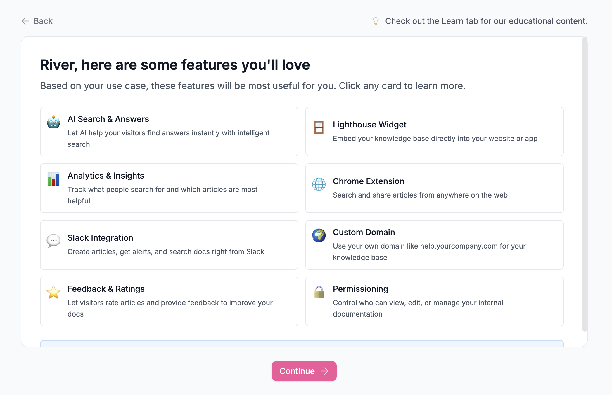
This single question shapes everything that comes next. - Based on their answer, we show relevant features. Someone building an external help center has different needs than someone creating an internal wiki. Rather than dumping every feature on everyone, we surface what's actually useful for their situation.
These open in Lighthouse, our self-serve widget, so they can explore without leaving the onboarding flow. - We auto-select a brand color based on their logo. This sounds small, but it removes friction. Instead of asking someone to pick a hex code or fiddle with a color picker, we just extract a dominant color from their logo and apply it.
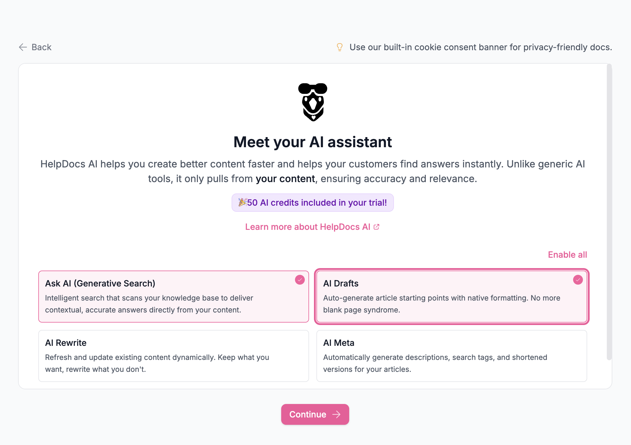
They can always change it later, but most people won't need to. - We introduce HelpDocs AI. For a lot of people, the scariest part of starting a knowledge base is the blank page. Our AI helps create and refine articles, so we make sure new users know it exists and how to use it.
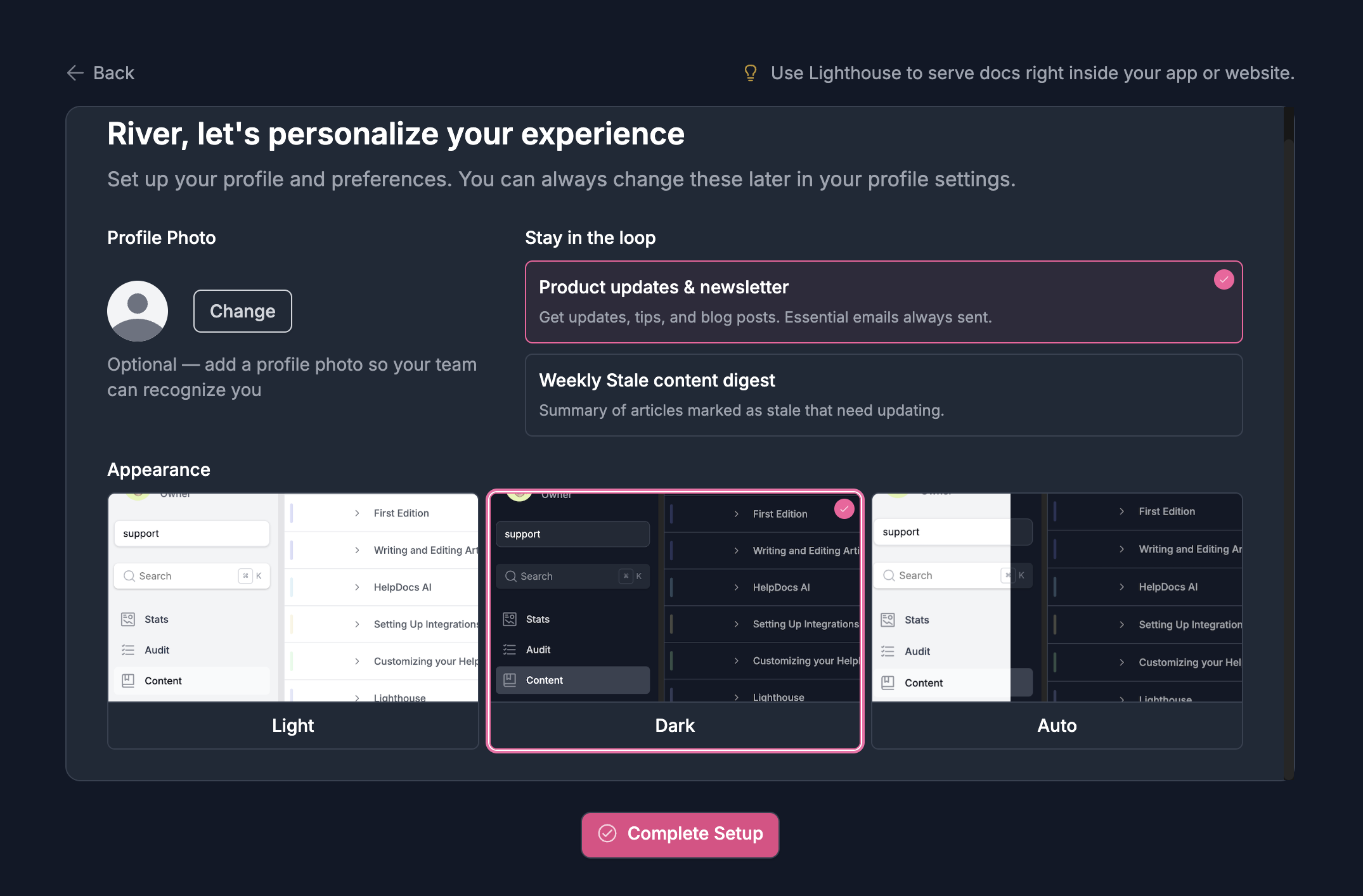
- Finally, we help them set up their preferences. Avatar, email preferences, dark mode. The personal touches that make the product feel like theirs.
The whole thing ends with that fake loading screen I mentioned.
The new onboarding sequence for HelpDocs.
"We're just putting together everything for you." In reality, everything's already ready. But that brief pause creates a sense that something meaningful just happened. It's theater, but it's effective theater.
What we tried that didn't work
Not every idea survived.
Early on, we wanted to show a live preview of the user's knowledge base during onboarding. An HTML scaffold where they could see their logo and colors applied, and even swap templates on the spot.
It sounded great in theory.
In practice, it became an absolute nightmare. The implementation got complicated fast, and worse, we realized it might actually overwhelm people more than help them. Someone signing up for the first time doesn't need to make template decisions in their first five minutes. They can explore that later once they understand what they're working with.
We scrapped it. Sometimes the best feature is the one you don't build.
The "best practice" we ignored
Here's something you'll see in almost every SaaS onboarding flow: a prompt to invite your teammates.
We deliberately left it out.
The logic behind team invites during onboarding makes sense on the surface. More users means better activation metrics, more engagement, stickier accounts. But when I actually thought about it from the user's perspective, it felt wrong.
You're signing up for something new. You haven't explored it yet. You don't know if it's right for your team. Why would you invite colleagues at that exact moment? 🤔
It'd be awkward to bring people in and then say, "Actually, we're not going ahead with this." We'd rather people get comfortable first, see the value, and then bring in their team when they're ready to commit.
The invite flow is still there, just not shoved into the first five minutes.
Early results
It's only been a few weeks, so I'm hesitant to declare victory. But the early signs are encouraging.
Our engagement scores are up noticeably. People are taking more meaningful actions after completing onboarding, which suggests they actually understand what they're working with now.

We also overhauled the email sequence. Fewer emails, more personal, more relevant to what each user is actually trying to do. The response rate is better, and when people do reply, they're having real conversations instead of asking basic setup questions.
What we learned
A few takeaways that might be useful if you're rethinking your own onboarding:
Personalization doesn't have to be complicated. Asking one question about use case let us tailor the entire experience. You don't need a 20-question survey.
Remove decisions where you can. Auto-fetching logos and auto-selecting brand colors sounds minor, but every decision you remove is one less bit of friction.
Artificial delays can add perceived value. It feels counterintuitive, but a brief "loading" moment makes people feel like something meaningful is happening. Just don't overdo it.
Question the "best practices." Team invites during onboarding might work for some products, but it didn't feel right for ours. Think about what makes sense for your users, not just what everyone else does.
Kill your darlings. That template preview feature would have been cool. It also would have been overwhelming and complicated. Sometimes good ideas aren't right ideas.
We're still iterating, and I'm sure we'll learn more as we collect data over the coming months. But so far, the rebuild has been worth it.