The Accidental Evolution of the HelpDocs Brand
HelpDocs is now 5 years old and while we've always had a bookmark it's certainly changed over the years. Here's a little insight into how the HelpDocs brand has evolved.
I’m proud to say HelpDocs is the grand age of 5—that's 5 years of evolution.
Over those years HelpDocs has changed a fair bit. The only thing that hasn’t changed is the way it’s run. We’re still very much bootstrapped. But this post isn’t about bootstrapping—it’s about our bootstrapped brand.
We’re pretty fond of it. It’s been created in-house with nothing but time. But what’s it about and how has it progressed since HelpDocs’ birth back in 2016?
Blue Like Everyone Else
A lot of companies have a blue color scheme. It’s supposed to mean loyalty and it’s an easy, inoffensive color. It’s the color HelpDocs started off as.
Back when gradients and shadows were fabulous (although they’ve come back in fashion recently 😎) I started making shapes in the design software Sketch. I drew the letter HD with a bookmark hanging off the H. It probably took around 10 minutes and I was done.
Then I tried a ton of different shades of blue. Popping blue, baby blue, dark blue. In the end I used the most boring version of blue I could possibly find. And that was the first version of the HelpDocs branding.


Simple, blue, and pretty dull. But it worked.
Jazz It Up
The blue logo got us pretty far down the line. We used the logo for a whole year.
Blue and boring worked for us but we started to find our footing in our industry and wanted something that represented us better. We had an opportunity to define what we cared about and stand out at the same time.
The team behind HelpDocs isn’t dull. We’re a friendly team who care about equality and being ourselves at work.
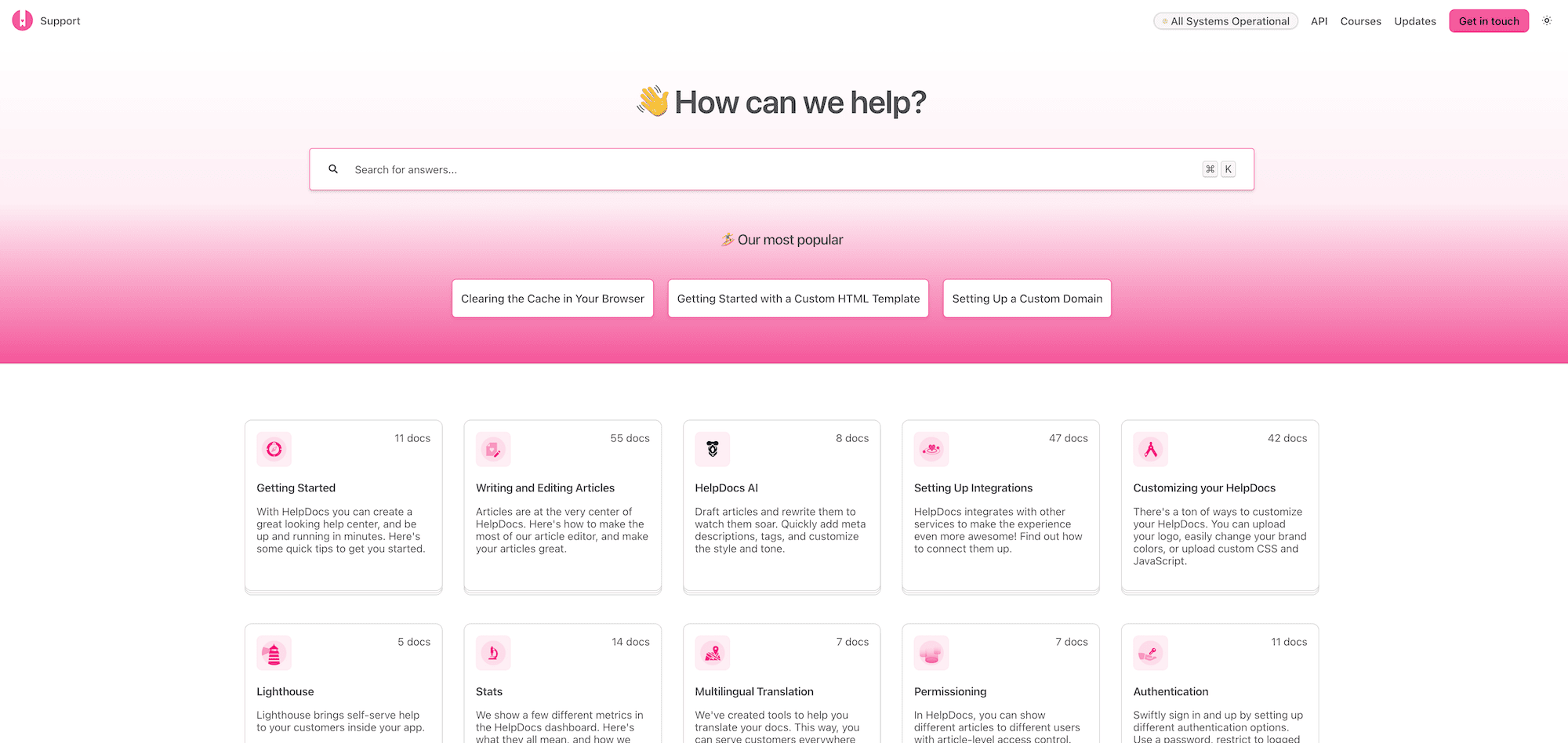
Pink seemed to represent us better. So we chose a pink that popped. And it sure did (almost a little too much).
When it came to the actual wordmark, I was concerned the HD matched the HD logo you find in TVs. It wasn’t distinctive enough.
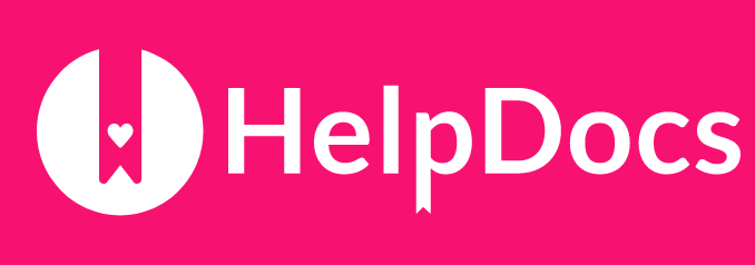
I ditched the letters but kept the bookmark. A bookmark and knowledge base software kinda makes sense. It’s all about knowledge and knowledge lives (or at least used to) in books. And HelpDocs helps you find the right article in seconds.
I decided to keep the circle and put the bookmark in the middle. I sat back and felt something was missing.
That’s when I added the love heart. It softened the logo and added a little character. It represented the love we add to our product 💖
Now we had a logo we could be proud of. It represented us as a team and gave a little glimpse of our team culture.
Evolution of Illustrations
I wrote briefly about the blog headers we create for Bookmarked but not about the style and how our illustrations have evolved.
It all has to do with my art skill. To be honest, I never was any good at art. I never pursued it at school. I found drawing on paper a tricky thing to get the hang of. I doodled in my university lectures but that was the end of it.
Luckily I had experience drawing pixel art on Microsoft paint. I found it a breeze to use a mouse vs. an actual pencil. I used to spend hours creating virtual furniture out of nothing.
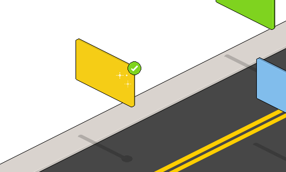
And that’s where the isometric style came into play. I always used to draw isometric pixel art. So I found it simple to create vector isometric illustrations in Sketch. I never took an online course—I taught myself from scratch.


The isometric style lasted a long while and people seemed to like it. But I wanted to move on and learn something new.
Then the second-generation Apple Pencil was released and I knew I wanted to learn to draw on the iPad. It was clearly the future.
I’d tried drawing on a Wacom tablet in Adobe illustrator. I found the disconnect between where I was drawing and where the line was being generated a tough transition. And I never got the hang of it.
I unwrapped the iPad I bought in Central Station and found the Apple Pencil a natural fit. It was what I’d been looking for.
And so then came the animal drawings.
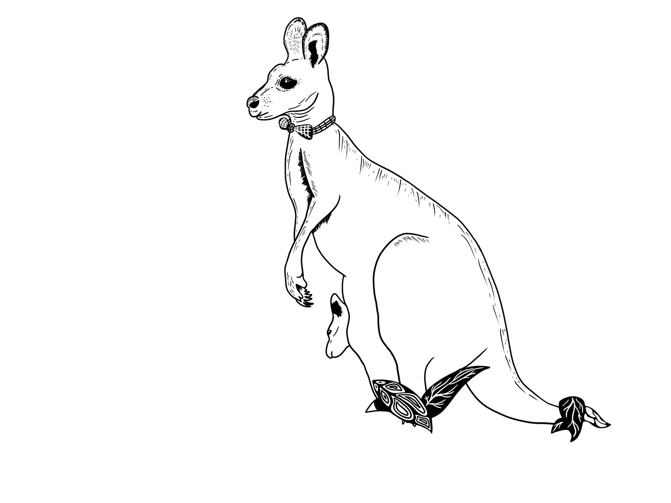
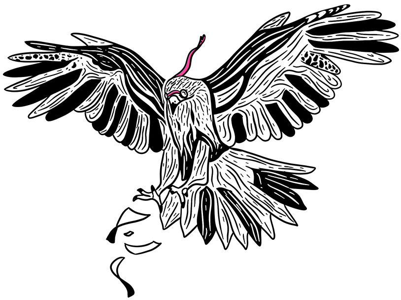

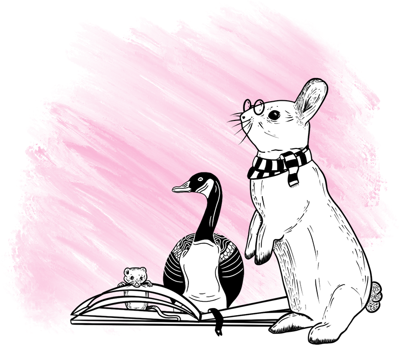
I found black and white a lot easier to begin with. And it worked as an illustration style for HelpDocs. With a bit of added pink 💅
I started drawing more elaborate patterns inside the animals as I got more confident. And so the homepage illustration we got a lot of compliments came together.
Skip the Eye Bleach
After getting the hang of creating illustrations in our DIY brand book (we don’t actually have one of those just yet 😬) our pink needed a little work.
I remember someone saying the pink was a little too harsh. After looking at it I tended to agree (especially on Firefox, which is EXTREME 🤪).
So we decided to soften the pink and round the bookmark corners for a more friendly look.
That’s where we’re at right now—a pretty #F45599 with our beloved bookmark.
The Next Step
Who knows what HelpDocs will look like in 2, 5, or 10 years. Maybe we’ll hire a professional designer one day who can make the brand official. Or we’ll just muddle along making it up.
I just know it’s likely to represent who works at HelpDocs. A lovely team who’s proud to make information easy to access for millions of people across the world.
Just knowing my artwork has been seen by millions of people makes me feel pretty satisfied 😌