
The sun is shining, casting a warm glow over the beautiful streets of Paris, and with the Paralympics just around the corner, there's an exciting buzz in the air. I'm savouring a rich Americano at a charming café, watching the world go by, and soaking in all the positive vibes! 😎
I’m thrilled to share some (ok, a TON) of the exciting updates we’ve rolled out for our users over the past few months. Our team has been incredibly busy, and we’ve made significant strides to enhance your experience! ✨
Based on your invaluable feedback, we’ve completely revamped the search functionality to make it more intuitive and user-friendly.
We’ve also introduced V5 templates in Beta, which now include a sleek dark mode for those who prefer working in the dark! We’ve also rolled out Dynamic Clips that make updates easier than ever, allowing for seamless integration of new content.
Finally, our improved stats filtering by source will help you gain deeper insights and make informed decisions.
We can’t wait for you to explore these enhancements! Let's dive into the details (but maybe not the Siene) 🏊
New Search Functionality
You spoke; we listened.
Look—we ain't hating on our old search at all. But we know the world of search has moved on slightly in the last eight years, and there's new technology to use to make search even better.
We scoured the land of search and found something that was the perfect fit on which to base our search. We know how important it is for our customers to get search working well 🫡
So for the last year, we've been tweaking, rebuilding, stemming, and indexing to make our search the best it can possibly be. And now we're ready to share it with you.
Highlighting built-in
The first thing you'll probably notice is how highlighting shows up when you search for a keyword.
It'll appear for both the article title and the description, so your customer will know exactly why the results have come up.
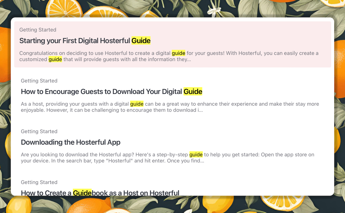
And the best thing is you don't need to lift a finger. It'll work as soon as the feature is rolled onto your account. Pretty neat, right?
Smarter searching
Another neat thing is how the search actually works.
The search is now far more typo-tolerant (I'm always misspelling on my phone 🫢), and it'll filter out most stop words and extract the keywords from the search instead.
It's faster, wiser, and looks cool too.
The future of our search
We’ve been working hard to roll out an amazing new search feature that’ll be ready as soon as it hits your account. Of course, there are always some edge cases we might have missed.
We want to make our search the best for you, so if you come across anything that doesn’t seem right, we’d love to hear from you (just shoot us an email!).
We're super excited about what’s coming next! I can’t share too much just yet, but I can tell you it’ll involve AI paired with this awesome new search functionality.
V5 templates in Beta
Get ready for something awesome!
We've been hard at work behind the scenes, and I can't wait to unveil our brand-new templates. Our V5 templates are loaded with the latest features, designed just for you!
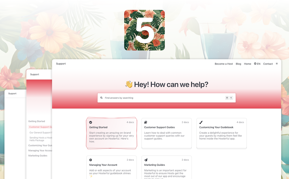
All three of our new V5 templates have some pretty neat features. Let's take a look 👀
Dark mode
Let’s discuss dark mode—because who doesn’t appreciate a sleek, stylish interface that’s gentle on the eyes? 🌙
With our new V5 templates, you can effortlessly switch to dark mode, transforming your workspace into a calm, modern environment without any hassle. Whether your customers are burning the midnight oil or simply prefer the sophistication of darker tones, dark mode enhances their experience significantly.
Not only does it look stunning, but it’s also engineered to reduce eye strain, making it perfect for those who have spent hours in front of a screen. Imagine immersing yourself in your documents with a chic interface that keeps everything sharp and clear, all while making you feel like a true professional.
Get your customers ready to embrace those late-night productivity sessions with comfort—dark mode is here for them to explore 🌃
Breadcrumbs in search
Ever find yourself putting similar articles in different categories? We hear you, and you're definitely not alone in this struggle 🙋
Many users face the same challenge when trying to organize content effectively. That’s why we've introduced breadcrumbs into the (new!) search feature to make it crystal clear where each article is located.
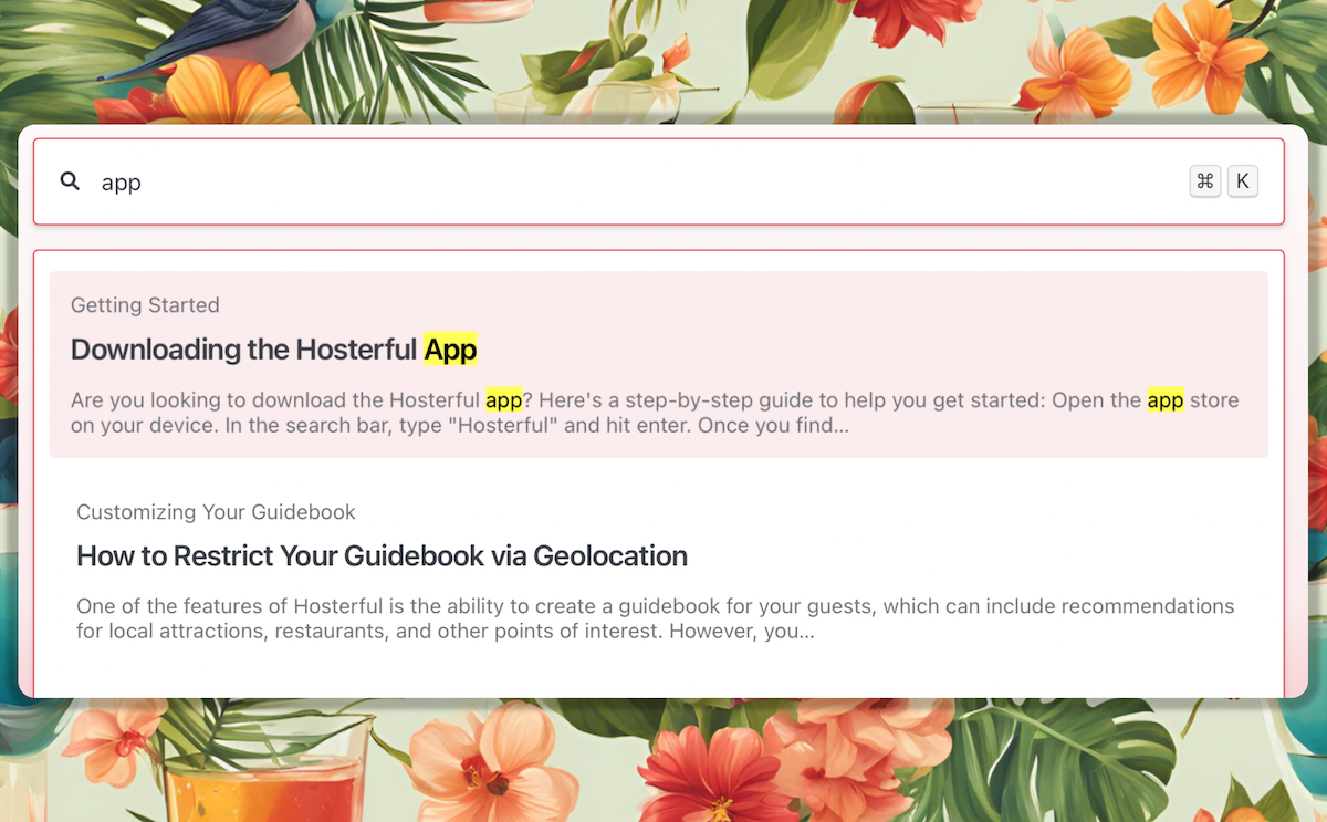
Breadcrumbs provide a clear trail of links, allowing you to see the path from the homepage to the specific article, making navigation intuitive and straightforward.
No more wondering which category it belongs to—now you can easily track your steps and understand the context of each piece of content!
Filter search by category
We're not quite done with the new search functionality on our new V5 templates. We’ve made searching even better with the option to filter by category! 🪩
Now, when you’re deep into a specific section, you can focus your search solely within that category, making it super easy to find precisely what you need without sifting through unrelated content.
This is a game changer for your customers who love to dive into niche topics—they'll save time and stay in the groove.
But don’t worry if you want them to be able to cast a wider net!
They can still search the entire Knowledge Base whenever they like. So, if they're feeling curious and want to explore everything you have to offer, the option is right there for them! It’s all about giving your customers the flexibility to search their way.
Happy exploring, friends! 🧭✨
Custom article icons
We’re all about making your Knowledge Base as branded as possible, and that’s why we’re excited to announce the introduction of custom article icons in our V5 templates! 🎨✨
Now, you can sprinkle a little creativity into your articles by adding unique icons that truly represent their content.
This feature allows you to give each article a touch of flair—whether it's a lightbulb for ideas, a book for resources, or even a coffee cup for those casual reads. It’s super simple to implement—just upload your custom icon, and watch as your articles come to life with personality!
This update isn’t just about aesthetics, though; it also helps with navigation. When users can easily spot familiar icons, it makes finding the right articles a breeze 🖼️✨
Pixel lovin'
When it came to creating our new templates, we poured our hearts and souls into every single detail. Meet our trio of fantastic templates: Startup, Detailed, and ECommerce!
Each one has been crafted with the intention of catering to a wide range of use cases, ensuring that there's something perfect for everyone. We understand that every user has unique needs, so we focused on making these templates versatile and user-friendly.
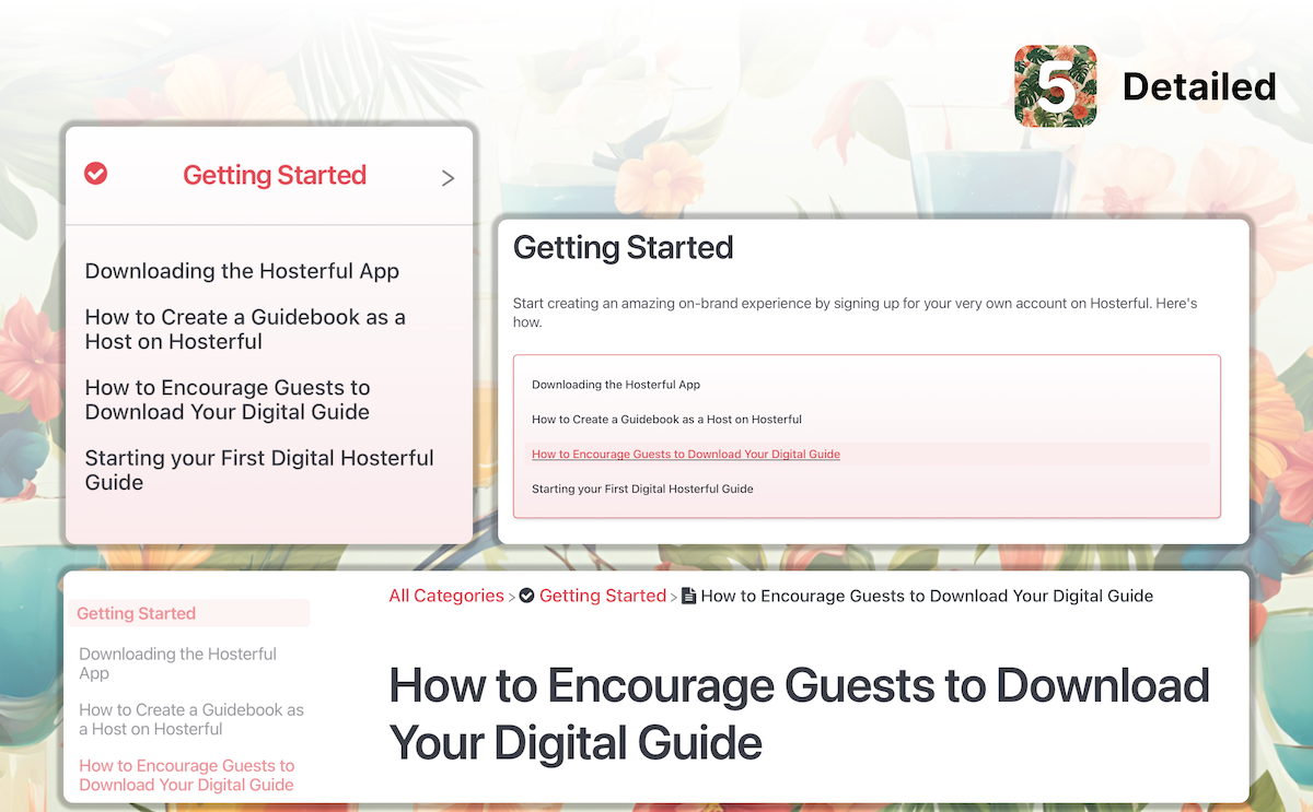
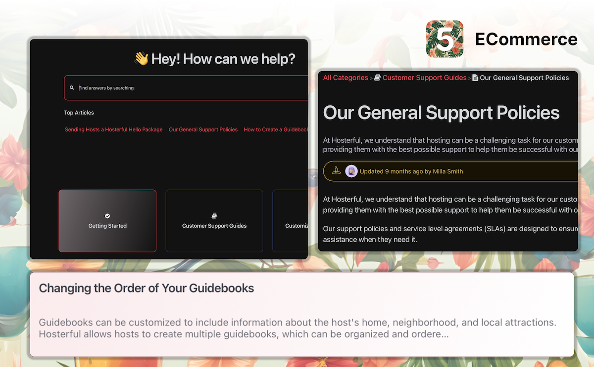
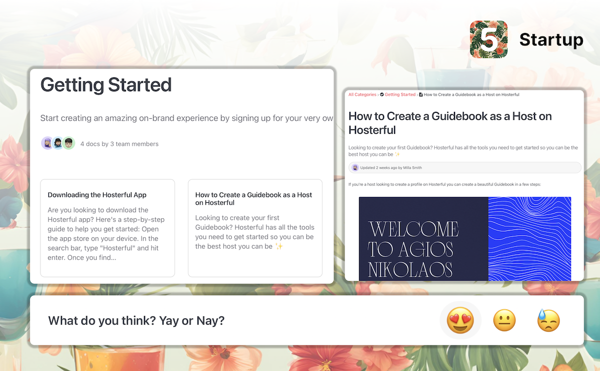
Each template in the V5 suite brings its own style 🌿
From the overall layout to the tiniest pixel, every aspect has been thoughtfully considered to enhance your experience.
We know that having a stunning template is just the beginning, so we’ve gone the extra mile to optimize our V5 templates for SEO, speed, and accessibility.
Startup is all about that clean, modern look to help new ventures shine. Detailed offers an organized space for presenting in-depth information, while ECommerce serves up an engaging shopping experience that captivates customers.
We truly believe that the effort we put into designing these templates will help you connect with your audience like never before—because each pixel isn’t just a square on a screen; it’s part of a larger, loving design that reflects your brand and passion for your work 🎨✨
Dynamic Clips
Okay, let’s talk about one of the features you’ve been eagerly waiting for: the ability to update Clips in one place and have those updates reflect everywhere! 📎
This was no small feat—it was a massive technical challenge that we’ve successfully tackled.
With the introduction of Dynamic Clips, you can now create content that lives across your articles.
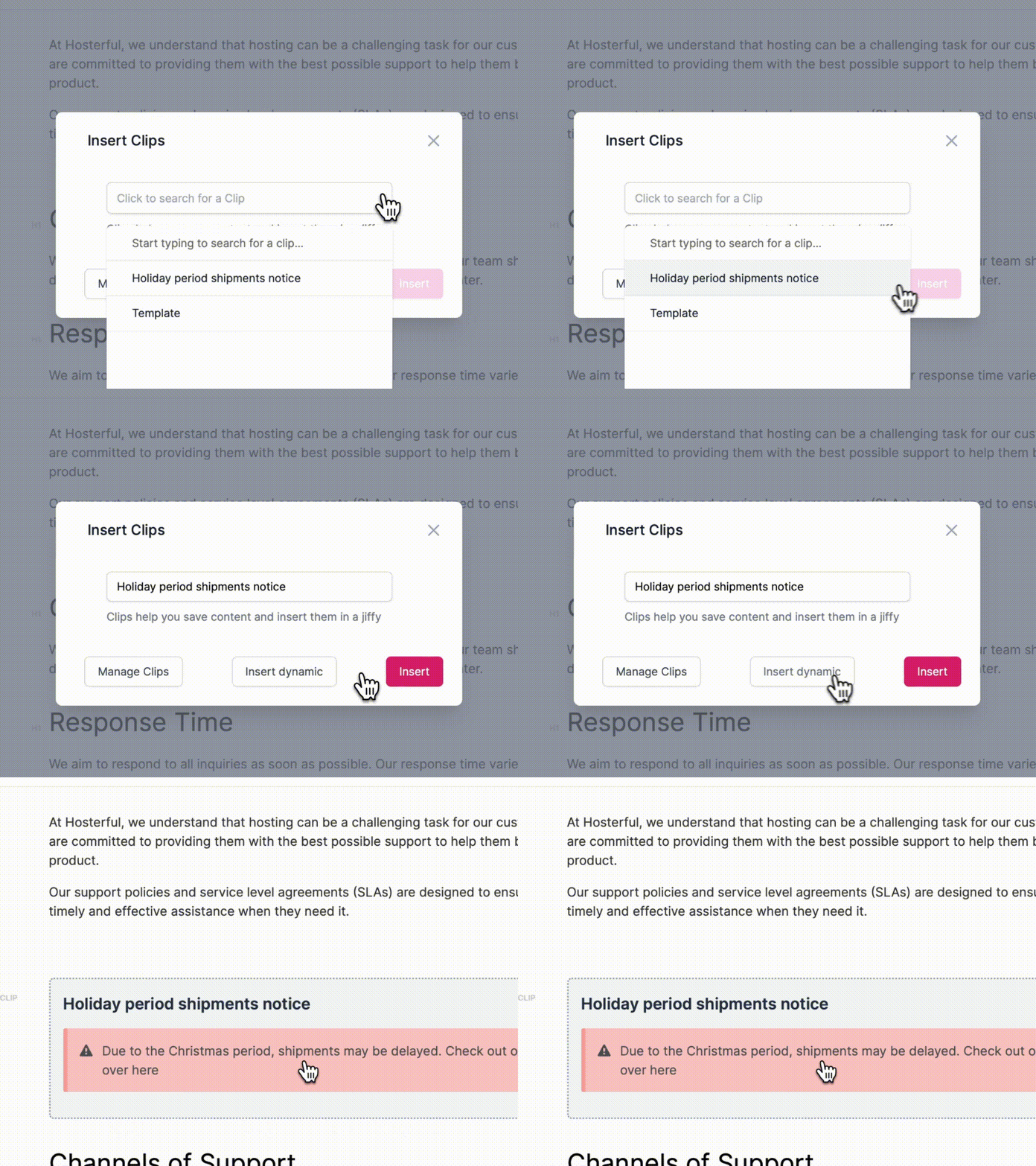
So, let’s say you’ve got a piece of information that needs tweaking or an important announcement to make; instead of hunting down every single article where it appears, you just update it once, and voilà! Your content is automatically refreshed everywhere.
This means less stress for you and a seamless experience for your readers.
They’ll always have access to the latest and greatest information without any hassle. We’re pretty stoked about this, and can’t wait for you to take it for a spin!
Just imagine how much easier it’ll be to keep everything up to date. Happy editing! ✨
Flamegraphs to Uncover Popularity
We’re super excited to introduce a fresh feature that we think you’re going to love: Flamegraphs!
This nifty addition gives you a brand-new way to explore articles within your content list. It's awesome being able to see a visual representation of your content at a glance, making it easier to spot trends, popular pieces, and connections in just seconds.
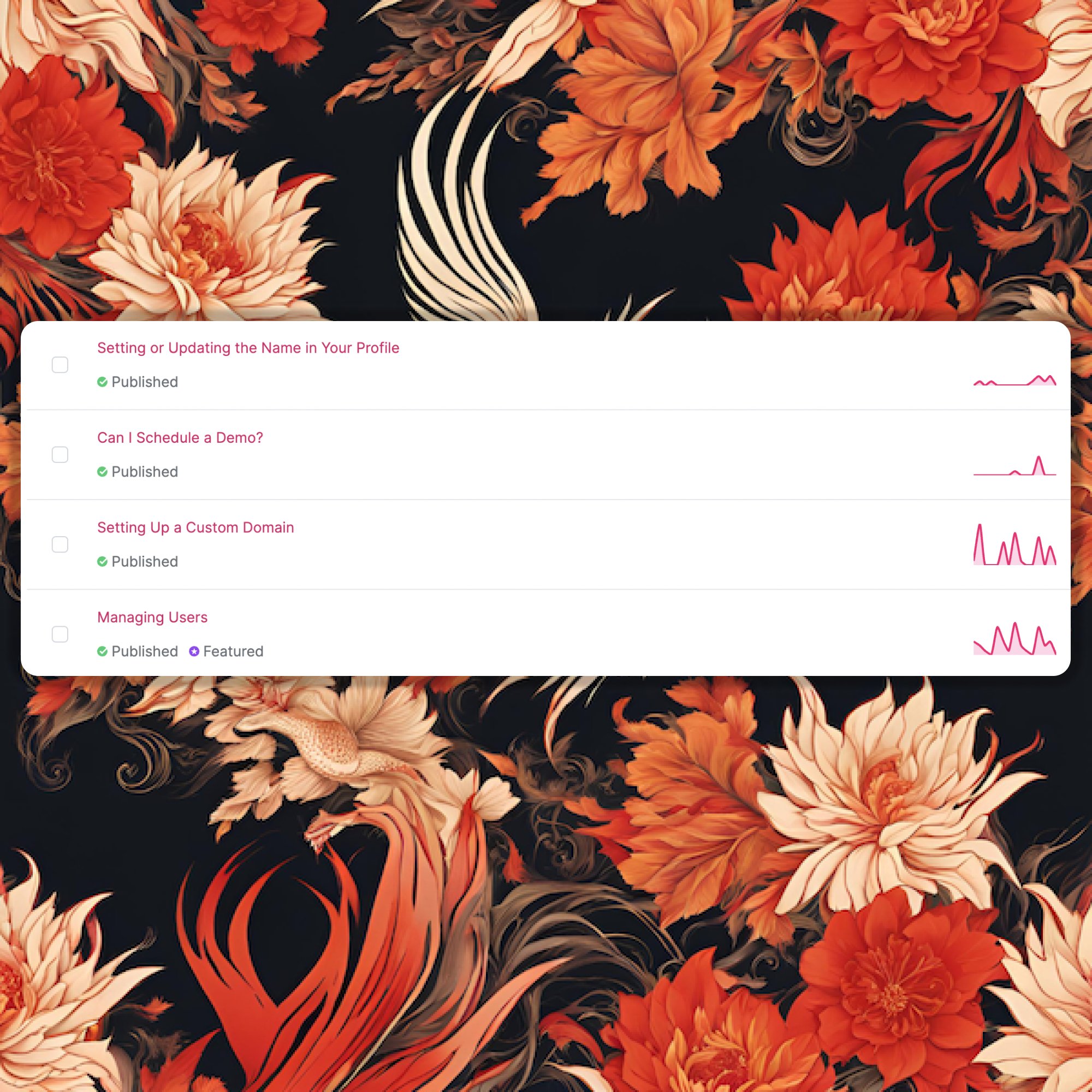
With Flamegraphs, you can simply click on a graph associated with each article to dive deeper into the details. This makes it simple to understand how your content is performing and engaging with your audience.
Plus, it adds a fun, interactive element to your browsing experience! We believe this feature will not only enhance your workflow but also spark some inspiration as you navigate through your content library.
So get ready to click, explore, and see the art of your articles unfold like never before! 🔥
Introducing JWT Studio: Your Go-To for Creating and Validating JWTs 👾
We're buzzing with excitement to bring you JWT Studio. If you've ever needed to create or validate JSON Web Tokens (JWTs), you're in for a treat!
JWT Studio is designed to make your developer's life easier by providing a simple and intuitive interface for all your JWT needs.
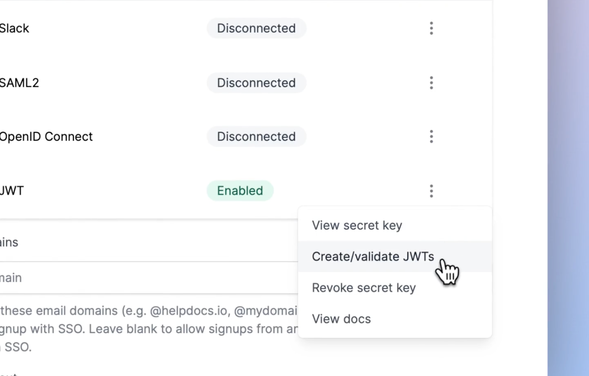
What Does JWT Studio Offer?
With JWT Studio, creating and validating JWTs has never been simpler. Here’s what you can expect:
- User-Friendly Interface: No need to be a coding wizard! Our clean design makes it easy for anyone to whip up a JWT in just a few clicks. You can input all the necessary information, and watch the magic happen! ✨
- Instant Validation: Not sure if your JWT is valid? No problem! Just paste your token into the validation section, and we'll check it for you. Quick feedback means less guesswork and more confidence in your tokens.
- Customization Options: Tailor your JWTs to fit your specific needs! Whether you need custom claims or have special requirements for expiry times, JWT Studio's got you covered.
- Security First: We prioritize your security. JWT Studio ensures that generated tokens are not only user-friendly but also robustly secure, keeping your data safe and sound.
Filtering Stats by Source
Hold onto your hats, folks, because we’re stepping up our stats game! 📊
With our new filtering feature, you can now easily sift through your stats by data source, which is a total game changer for those who want to get specific about their metrics.
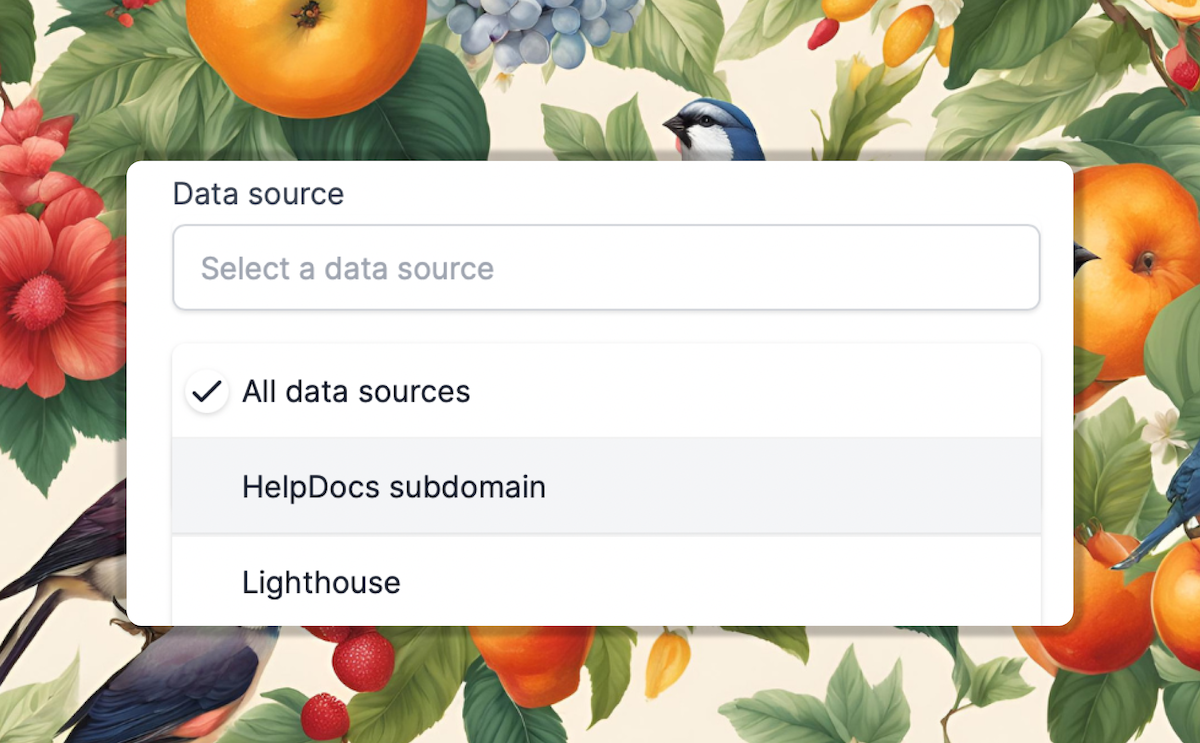
Whether you’re looking to dive into insights from our stellar Lighthouse widget, pull data from your API, or analyse information specific to your custom domain or subdomain, it’s all right at your fingertips!
This means you’ll have a clearer picture of performance across all platforms, allowing you to make smarter decisions based on precise data. No more guessing games—just straightforward analysis that helps you focus on what really matters.
Get Started With Our New Features
Our V5 templates are currently in Beta, but you can start enjoying them in your account today. We’re super keen for you to explore all the fantastic features we’ve packed into these templates 🎉
Just a quick heads-up, though—our new search functionality is still being rolled out. If you don’t see it in your account just yet, don’t hesitate to get in touch with us! We’d be more than happy to enable it for you.
A Summer of Treats ☀️
And there you have it, folks! We’re beyond excited about all these new features and improvements designed to make your experience smoother and more enjoyable.
From intuitive search functionalities to versatile templates and easy content management, we’ve really put our heads together to bring you the best updates possible.
But don't go anywhere just yet—there's more! We’ve shared our additional updates, fixes, and enhancements you can check out below.
Other Small But Mighty Updates
🔼 Improvements
- The
/searchAPI path now returns drafts - Ability to limit search results to a category in the API
- It's clearer how to change billing in our Billing Portal
- Clips now have a direct link so you can share them with your team
- We've dramatically improved the speed for Stats to load from our database
- Language names are more consistently appropriate
- You can now filter Stats data by Permission Group
- It's clearer that changes will be overwritten by machine translations
- There's now a warning when RTL languages selected but template doesn't have full RTL support
- Improvements to machine translations
- Better performance for showing Presence
- It's easier to add articles to empty categories since we added a button at the bottom
- In-app alert system so we can make you aware of problems or improvements to the platform
- Sort selective PDF export by category to better mirror the dashboard
- Copy to HelpDocs feature for images now works with inline images too
- Direct link to product updates in the profile dropdown
🐛 Bug fixes
- Prevent empty machine translations
- HTML blocks in text editor no longer have a minimum height
- Better drag-and-drop performance for reordering content
- Lighthouse buttons didn't look quite right with a dark primary colour. Now they shine ✨
- Sometimes you'd get a blank screen if your local storage was full. We now automatically clear it for you 🧹
- We now load unassigned articles instead of a splash screen in accounts without categories