Optimizing Your Knowledge Base for Mobile
Learn why mobile optimization of your Knowledge Base is crucial to connect with your customers wherever they are.

Everywhere I go, I see people looking down at their phones (where I'm not looking down at mine 😅). On the tube, in shop queues, and inside airports.
Our smartphones are practically an extension of our hands. So it's high time we discuss a crucial aspect of online presence—making your Knowledge Base mobile-friendly.
Think about it: your wealth of information, no matter how extensive, is only as valuable as its accessibility.
If users can't effortlessly navigate and engage with your content on those pint-sized screens, you risk alienating a significant chunk of your potential audience.
Making your Knowledge Base mobile-friendly is about connecting with your audience wherever they are. And people are on the move all the time.
So, buckle up as we jump into the realm of mobile optimization, unraveling the secrets to supercharging your user experience for mobile users.
The What and Why of Mobile Optimization
First things first—what is mobile optimization?
It's not just a tech buzzword. It's a game-changer. Mobile optimization involves tweaking your Knowledge Base to ensure it functions seamlessly on smartphones and tablets.
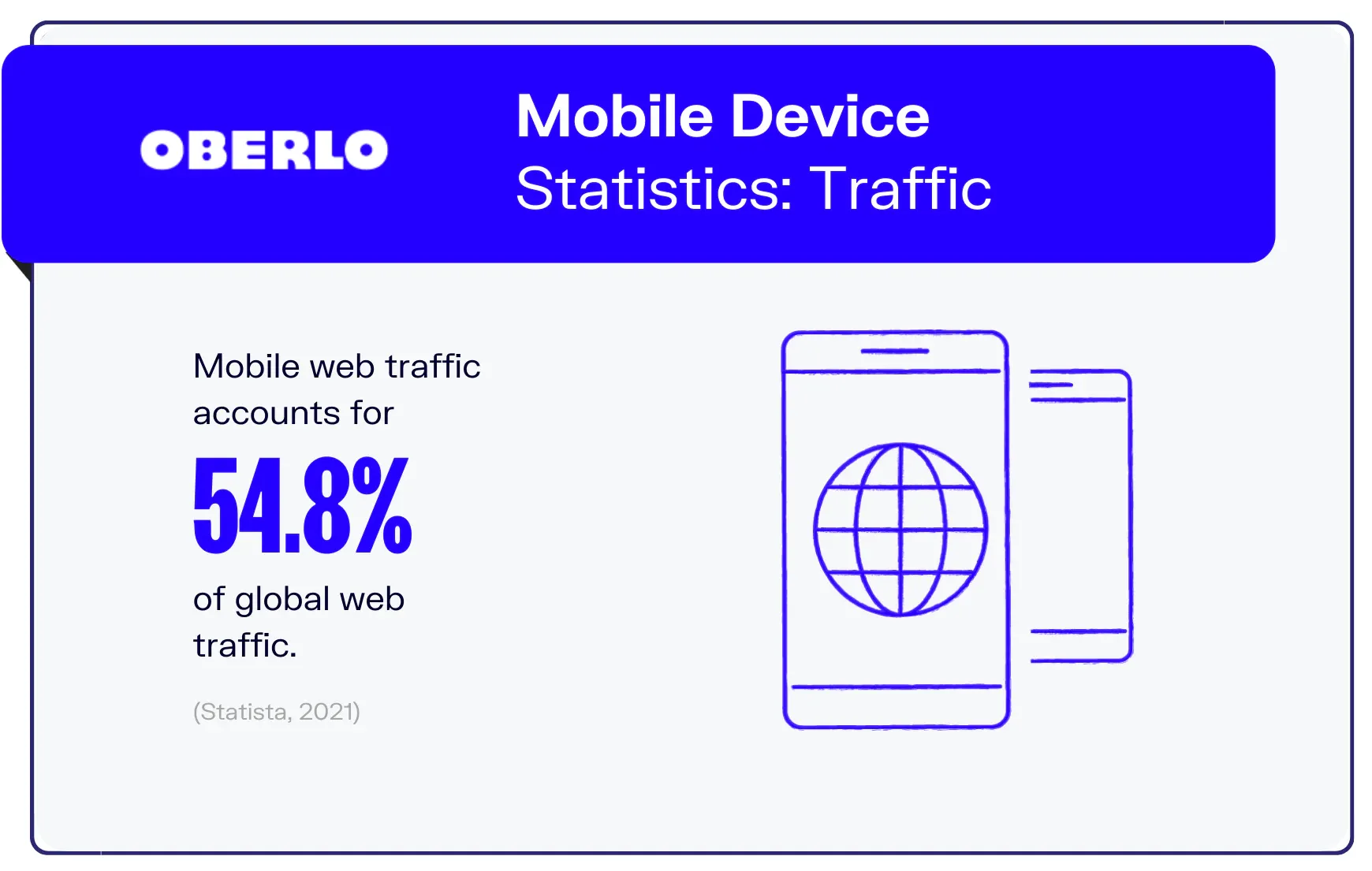
Why bother, you ask? Consider this: around 56% of internet traffic comes from mobile devices. That's more than half of your potential audience accessing your Knowledge Base on the go. Ignoring mobile optimization is like leaving money on the table!
Mobile optimization of your Knowledge Base is about tailoring and fine-tuning your information repository's structure, design, and content to ensure optimal functionality on mobile devices.
It involves adapting the Knowledge Base to the specific constraints and characteristics of smaller screens, touch interfaces, and varied network conditions commonly associated with mobile usage.
 River Sloane
This optimization aims to make the Knowledge Base accessible, readable, and navigable on mobile devices.
The goal is to provide a seamless and efficient experience for users who access the knowledge base on the go, enhancing overall accessibility and user satisfaction.
Why Must Businesses Prioritize Mobile Optimization?
Let's put it in perspective.
Picture this: you're at a coffee shop waiting for your latte and want to look up information quickly. What do you reach for? Your smartphone, of course!
It's not just you; it's a global trend. Studies show that the average person spends over 4 hours on their mobile device daily. Your audience is mobile, and to remain relevant, your Knowledge Base needs to be too.
Your Knowledge Base is the hub of all your valuable info.
If that goldmine of knowledge isn't tailored for those tiny screens, you're potentially waving goodbye to a big chunk of your audience. In a world where over half of internet traffic comes from mobile devices, it's not just a nice-to-have—it's a must.
Mobile optimization is like rolling out the red carpet for your users. It's about ensuring that your content looks sharp, loads fast, and is a joy to navigate on smartphones and tablets.
Neglecting mobile optimization is like closing the door on a massive chunk of your audience, leaving them frustrated and, let's be honest, probably bouncing off to a competitor who gets it.
So, why should businesses prioritize mobile optimization? It's simple—because that's where your audience is.

Our content in monthly bitesized emails
Get our best content delivered straight to your inbox.
SubscribeIt's about being where your customers are, delivering a seamless experience, and staying ahead in the game. Mobile optimization isn't just a tech tweak. It's your ticket to a thriving, engaged audience who can access your knowledge base anytime, anywhere.
Best Practices for Designing a Mobile-Friendly Knowledge Base
Crafting a space where your audience can effortlessly access information on the go is a game-changer. Here are some best practices to turn your Knowledge Base into a mobile-friendly oasis.
Embrace Mobile-first Responsive Design
Responsive design can feel like a real pain when you're designing something new. But since it contributes over half of internet traffic, it's worth investing in.
It's all about ensuring your content looks fantastic and functions seamlessly across a spectrum of devices, from the tiniest smartphones to larger tablets. No more pinching and zooming—just a smooth, adaptable user experience.
 UXPin
UXPin
When designing your Knowledge Base for mobile devices, consider the following elements:
- Article content: Make sure the page doesn't horizontally scroll, images are scaled to fit with some margin for readability and are zoomable by tapping, tables display properly, and the font is a suitable size
- Navigation: Use a hamburger menu to condense navigation items, the items themselves should have large tap zones, and search inputs should be usable
- Fields: Many people use password managers or browser auto-filling features. Make sure all the fields on your Knowledge Base use the correct HTML input types
Optimize Images and Videos
Media files can be the heavyweight champions when it comes to slowing down load times.
Optimize your images and videos for mobile consumption. Compress those files without sacrificing quality to keep your Knowledge Base nimble and your users happy. Nobody likes waiting around for a sluggish page to load!
 Mohit Joshi
The good news is that with modern browsers you can tailor the images based on device which makes load times a lot easier to manage.
Minimize Load Times
Speaking of load times, speed is the name of the game. Mobile users are on the move, and patience isn't their strong suit.
Trim the excess size from your pages—unnecessary plugins or scripts, large images, and clunky scripts. The faster your pages load, the happier your audience will be—literally.
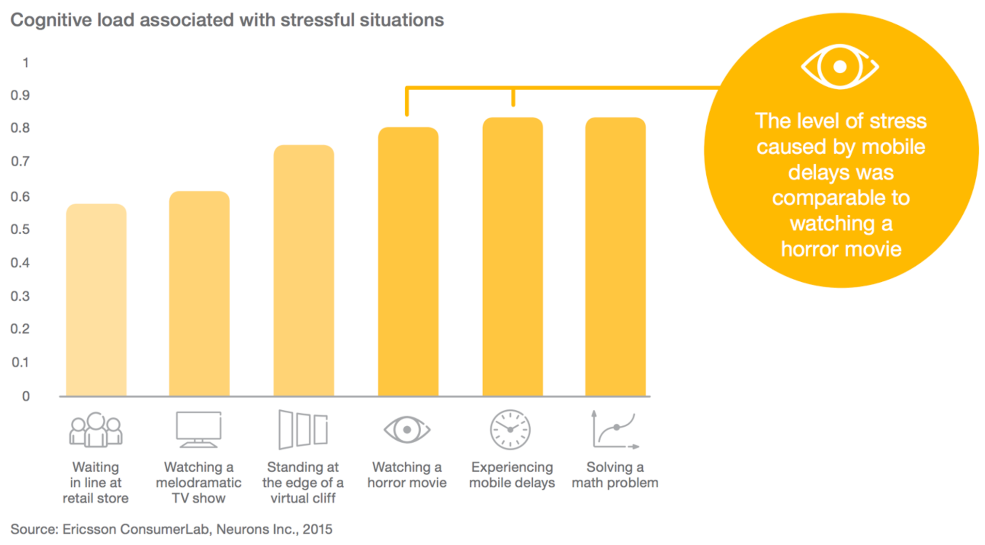
According to Ericsson, slow mobile load causes more stress than watching a horror movie. Yikes.
The main culprits are usually large images or autoplay videos. You should look at how many external fonts you're loading as too many can bloat the page. Switch to SVGs for icons, WebP images for large images, and run regular tests for optimization.
Prioritize Readability
Ever tried reading microscopic text on your phone? Not fun. Ensure your fonts are mobile-friendly—large enough to read without squinting. You can do this in a couple ways:
- Use dynamic font sizes like vertical height or vertical width
- Leave enough padding between paragraphs by adjusting the margins based on screen size using media queries
- Consider click ability of text by making links inside of content clear
Break up content into digestible chunks, and use bullet points and lists to make information easily scannable.
"A mobile-friendly Knowledge Base isn't just a checkbox. It's a commitment to delivering a top-notch experience for users on the move."
Your users will thank you for saving them from endless scrolling.
Ensure Consistency Across Devices
Consistency is key when it comes to mobile design. Your users might switch between devices, so make sure their experience is consistently excellent. Whether they're on a phone, tablet, or desktop, the look and feel should be familiar and user-friendly.
A mobile-friendly Knowledge Base isn't just a checkbox. It's a commitment to delivering a top-notch experience for users on the move.
Make use of a framework to make the job easier for yourself like Tailwind or Bootstrap. Don't forget to use built-in frameworks too like flexbox and CSS grid.
Tips for Easy Mobile Navigation
No one enjoys getting lost in the sea of information, especially not on a mobile device. Your users should be able to find what they need without getting frustrated by your navigation.
 Phil Wijs (‘Weiss’)
Here are some tips for organizing your content for seamless navigation on mobile devices.
- Collapsible sections: Integrate collapsible sections to keep things neat and tidy. Users can expand what they need and collapse the rest, preventing information overload.
- Clear Headings and Subheadings: Provide crystal-clear headings and subheadings for each section. Use descriptive and concise titles that give users a preview of what to expect.
- Logical Content Hierarchy: Organize your content in a logical hierarchy. Users shouldn't feel like they're lost in a maze. Guide them seamlessly from broad topics to more specific details.
- Thumb-Friendly Touchpoints: Consider the touch-friendly nature of mobile devices. Ensure that clickable elements are thumb-friendly and well-spaced, minimizing the chance of accidental taps.
- Consistent Formatting: Maintain consistency in formatting across your content. Consistent fonts, colors, and spacing create a visually harmonious experience, making it easier for users to follow.
- Progressive Disclosure: Embrace progressive disclosure principles. Introduce information progressively, revealing details as users delve deeper, maintaining a clean and focused interface.
- Prioritize Important Information: Place crucial information upfront. Mobile users often have limited time and attention, so prioritize what they need to see first for a more efficient user experience.
Strategies for Making Content More Readable on Mobile Devices
Let's talk about making your content shine on those smaller screens.
Here's a handy list of strategies to make your content more readable on mobile devices.
- Larger Fonts: Enlarge your fonts to ensure readability. Strive for a font size that's comfortable for mobile users, reducing the need for zooming in.
- Minimize Scrolling: Minimize the need for excessive scrolling. Break content into manageable sections, reducing the need for users to scroll endlessly to find information.
- Bullet Points and Lists: Utilize bullet points and lists for scannability. Mobile users often skim content, and these formatting elements make it easy for them to grasp key points quickly.
- Clear Font Styles: Opt for clear and easy-to-read font styles. Steer clear of overly elaborate fonts that may become difficult to decipher on smaller screens.
- Ample White Space: Embrace white space for a cleaner look. Adequate spacing between lines and paragraphs enhances readability and prevents a cluttered appearance.
- Contrast for Visibility: Ensure sufficient contrast between text and background. High contrast improves legibility, making it easier for users to read your content in various lighting conditions.
- Adaptive Content: Consider adaptive content based on device orientation. Adjust content layout and formatting when users switch between portrait and landscape modes for a seamless reading experience.
Best Practices for Mobile Search Functionality
A powerful search functionality is the secret sauce for mobile-friendly Knowledge Bases.
Here are some best practices for optimizing mobile search functionality.
- Prominent Search Bar Placement: Place the search bar prominently on the screen. Users should easily spot and access the search function without unnecessary scrolling.
- Predictive Search Suggestions: Implement predictive search suggestions. As users type, provide real-time suggestions to anticipate and streamline their search process.
- Filters and Tags: Integrate filters and tags for refined results. Allow users to narrow down their search by applying filters or selecting relevant tags.
- Voice Search Capability: Incorporate voice search functionality. Enable users to search hands-free, a particularly useful feature for on-the-go mobile users.
- Smart Search Bar Placement: Keep the search bar accessible during scrolling. A fixed or smartly positioned search bar ensures users can initiate a search whenever inspiration strikes.
- Relevant Thumbnails and Snippets: Include relevant thumbnails and snippets in the results. Visual previews and concise snippets give users a preview of the content, aiding in decision-making.
- Optimized Search for Different Devices: Optimize the search experience for various devices. Consider differences in screen sizes and resolutions, ensuring a consistent and user-friendly search experience.
Tips for Testing and Optimizing Your Mobile Knowledge Base
Don't launch and forget. Test your mobile Knowledge Base with real users, track metrics, try on different mobile devices and browsers, and be open to continuous improvements.
A well-optimized Knowledge Base is a living, breathing entity that evolves with your users' needs.
Here are some tips for testing and optimizing your mobile-friendly Knowledge Base.
- User Testing Extravaganza: Conduct thorough user testing sessions. Get real people to interact with your mobile Knowledge Base. Watch, learn, and gather insights into how they navigate and engage with the content.
- Track Key Metrics: Implement robust analytics tools. Track metrics like page views, bounce rates, and user journey to understand how users interact with your mobile Knowledge Base.
- Continuous Improvement Mindset: Embrace a mindset of continuous improvement. Regularly assess user feedback and analytics, and be ready to make adjustments to enhance the user experience.
- Load Time Monitoring: Keep a close eye on load times. Optimize images, scripts, and other elements to ensure your mobile knowledge base loads swiftly. Users love a speedy experience.
- Device Compatibility Testing: Test on a variety of devices and browsers. Ensure your mobile knowledge base looks and functions seamlessly across different smartphones, tablets, and browsers. What works on an iPhone might need tweaking for an Android.
Research, Analyze, and Improve
Making your Knowledge Base mobile-friendly isn't just a trend, it's a necessity. And it's constantly adapting with new technology and devices.
With over half of your audience checking out content on their smartphones, catering to their needs isn't just good business—it's survival.
Keep on top of the latest browser features that are making it easier to create a seamless experience each year. Make sure you're catering to new device sizes and think about the future like virtual reality as it starts to seap into everyday life.
So roll up your sleeves, dive into the world of mobile optimization, and watch your Knowledge Base become a mobile masterpiece!