August 2019 Product Updates Post
An overhauled content list, super easy content reordering, smarter content filtering, and a better text editor.


August was a super quiet month for HelpDocs. Not much happened. We didn’t ship. Everything stayed the same. The world was at peace…honest!
Ok, that was a lie! Barefaced, nose-growing, pants-on-fire subterfuge at it’s finest.
In fact August was crazy. Terrifying really. But dotted with enough optimism to trick us into a false sense of security. As if somehow we’d glide through in an uncharacteristic month of plain sailing.
No, August had other plans. 😬
It’s our own doing though, because in August we shipped a whole bunch of awesomeness including a rebuilt content tab and text editor, some new functions, and the brand spangly new template we’ve been teasing in our docs for weeks.
Let’s take a look 👀
The New Look
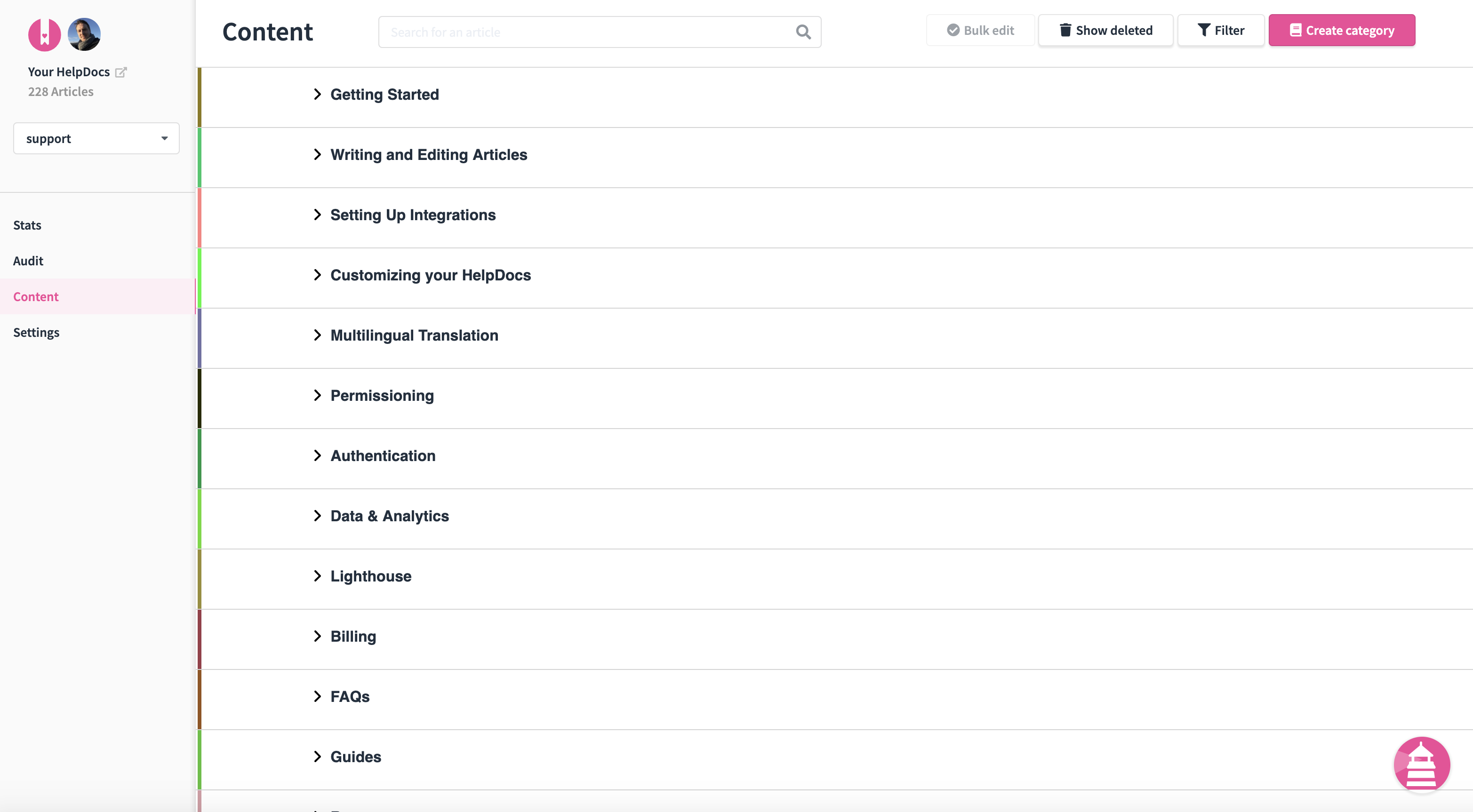
Probably the biggest awesome in the awesome bucket was the complete overhaul of the content tab.
And when I say a complete overhaul I don’t mean we changed a couple of colours, added some illustrations and rebranded it as a miraculous new era in the future of knowledge base software. 🤷♂️
I mean we did add some illustrations throughout the software but that’s beside the point! 🙈 Stunning though they might be (great job Jarratt! 💪)
No! The real mind-blower was the increase in load speed thanks to the way we now load categories and their articles.
Or rather the way we lazily load categories and their articles.
It might sound counterintuitive, but by loading in a lazier way (less is more) we improved load efficiency a massive amount.
Laziness as a way to boost efficiency is something I’m yet to replicate in my day-to-day though. Nevertheless I’ll persevere! 💪
Jokes aside, one of the main driving points of the overhaul was to make things quicker and more streamlined.
Decluttering I guess you could call it.
Going full Marie Kondo on the content dashboard.
We improved the aesthetics too.
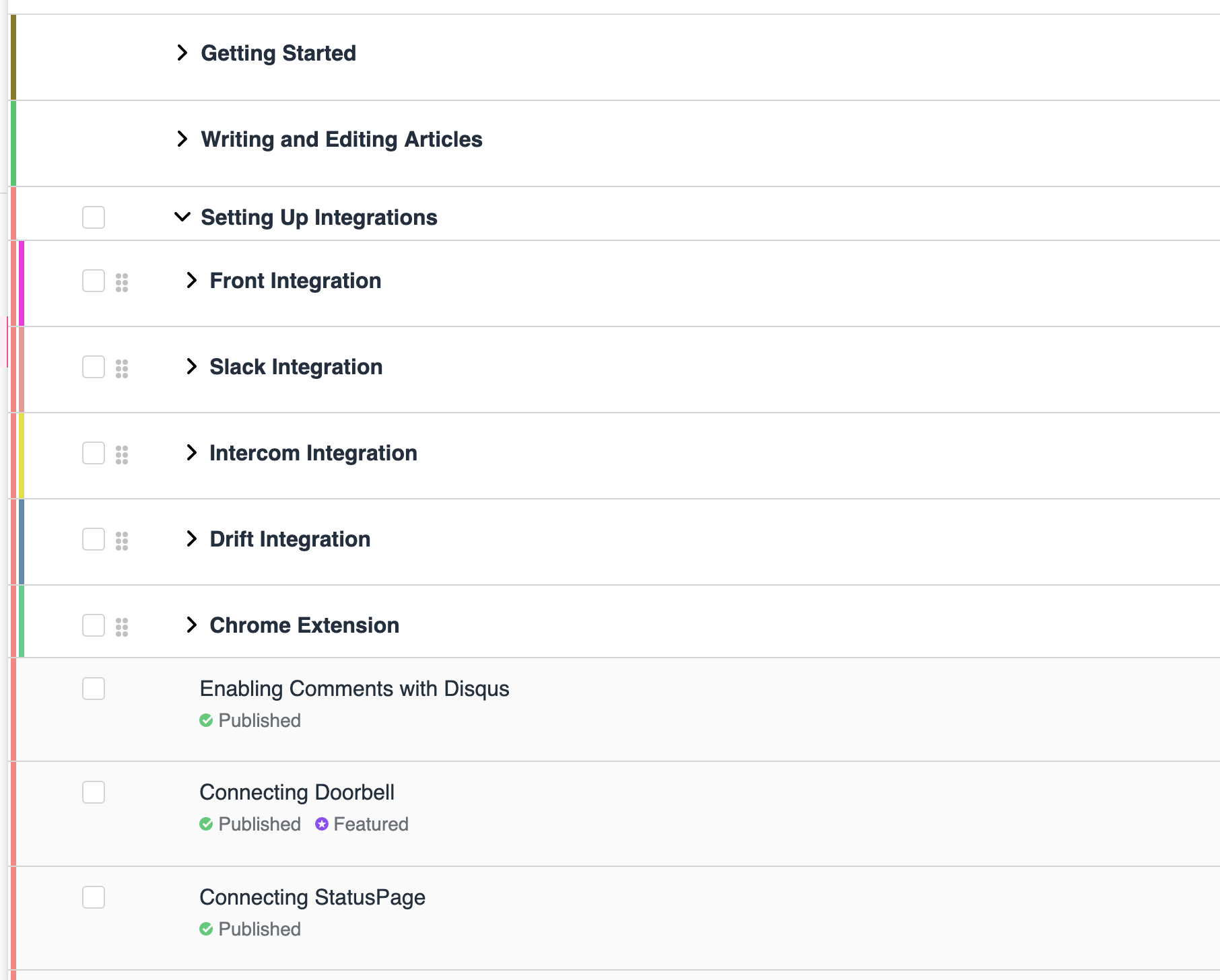
We introduced the random allocation of colours to categories and their subcategories to make things easier to see things at a glance.
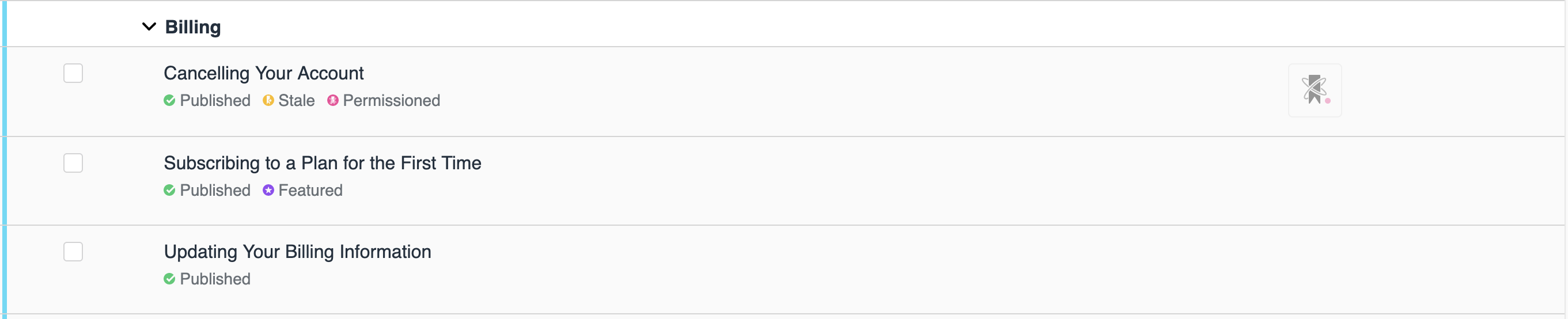
We added labels to indicate an articles publishing, Stale, and Featured state. As well as visual indicators when an article is has access permissions or feedback via Doorbell.
And we switched away from the editing pencil icon and opted for more obvious (Edit) which opens up a much nicer and easier to use editing modal.
😅 Phew!
So yeah, there was a lot that got worked on in the content tab…
…but that’s not all! 😱
Introducing the Power of Filtering
It seems like we could do with more filters in a few aspects of life nowadays.
Well lucky for you, we decided to add a way to easily navigate and manage your articles in the content dashboard with super powerful filters.
You can filter by published and Stale status. You can filter by Author, Category, specific Permission Group, or Tags.
Hell, you can filter by all those things, or some of them.
This has proven to be incredibly useful when working on things like Stale articles.
Or when you’re trying to get a bunch of articles in a category ready.
Or when you just need to find that article that you definitely started but can’t for the life of you remember what the title was.
And yes, that’s the voice of experience 😬
They really are something special. ✨
The New Text Editor
Ok so we weren’t done with the content tab.
Oh no no no. 😄
‘Cause let’s face it, if we’re rebuilding one part, we might as well take a look at the other bits too, right?! 🙈
Welp! We did!
We stripped back the text editor and made it much more elegant. Ditching the arbitrary visual boxing and making much better use of the space.
Not only has the toolbar been better incorporated into the browser window. We’ve also made it sticky. So no matter how long your article is, you’ll always be able to get to the tool you want.
We’ve also reworked some sections. Things like meta information, featured status and table of contents have now all been incorporated under a three-dot menu.
We’ve moved permissioning under a more visible icon.
And we’ve made the word count, readability, and versioning much easier to keep track of and use.
All round it’s a badass update 🙃
Bars V4 Template release
Last but by no means least we got to the end of our arduous journey to release the first V4 template.
The eagle-eyed amongst you will already have noticed us teasing using it for our own docs over the last few months. And now you can use it too!
Built on CSS grid, it’s a stunning template. Fit for mobile and desktop. Complete with a frankly huge search bar, quaint animated elements, and much better differentiation between articles and categories.
We’ve also introduced a “Next” and “Previous” navigation feature at the end of articles. This’ll allow editors to create follow-on customer experiences within categories.
And as with the V3 Bars template, there is a Table of Contents in the left hand sidebar.
I mean…what more could you want 😍
Smaller, but No Less Important
Everyone loves an OG. When visitors hit a 404 page, they were seeing HelpDocs wonderful graphics.
But as beautiful as those images were, it made more sense to show the Open Graph image assigned in the Brand settings.
Fixes
Once and owner, always an owner. Reassigning the account owner was leaving the old owner in place too. That was a little messy. Probably not what was intended either. So we fixed it.
Mind your Language. When users switch primary languages but don’t change secondaries it now switches the language code in for the existing primary content instead of switching the content itself.
Someone’s at the Door. The connect/disconnect with the Doorbell integration had broken due to an update. So we wen’t and fixed it. No more broken doorbells 👍
Lightercom? Interhouse? There was an issue where Intercom and Lighthouse icons were overlapping causing some issues with usability. We’ve made it so the Lighthouse icon takes it’s rightful place 😁
Spaced Out Custom Domains. Empty space at the end of a custom domain field was stripping the entire field 😬 I dunno how we found out about that. Certainly nothing to do with me (lies).
Engl-ish. The Front plugin language selector was overlapping the search text causing untold levels of complication. Ok it wasn’t that bad. A minor annoyance really. We fixed it though. 🤷♂️
Does my Front Look Wide in this? Front let us know they're changing their plugin minimum width and suggested we might want to do the same. We did want to. So we did!