Shedding Light on Dark Mode for Your Knowledge Base
Explore the perks of Dark Mode for your Knowledge Base–from reducing eye strain to saving battery life, discover why this UI trend is more than just a cool feature.
It's 3am and it's well past my bedtime.
I'm working on finalizing a feature for HelpDocs customers. My eyes feel strained, my mind is exhausted, and I'm just a few lines of code away from wrapping up for the day.
As I search for documentation, a bright light from my laptop screen suddenly blinds me. The glaring interface of the documentation gives me a slight headache. If only there were a dark mode, right? 🫢
If you're the keeper of a Knowledge Base, then dark mode might initially spark little excitement. But this humble user interface setting deserves a closer look, and here's why.
Dark mode isn't just a passing trend; it's an excellent design feature that can jazz up how your interface looks and works ✨
Once upon a time, 'dark mode' was merely a shadowy figure lurking in the corners of interface design—often overlooked and seldom used.
Fast forward to today, and oh, how the tables have turned!
Dark mode has danced into the limelight, becoming a wildly popular feature across apps, devices, and websites. Its rising popularity isn't just a coincidence or a fleeting fashion statement in the tech world.
Users everywhere have started recognizing the charm and benefits of flipping the switch to the dark side.
In this guide, I'll light the way in the UX maze as we delve into the world of dark mode for your Knowledge Base. Let's go!
What is Dark Mode and Why Should You Care?
Dark mode is an interface display setting that swaps out light backgrounds and dark text for a darker backdrop with lighter text.
It's designed to reduce eye strain, especially during prolonged screen use in low-light conditions.
But it's more than just a visual preference; dark mode has some practical benefits too:
- Eye Comfort: Staring at bright screens all day? Dark mode offers a visually soothing alternative to reduce eye strain, especially in lower light conditions (like me huddled over my laptop at 3am 😴).
This is important not only for the current digital workspace but also for the future with products like Apple Vision Pro and Meta Quest. A study at the University of Central Florida found that dark mode increased visual acuity and reduced visual fatigue when using optical see-through head-mounted displays (OST-HMDs). - Battery Savvy: According to a study by Purdue University, dark mode can be a real battery life saver on devices with OLED screens.
Fewer pixels need to be lit up, which means less power consumption (though screen brightness made a much more significant impact). - Aesthetic Appeal: There's something undeniably sleek and modern about dark mode.
It brings out the vibrancy in colors and makes images, text, and design elements pop in ways that traditional light backgrounds can't.
From tech enthusiasts to everyday users, the shift towards dark mode is a testament to its appeal and functionality.
It's not just about giving your eyes a break or keeping your device alive for a few more hours; it's about experiencing content in a way that feels refreshingly different yet comfortably familiar.

Our content in monthly bitesized emails
Get our best content delivered straight to your inbox.
SubscribeDark mode has indeed moved out of the shadows and into the spotlight, becoming essential in enhancing the user interface experience.
How Can Dark Mode Shine in Your Knowledge Base?
Imagine this: you're cozily tucked in your blanket fort (we all have one, right?), it's late, and you're on a quest for some quick help from your favorite service's Knowledge Base.
You're not just seeking answers; you're also trying to keep the peace with your sleep cycle.
Enter Dark Mode—the unsung hero of night owls and eye-comfort crusaders everywhere.
How does this mystical feature transform the landscape of a Knowledge Base? 🌌
- Night Owls: For those who prefer the cover of night to seek enlightenment (or troubleshooting steps), dark mode makes your Knowledge Base friendlier.
- Aesthetic Acrobats: A well-designed dark mode does more than dim the lights; it performs visual acrobatics, making texts dance, and images pop in ways that keep the user engaged and focused. Your Knowledge Base isn't just informative; it's also dressed to impress.
- Inclusivity Icons: Offering a dark mode option is like extending a hand to those with light sensitivity or certain visual impairments. It's about making your Knowledge Base a welcoming space for everyone, showcasing your commitment to accessibility and user comfort.
By wrapping dark mode in the fabric of your Knowledge Base, you're not just following a trend. You're setting the stage for a user experience that's comfortable, engaging, and inclusive.
But dark mode takes time and effort to create—it can't be all sunshine and, er...moonshine 🌚
 River Sloane
You'd be right! It often feels like it's just the cool thing to do. A trend that will eventually be replaced with something else shiny and new.
According to a study at the University of Crete and Foundation for Research and Technology, researchers found that while dark mode helps with accessibility, its advantages may not extend much beyond just looking good.
Whether your users are night owls, design enthusiasts, eco-warriors, or seekers of comfort, dark mode might still be worth it for creating a Knowledge Base that feels like home, even in the wee hours of the night 🌜✨
Weighing the Decision: Should Your Knowledge Base Go Dark? 🌒
Deciding to implement dark mode in your Knowledge Base isn't just about taste; it's about what works best for you and your audience.
River Sloane
Before you plunge into the cool, shadowy depths of dark mode, consider these key factors:
- User Demographics and Preferences: Who are your night owls and day hawks? A quick look into your user analytics can reveal when and how your Knowledge Base is accessed.
If a significant portion of your audience is browsing your content under the moon's watchful eye, dark mode could be a beacon of comfort for them. Remember—offering a toggle option lets each user choose their own adventure. - Branding and Design Considerations: Does dark mode wear your brand colors well? Transitioning to dark mode is not just about flipping the light switch; it's about ensuring your brand identity shines—even in the dark.
The contrast and colors should maintain the essence of your brand while ensuring readability and engagement. - Technical Considerations: Like baking a complex pastry, implementing dark mode requires precision and consideration of various ingredients. Will your images, charts, and videos still make sense when viewed in dark mode? 🤔
Do you have the resources to test and ensure a seamless toggle between modes? Remember, a half-baked dark mode can leave users with a sour taste.
How Designers and Developers Can Craft the Perfect Night Mode Experience
Ah, venturing into the cool, dimly lit world of dark mode isn’t just a walk in the park under the moonlight (although Google is working on an automatic dark mode).
It's more like navigating a mysterious forest where every turn presents a new challenge. Just ask any designer or developer who's spent nights (probably in dark mode themselves) puzzling over the perfect shade of grey 🧑🎨
River Sloane
For these brave souls, the path to crafting that oh-so-perfect night mode experience is fraught with conundrums and considerations that might not be immediately obvious.
Take it from me; my first foray into the dark side involved more twists and turns than I expected.
From ensuring that contrast ratios hit the sweet spot for readability without blinding anyone, to making sure that images and multimedia don’t look like they've gone full on ghost-mode—it’s a delicate dance.
In the points that follow we'll break down some common challenges into bite-sized pieces, shed some light (ironic, I know) on common pitfalls, and provide you with the tools and tips to create a night mode experience.
Trust me, it’s worth it when you see users sticking around because your digital space feels just right, be it day or night.
Let's illuminate this path together, shall we?:
Understand the Palette
Before painting your digital canvas dark, it’s crucial to select a color palette that's both soothing for night-time use and consistent with your brand.
Opt for softer, darker hues that minimize glare, and ensure your primary, secondary, and accent colors adapt well to the dark theme 🎨
According to UX Planet, it's best if you avoid pure black colors—they just don't look good. Using deep grays and subtle shadows can make for a more pleasant browsing experience.
If you're a designer then consider creating a palette for dark mode. Prototypr.io recommends creating a light mode palette and tweaking it from there (or using a magic Figma/Sketch plugin).
Contrast is Key
While it's tempting to go ultra-dark, remember that readability is paramount. Strive for a balance that ensures text pops without straining the eyes. Avoid pure white for text as it can cause some eye strain.
Aim for a contrast ratio that meets WCAG accessibility standards for optimal readability.
Test Images and Media
Flip the switch and see how your visuals fare in the dark mode.
Images, icons, and graphics should be tested to ensure they still convey the intended message and maintain their aesthetic appeal. Consider using alternate assets if necessary.
Adjust your images by changing them to 90% opacity or so. That way your images won't pop out as much.
Toggle with Grace
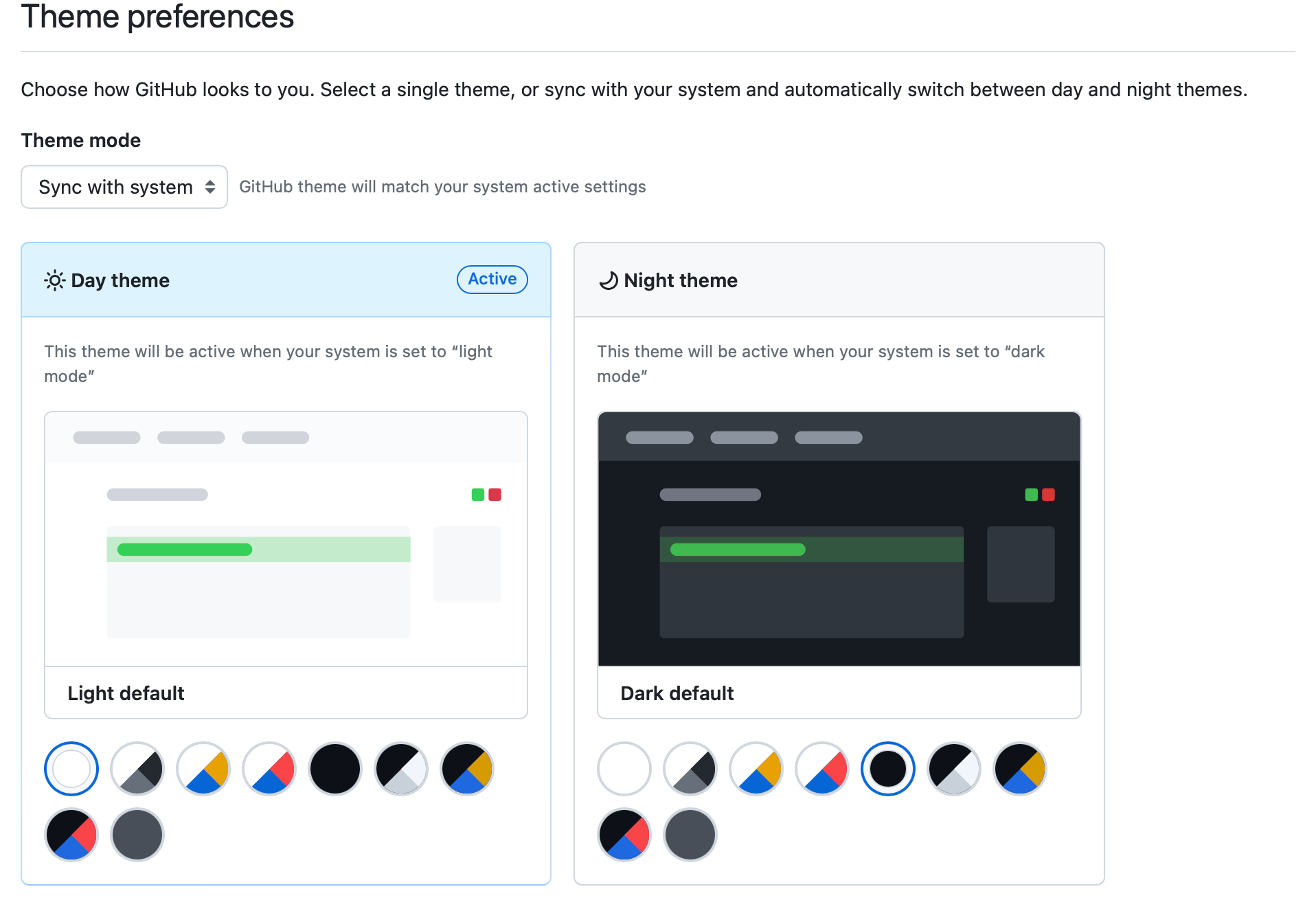
Offering an easy way to toggle between modes is not only considerate but expected. Whether through user settings or system preferences, make sure the transition is smooth and retains the user’s choice across sessions.
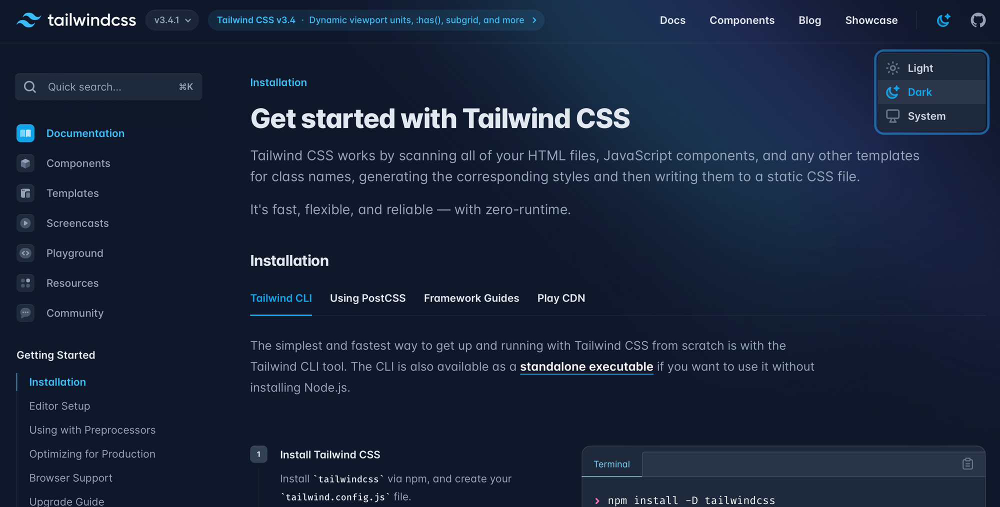
You can use a dropdown or simply a button that changes. Make sure it's accessible by using ARIA labels so everyone can use it.
Feedback is Your Friend
Early and often, turn to your users for feedback. Dark mode might look cool on your end, but it's the real-world application that counts. Use analytics and user insights to tweak and improve.
In the realm of digital design, the introduction of dark mode has been akin to discovering a new continent—a land teeming with possibilities, but also with unseen challenges.
By approaching this feature with a thoughtful, user-centric lens, designers and developers can craft experiences that are not only eye-catching but genuinely beneficial to the end-user.
Dancing in the Dark (Mode) with CSS, JavaScript, and HTML
Ah, the transition into dark mode. It's not unlike learning a new dance 🪩
At first, the steps might seem a bit complex—where do your feet go? Which way do you turn? But with a bit of practice (and perhaps a few stumbles), the rhythm becomes second nature.
When I first tried to code in dark mode it felt like trying to waltz in the dark. Yet, the thrill of finally getting it right was unmatched.
 Robin Rendle
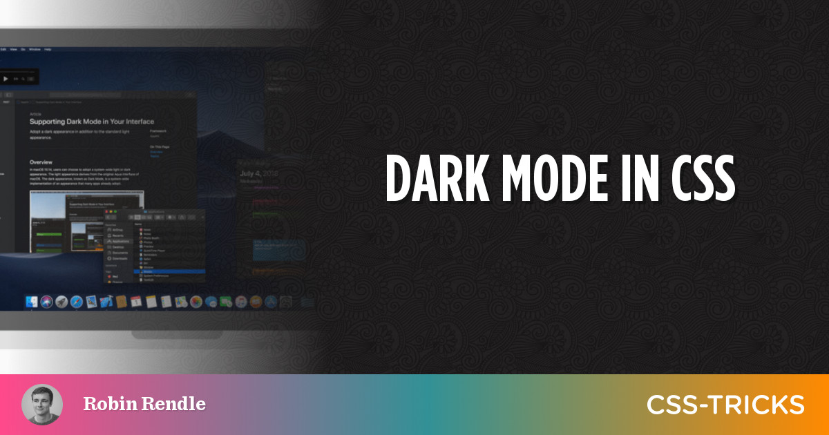
I found this article by CSS Tricks super handy when working out how to implement dark mode. Here's a few top tips I learned:
- Use CSS Custom Properties: Start by defining a color scheme for both light and dark modes using CSS custom properties.
- Media Query Magic: Implement a `prefers-color-scheme` media query. This CSS feature is the DJ, automatically changing the music (or in this case, theme) based on the user's system preference.
- Toggle Function: Create a function that toggles between the light and dark modes on a button click. You can write a function so a special class (e.g. dark-mode) gets added to the body class which can transform the page.
- Saving Preferences: Use local storage to remember the user's choice, so their preference is saved even after the curtain falls and they leave the page.
- Dark Mode Switch: Add a button or popup that lets your users switch between modes. It’s like giving them control over the lighting.
- Semantic HTML: Ensure your HTML is clean and semantic. This doesn't directly relate to dark mode but think of it as keeping the stage tidy for your performers.
Delight Your Night Owls
And there you have it, folks!
Stepping into the world of dark mode is akin to navigating a labyrinth that's as mystifying as it is mesmerizing. We've traversed its shadowy corners together, shining a spotlight on the pivotal steps to ensure your digital domain doesn't just survive but thrives under the moonlit skies of user interfaces.
From the delicate art of palette picking and maintaining the perfect contrast, to the technical tango of toggling modes and ensuring every visual element plays its part perfectly in the dark.
Remember, the goal is not just to darken the background but to create a user experience that feels like a cozy, moonlit stroll rather than a stumble in the shadows. By arming yourself with the insights and tips shared, you're not just coding or designing; you're orchestrating an experience that resonates with users, regardless of their preferred theme.
May your foray into the nocturnal side of UI bring enlightenment (not the blinding kind, obviously) and success.
Keep dancing in the dark, coding comrades, and continue to illuminate the path for others with your digital creations. Whether you're a seasoned night owl or a newcomer to the dark-mode dancefloor, the adventure is just beginning 🌙✨