Why we built Stats 2: Moving from "what happened" to "what to do"
Why we built Stats 2: moving beyond pageviews and graphs to analytics that actually tell you how to improve your knowledge base. No guesswork needed.
We didn't set out to rebuild our entire stats dashboard. Honest 😵
The plan was simple: surface HelpDocs AI usage data so teams could see how their AI assistant was performing. But as we started pulling together those metrics, something bothered us. We were looking at a lot of numbers.
Pageviews, search queries, article rankings. But none of them actually told us what to do about it.
That's when we realized we had a bigger opportunity.
The problem with "just the numbers"
Here's what our old stats looked like: a table showing top articles with view counts, some graphs tracking traffic over time, and various metrics that technically told you what was happening in your knowledge base.
The information was there. But so what?
Take the "top articles" table. You'd see Article A got 1,247 views and Article B got 892 views. Cool. But what does that mean? Is 1,247 good? Should you do something about Article B's lower numbers? Are people actually finding answers, or just clicking around desperately?
The numbers didn't tell you. You had to figure it out yourself, compare things in your head, and make educated guesses about what needed fixing.
We felt this frustration ourselves. When we wanted to improve our own documentation at HelpDocs, we couldn't answer the most basic question: How effective are our docs, and what can we do better?
When AI usage revealed the real opportunity
The catalyst was wanting to track our AI assistant's performance. We'd launched Ask AI and wanted to give teams visibility into how often it was being used.
But as we built that section, Taylor pulled up some other data we'd been collecting. "Take a look at this," they said, showing me a traffic distribution analysis.
It was surprisingly cool.
Instead of just listing pageview counts, it showed the distribution of traffic across our entire knowledge base. Like: your top 10 articles capture 30.2% of traffic, while the other 69.8% is spread across everything else.
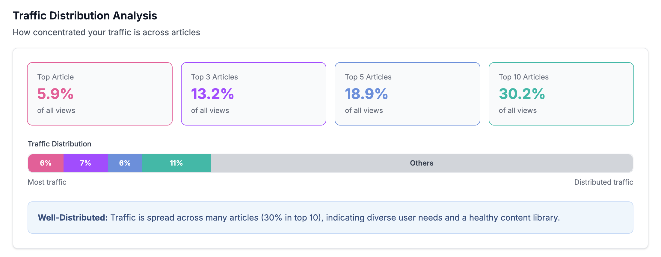
That actually meant something. A well-distributed knowledge base, where traffic spreads across many articles, signals that you're addressing diverse user needs. Heavy concentration in just a few articles might mean people are struggling to find specific answers and falling back on generic docs.
That was the moment.
We realized we weren't just looking at numbers anymore. We were looking at insights that could guide decisions.
From "what" to "so what"
We knew from our existing metrics that people liked scores they could understand quickly. Our Tickets Deflected score and Happiness Score worked well because they immediately told you if something was good or needed attention.
No mental math required, no interpretation needed. We wanted more metrics like that. Ones that answered "so what?" automatically.
So we completely rethought what analytics should do. Stats 2 needed to give you rich insights into your content and, most importantly, how to improve your knowledge base. Not just report what happened, but tell you what matters.

Become an expert in all things Knowledge Base with our monthly newsletter. No spam, just expert content, delivered.
Here's how that philosophy shaped specific features:
- Self-Service Rate became our headline metric. Instead of showing raw session counts, it calculates the percentage of sessions where someone found their answer without using your contact form. It's specifically tuned for knowledge bases, tracking complete user journeys rather than individual pageviews. When you see "78% Self-Service Rate," you immediately know roughly how well your docs are working.
- Traffic Distribution shows whether your knowledge base is healthy or lopsided. The insight we give adjusts based on your actual distribution, telling you if traffic is "Well-Distributed" or "Top-Heavy" with context about what that means for your content strategy.
- Content tab insights go beyond listing articles. We show you what's Stale (content you've manually flagged as needing updates), what's pending review, and what's sitting in drafts. These are actionable lists—not just data points.
The decisions we made (and didn't make)
Building Stats 2 meant making some tough calls.
The AI decision: Everyone's adding AI to everything right now, and we definitely considered using it to generate insights. We could have had AI analyze your content and suggest improvements, write summaries of your stats, or predict what articles might need updates next.
We decided against it. Not because AI isn't useful. We use it thoughtfully in drafting articles, creating metadata, and powering search. But for analytics, calculations and scores do the job better. They're instant, consistent, and transparent. You can see exactly how we arrived at each insight.
Maybe we'll add more AI-powered features later. But for now, we wanted to ship something immediately useful without over-engineering it.
The design challenge: Stats had been a single-page dashboard forever. Breaking it into tabs (Overview, Feedback, Health, Search, and Content) felt like a big change. We went through multiple design variations trying to organize everything logically without overwhelming people.
Eventually we realized that different questions need different views.
When you're asking "how's my knowledge base performing overall?" you need the Overview. When you're asking "what content needs work?" you need the Content tab. Splitting things up actually makes each view simpler and more focused.
What stayed and what went: We kept the stuff that worked like date range filtering, the core metrics people relied on, but rebuilt how they're presented. Instead of just raw numbers in tables, you also get context and comparisons.
What we discovered along the way
Building Stats 2 surfaced some uncomfortable truths about our own knowledge base.
When we first ran the abandoned drafts check in the Content tab, we found 19 articles sitting unfinished for 3+ months. Ouch. 😭 That would have taken forever to discover manually, filtering through draft status, checking dates, compiling a list.
Now it's just there, staring at us, asking to be dealt with.
That's the power of actually surfacing insights rather than making people hunt for them. You can't ignore what's clearly marked as needing attention.

The Traffic Distribution analysis surprised me too. I'd never seen that kind of visualization for knowledge base content before. It's one thing to know your top article gets lots of views. It's another to understand your entire content ecosystem at a glance.
What makes this different
Generic analytics tools show you pageviews, bounce rates, and session duration. Those metrics come from the web analytics world, where the goal is often driving conversions or ad revenue.
Knowledge bases have different goals.
You want people to find answers quickly and leave satisfied, not stay longer (off you pop 👋). You want content distributed across real user needs, not concentrated in a few viral articles. You want to spot gaps and outdated information before they frustrate someone.

That's why we built metrics specifically for knowledge management. Self-Service Rate means something different than a traditional conversion rate. Traffic Distribution tells you something specific about content health. Stale articles matter in ways that "low-performing pages" don't quite capture.
How teams are using it
Stats 2 just launched, but we're already seeing patterns in how people use it.
The Content tab is getting heavy traffic, which makes sense. It's probably the most immediately actionable view. You can see exactly what needs work and prioritize your content updates accordingly.
The Self-Service Rate gives teams a quick health check without diving deep into data. One glance tells you if things are generally working or if something needs attention.
We built Stats 2 because we needed it ourselves. We were tired of looking at numbers that didn't tell us anything useful. We wanted analytics that respected our time and gave us clear next steps.
If you've ever stared at your knowledge base analytics wondering "okay, but what should I actually do about this?", that's exactly the problem Stats 2 solves.