Wow, it’s been a busy few weeks. Our teeny little team’s been beavering away to make the product better than ever, and I’ve got a lot to share with you today.
We’re on a quest to make the best hosted knowledge base product. From integrations to templates, there’s something here for everyone. But we’re only getting started.
Integrations
Drift (and Driftbot 🤖)
It’s no secret that we love Drift. When we switched over to their awesome messaging app a couple months back we just had to integrate.
So we did. Not once, but twice.
You can easily add the Drift messenger to your HelpDocs knowledge base by pasting your Drift JavaScript snippet into your HelpDocs Settings page.
That way your users can start a chat from anywhere on your knowledge base. Plus we’ll configure your Contact button to trigger a new Drift conversation automatically.
If you've connected HelpDocs and Drift, the handy Driftbot will come in to assist your customer with links to any help docs which may be relevant.

Front Plugin
Live messaging’s great, but like most CEOs I still spend a ton of my day in email. That’s where Front comes in.
We manage all our team email with Front’s shared inboxes. That way we can keep each other in the loop on important messages, and loop in colleagues for advice.

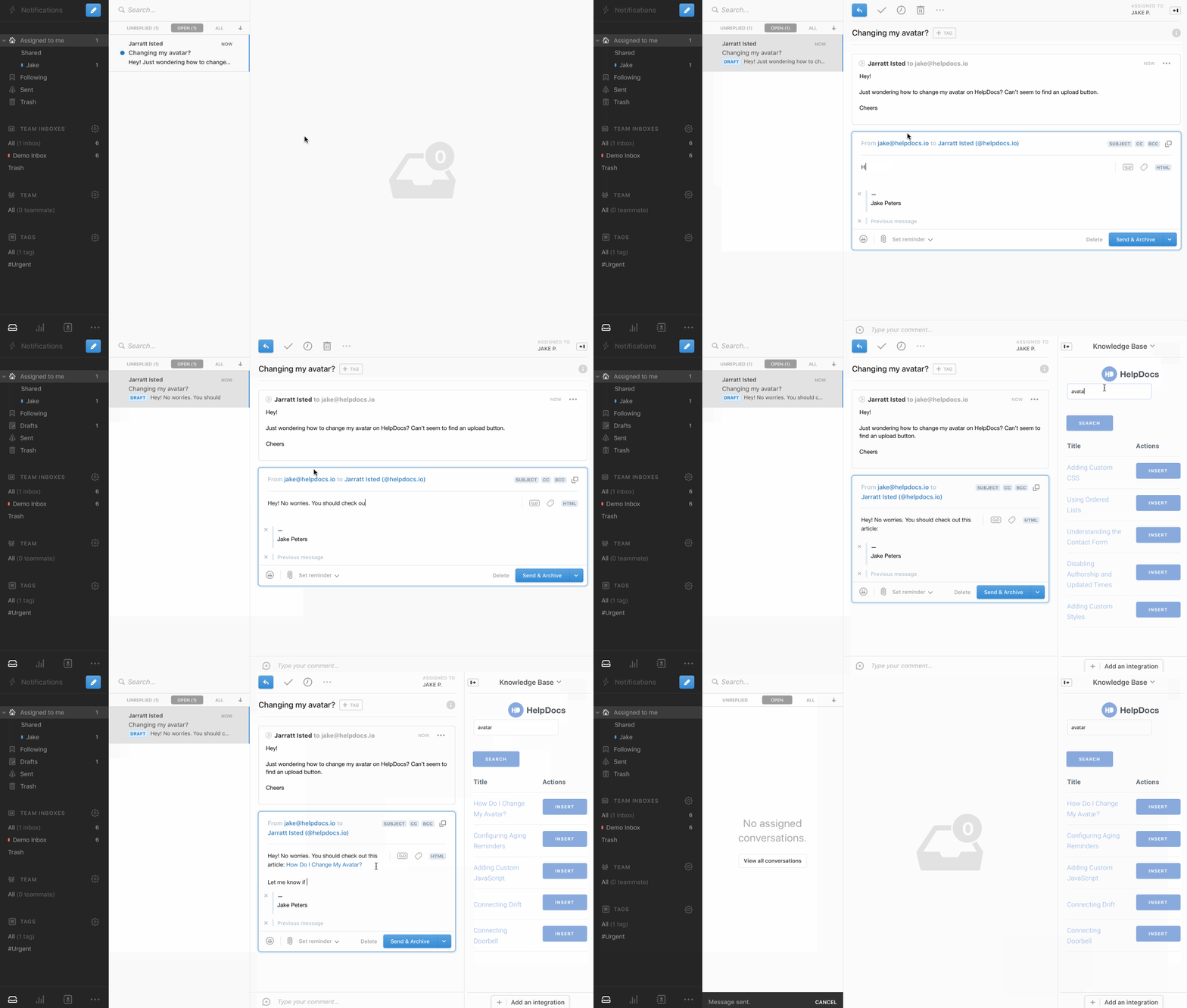
We found ourselves copying and pasting links to our knowledge base articles a lot when replying to support emails. So we built a Front plugin to help us out.
Our Front plugin lets you easily search your HelpDocs knowledge base to find answers for your customers and insert them into your response with a single click.
It’s super simple to set up, and you can be going in seconds.
Google Chrome Extension
But what about when you’re replying to live chats, or tweets, or blog comments?
That’s where our Google Chrome extension comes in.

Now you can search your knowledge base wherever you are, and copy an HTML link (with title) to any knowledge base article. It’s a huge timesaver.
Even better, it’s so simple to set up that your whole team can use it. They don’t even need a HelpDocs account.
You can grab a copy of our Google Chrome extension from the Chrome store.
Knowledge Base Improvements
Layouts
We launched HelpDocs with just two templates. Now we have more than 10 to choose from.
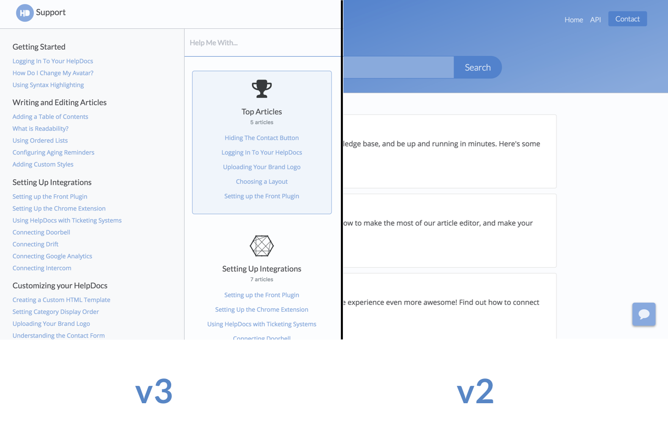
Recently we’ve added two different template styles. We call them v2 and v3.
v2 templates have a beautiful gradient header that’s automatically set with your brand colors. They’re a huge upgrade from the originals, but still familiar.
Our latest v3 templates are more like support hubs. With new features like smart related articles and top articles available, they’re great for your customers.

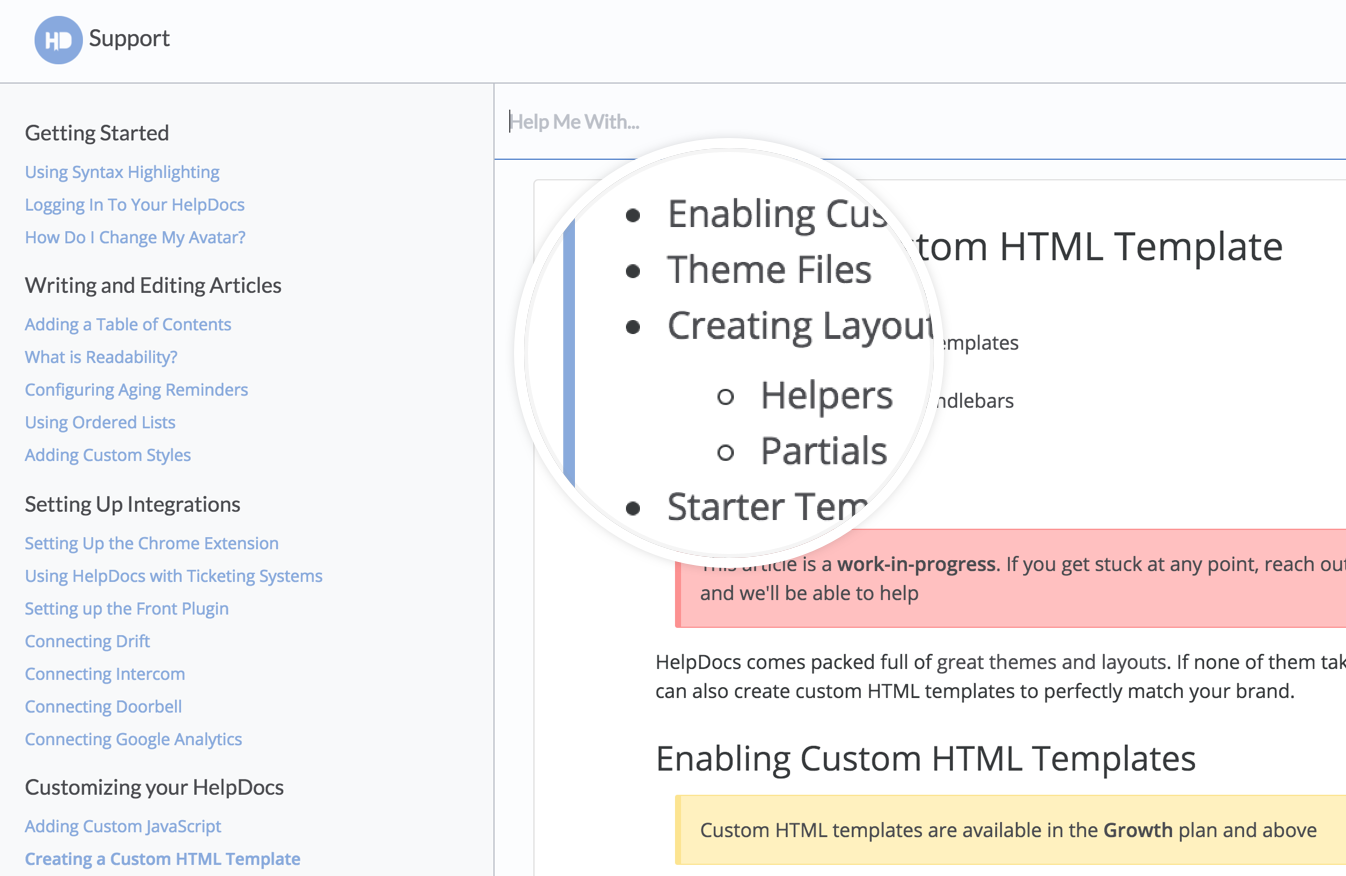
On top of those great stock layouts, we’ve released Custom HTML Templates. You can create your own knowledge base template from scratch using our templating system.
If you can imagine it, you can build it. And it’s now easier than ever to match your knowledge base to your main website or app.
Speed
It’s important that your customers find their answers quickly. But it’s even more important that the information they find is up to date.
That’s why we’ve built a dynamic caching engine. We cache all your pages dynamically. As soon as they’re updated, we clear the cache.
On average, this is boosting page load times by 10-30%. Even more on subsequent loads and refreshes.
Speed’s an area that’s really important to us, and we’re only just getting started here. Expect a ton more improvements in the coming weeks.
Search
One of the reasons we started building our own knowledge bases was to get search that works. It’s all very well having realtime search, but if it doesn’t give you the right results it’s all but useless.
We’ve made numerous improvements to our search algorithm that’ve made the results more reliable, and faster.
Now when your users search your knowledge base you can be sure they’re seeing the results they expect.
Table of Contents
When you write a long guide on how to do something in your product, it can sometimes be tough to navigate.
Adding a table of contents is a great idea, but it’s sometimes tough to manage. You can do it manually (if you have the patience to dig through the HTML), but that’s no fun.
We’ve made adding a table of contents as easy as checking a box.

Next to articles, you’ll now see a Table of Contents checkbox. Checking that automatically adds a table of contents to the top of your article. And it updates whenever you change a title.
Structured Data
Optimizing, well, anything, for search engines and SEO is hard work. It’s technical, it’s weird, but we’ve got your back.
Our smart structured data tool adds semantically correct structured data markup to your knowledge base articles automatically.
It’s like a special description for search engines that makes it easier for them to understand.
Search engines love markup, and you’ll see a natural boost in rankings without changing anything.
Add this to the Open Graph tags we add for you automatically, and you have an impressively optimized site with none of the bother.
Want proactive support on your docs? Good news—we integrate with @Drift! Here's how to set it up in a jiffy. https://t.co/BWfBmkWB8x
— HelpDocs (@HelpDocs) November 21, 2016
There’s nothing to configure, it’s all done in the background for you. Even if you’re using a custom template.
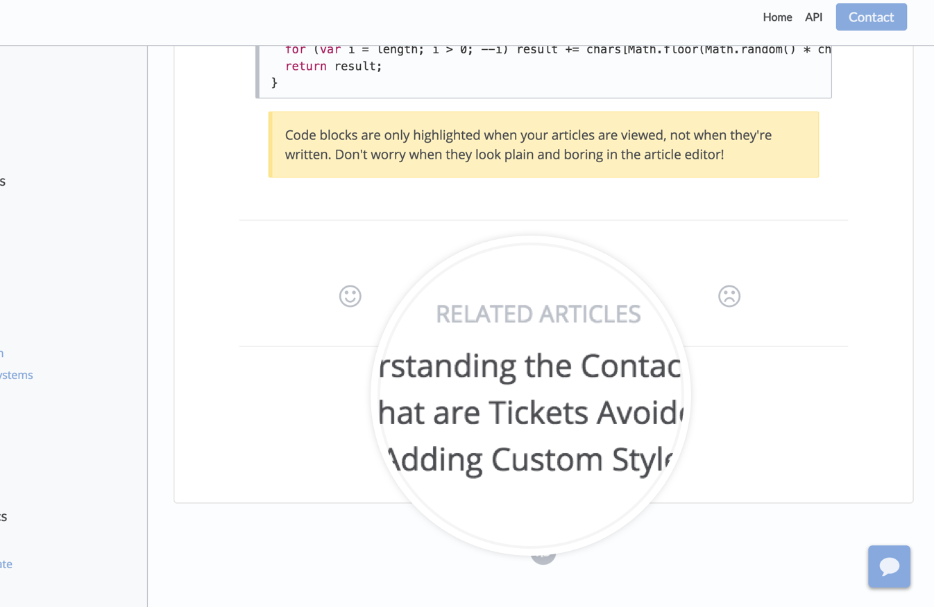
Smart Top and Related Articles
Y’know when you’re reading an article, and it suggests another article for you to read?
Yeah, we did that. But for knowledge bases.
We also show top articles based on recent viewing stats, so your users can quickly find articles that are popular right now.

You’ll find both of these in our v3 knowledge base templates, and they’re available for use in custom HTML templates too.
Dashboard
New Design
As if all those frontend changes weren’t enough, we’ve also made huge strides in the backend.
We’ve redesigned our dashboard to be cleaner and easier to use. Our new design makes creating articles quicker. It makes creating categories easier. It makes managing API keys…tolerable.
We’re still working on some areas, like inviting team members (it’s not my modal, I promise). But in general, our design’s getting there.
Assisted Markdown
Like writing in Markdown? We do too. In fact, I’m literally writing this article in Markdown now.
We thought about adding a Markdown editor. A few times, actually. But every time we came to the conclusion that an HTML editor is better for knowledge bases. Just because you can actually see what you’re gonna publish.
But don’t fear. We’ve made something we call Assisted Markdown. Write in Markdown, and we’ll convert it in real time to HTML.
We’re still ironing our some kinks, and for now we only support header tags and lists, but it’s an area we’re interested in expanding.
The Rest
I’m already over 1000 words, and I’ve still got 10 things left. So I’ll end in a couple sentences.
You can: upload your own favicon; change authors on articles; reorder categories; add icons to describe categories; set more granular permissions for API keys; and configure aging email periods. We’ve also: added annual billing options; redesigned our sublists; designed a whole new onboading experience; and moved our marketing site over to WordPress (and away from our main knowledge base servers).
Phew. That’s all for today. But we have a ton more planned for next month. So stay tuned.
P.S. If you’re looking for a great knowledge base, there’s never been a better time to start your 14 day free trial.
