It’s fair to say October was a busy month. And one focused on making things faster and more efficient.
Probably the biggest thing this month was a big change to the way we serve assets. A change that basically means everything gets a whole lot faster 💪
We also moved the entire marketing site—something I’m immensely happy about, let me tell you! 😅 And shipped a bunch of other things. Also focused on speed and efficiency.
Anyway enough rambling. Let’s get to it 👇 👇 👇
Serving Up the Assets
We’ve been looking for a way to serve static assets faster.
As we grow, we wanna make sure we’re doing everything we can to make the end-user experience as fast as possible.
The switch to a CDN has checked that box for us. And now we serve all our admin app, Front plugin, and Lighthouse static assets from there. We also serve all images from the CDN too. 🖼️
It’s freaking awesome! 🎉
Making the Marketing Website Flow!

What a difference a year makes! 📆
In fact it’s been over a year since we last overhauled the marketing website. And while it’s not an annual thing, with each iteration I feel like we’re opening up and showing a new side to the company.
Or maybe not new. Maybe just…more of us!
The biggest thing to celebrate in this years overhaul which is moving ALL our marketing site over to Webflow! 😍
And when I say ALL, I mean ALL.
The whole nine yards. 🏌️♂️
Why? I hear you ask. 👂 Well it’s pretty simple really.
As we scale our Education and Marketing—yes! I said “marketing—it dawned on us that having a site only the dev team could update might be a little tricky.
In fact it was pretty silly and incredibly time consuming. Let’s face it, the dev team’s time is better spent on areas that directly impact the product.
So we moved it to Webflow so the Education team can update it. And now the lives of the education team and the dev team are much easier. 🦄 ✨
Yay! 🎉
Bringing Product Updates in-app
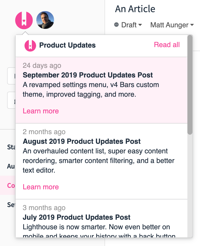
Another tweak to the HelpDocs dashboard was to take a step forward with making our product updates more visible and accessible by bringing them into the software 🙌
Historically, we’ve kept these updates hidden away on the blog. Not to actually hide them. Just because we didn't really know where else to put them! 😬
And although we share them all around, we kinda relied on people going out of their way to find out what’s changed.
That wasn't very proactive of us.
So we decided to make everything more visible.

Now, if you click the HelpDocs logo in the top left of your dashboard, you’ll get a dropdown of all our product updates posts. Click it, and you’ll get to see our latest month of updates.
Neat right?! 🙃
Smaller but no less important
A Tiny Bundle of Lighthouse Goodness. To further compliment our commitment to making things faster and better we decided to take a look at Lighthouse. Specifically, we made the Lighthouse JavaScript bundle a bunch smaller meaning it’s suuuuuuuper quick. Unlike reading suuuuuuuper!
See Who’s at the Door. It’s no secret Doorbell is one of my favourite HelpDocs integrations. It’s so darned useful! And we made it even more useful by passing user emails to Doorbell when they leave feedback. 👤
More Visibly Permissionable. It’s important to know who can see what. Particularly when you’re using permissioning to restrict article access. We decided to make some tweaks that make permissioning more globally visible. So you don’t have to jump through hoops just to find out who has access! 🔒
We Had to do Something Halloweeny!. Any avid Ghost users out there will probably have noticed they’ve shipped Ghost 3.0. We’ve actually been running 1.0 to power our blog for a while. So we figured it was time to make the leap. After all it’s pretty neat! Great job Ghost team 👻
➕1️⃣ For Data. We upgraded our analytics to make your life faster. I mean not your whole life. Stats and Audit Trail should be faster now. So like a very small part of your life. Which is slightly bigger if you’re on the Growth plan. 🤷♂️
HOLD IT ✋ That’s too big!. Imagine you try to upload a huge image, wait ages, and nothing happens. It’d be frustrating right? Yeah we thought so too! So we decided to start telling you when your images are too large to upload 👍 Happy to help!
Multilingually Slacking. Our Slack integration didn’t work properly with multilingual accounts. It was a little frustrating if you wanted it to, well, work properly with multilingual accounts! 😬
FOCUS 🧘♂️. We made a tiny tweak to the way you add links in the text editor. It’s a really tiny tweak. Like…mouse-sized. Basically when you click the link button we’ll autofocus on the link field.
…
Like I said, it’s tiny! 🐭
Fixes & Improvements
Great Search, Better Results. Some users found an issue where search results in the dashboard weren’t displaying properly. Naturally that wasn’t good enough so we fixed it.
Setting a High Bar in Firefox. Search results in our new V4 bars template were showing full height in Firefox. They shouldn’t have done that. Bad fox! 🦊
Confusing Edits. Images that had size and alignment edits in the text editor weren’t translating to the frontend of some templates. Don’t worry, we fixed it. And by we I mean someone who itsn’t me and who could actually fix it! 😁
Hold Back the Headings. In one of our templates longer Table of Contents header text was trying to escape into the main article. It looked super gross. So the product team wrapped up the text in a cuddly blanket to make sure it felt safe and secure.
Recaging the Callouts. ToC headers weren’t the only things trying to escape. We had reports of callouts in tables extending beyond their cells too. Don’t worry. We locked them down! 👮♂️
Sharing Multilingually. We made sharing multilingual articles easier by adding the language code to the share URL. It’s simple when you think about it!
Scale like you mean it. Wistia videos embedding in articles weren’t scaling in Lighthouse. It looked pretty disgusting to be honest. So we made them look less disgusting. By making them scale. 🤷♂️
The Tale of the Scrolling Text Editor. There was a tiny issue where the editor page was scrolling on some screens. It was super niche so you might not have seen it. If you noticed it, it should be fixed 😉
The Hyphen Trail. You should be able to type hyphens while you're editing. You couldn’t type a hyphen at the end of a slug. That made it weird for users. Now it’s less weird 👍
Correctly Showing Permissions. Permissions weren’t showing up correctly in the content filter. So we decided to fix it. I know! Crazy right?!
Draft > Published > Draft? We found a bug—fine a customer found a bug—where drafts were showing as published inside the content dashboard. That made things super awkward. And a little confusing. So we just kinda made it less confusing and awkward. ‘Cause that’s what we do 🦄 ✨
