It seems like customer onboarding is a never ending rabbit hole of options. It's difficult to tell what's working and what's not.
There are so many things to tweak, the job's never over.
Add a small copy change to your signup form and you might see conversation rates get boosted by half a percent.
Change it again and it might drop, but is it because of the season, the images, the way the customer was feeling? It's pretty much a guessing game.
What about adding a ton of tooltips to guide to user through a setup? Well, either it'll annoy the user no end and they'll leave or you'll have yourself a nice 1% increase in conversion.
You've got a few golden minutes to make an impression
One of the most challenging parts of getting a product right is deciding what to do right after a user signs up. It's an important step because they've put in effort to fill out your form and have some sort of dedication to making it work.
Here's where it gets a little tricky, though. In the few short minutes you have to make an impression in your onboarding, there's multiple things you need to do:
- Guide them through setting up an account the way they might like it
- Teach them how to navigate your product (you can teach them specifics using a knowledge base).
- Get them invested in using your software, whether that's entering a card right away, connecting up to your API, or in our case, getting started with creating categories and articles.
You can probably tell, it's no easy feat in the time limit of a user's attention.
If you can get it right you'll have a customer champion for life. They'll recommend, return, and shout about your product from the rooftops.
Get it wrong and you'll have a confused, maybe even irritated, user who takes up customer support time, costs you money, and doesn't convert.
Wasteland vs. a Sea of Help
Your product should (in an ideal world) be able to explain itself without the need for a complicated setup.
In reality, though, each product is different and has varying levels of difficulty for the user to overcome. What will work for a simple spellchecker won't work for a complex system for setting up a distributed network.
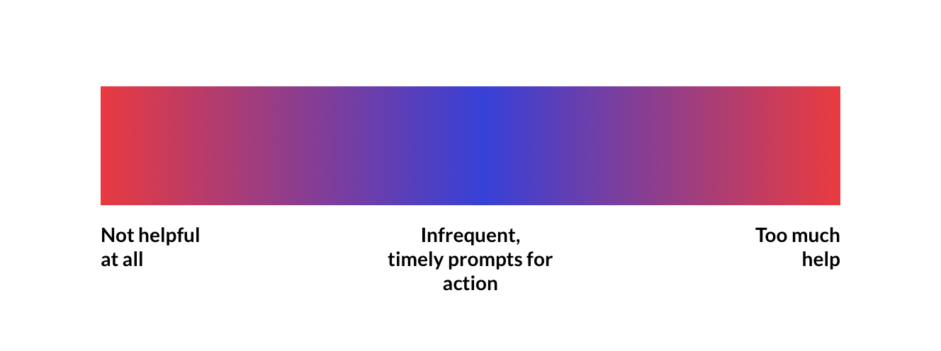
One thing I've noticed is a trend between having no help at all and having far too much. There seems to be a lack of middle ground for a lot of companies and their onboarding strategies.
The other day I tried out a simple document sharing product.
The problem was the product itself was easy enough to work out and I didn't need much getting set up. But before I knew it, I was bombarded with tooltips and was forced to click one after another. 😩
It took a good few minutes to click through all of them (yes, I didn't read them and I'm an awful user) and after that fiasco I left.
So it turns out you can actually be far too helpful. Maybe a user simply wants to get on with it and work it out for themselves.
You'll need to work out whether you're being over helpful. A tool like Fullstory or Ferpection can help you by providing analytics, but you'll also need to go through the process yourself and think critically.
A lesson in being overhelpful
We got it wrong earlier this year with an email sequence that didn't work at all. I wrote about it but soon after found that many users weren't opening the emails.
It might be that an email sequence like the one I explained only works for a certain type of product, but after getting a disastrous open and click rate I realised it just wasn't working.
Here's my theory: email sequences don't work with action-based tasks.
The trouble with email is that it's often opened in between tasks. You don't open your email to complete tasks for the product you signed up for a few days or even a week ago.
Email is primarily for conversation. This is why we switched from 7 educational emails to 2 conversation-based emails. Here's what we have right now:
Email number 1: Welcoming our awesome new user and offering to help in any way we can. We also ask how the user how they found us which is super helpful in focusing our marketing efforts.
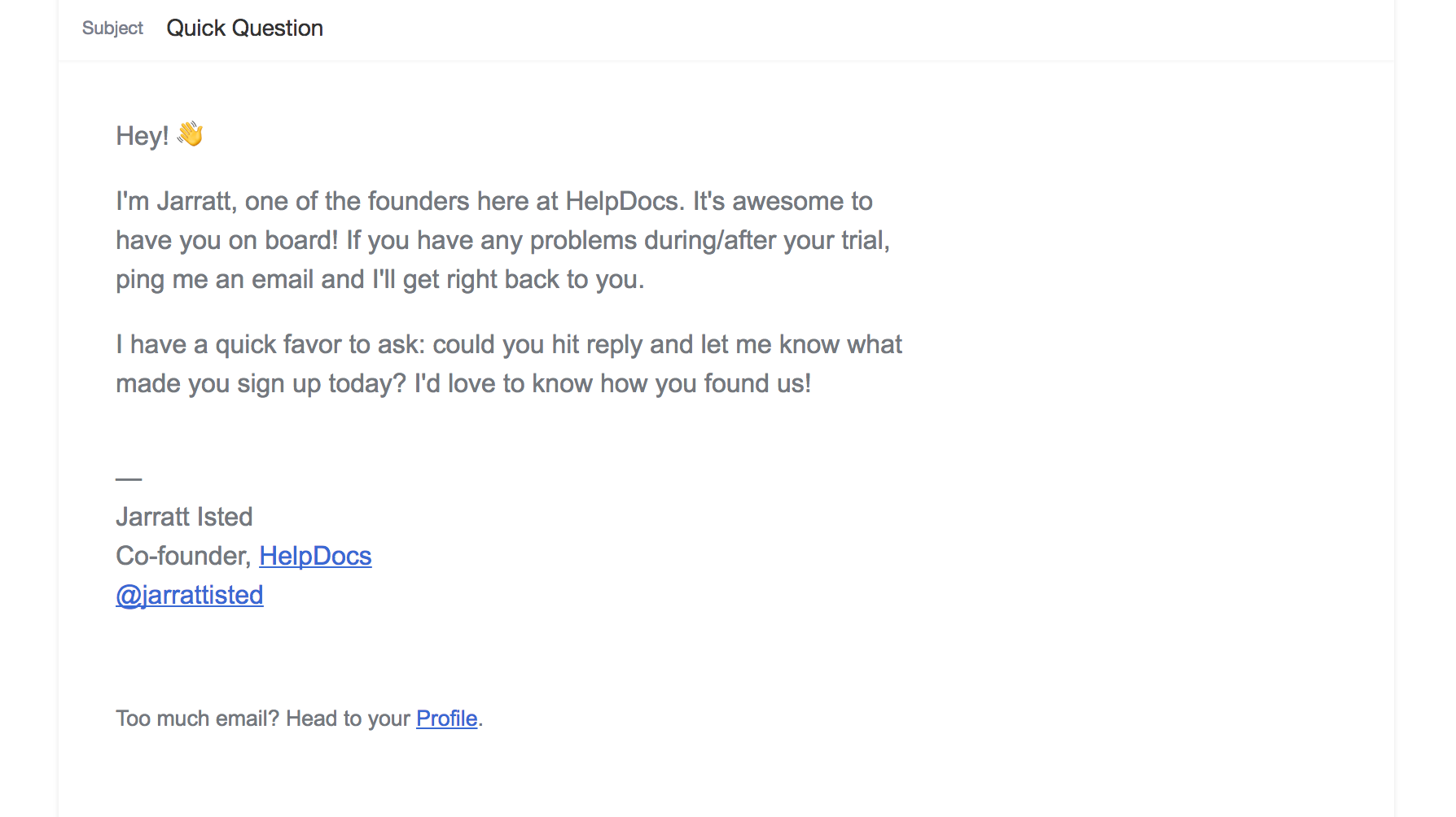
We get a surprising reply rate on these, which shows being a little proactive can extinguish user concerns and help you reach more by better managing marketing resources.
Email number 2: This is straight to the point, no messing around. It's simple: your trials almost over and here's how you pay.
You might think it's a little short and you'd be correct. It totally is. But sometimes the best way to get someones attention in their inbox is by making it readable.
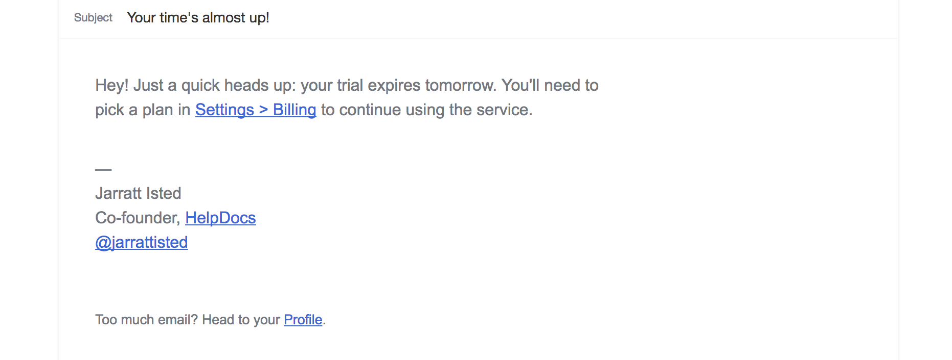
We've seen a big increase since sending these out. Turns out just letting your users know when it's time to pay helps dramatically. Seems obvious, right?
The biggest takeaway is not to email users too often and only when they've recently signed up or they must do something in their account.
If you send helpful education emails, you're kinda training them to ignore your emails and they'll likely miss important notifications in the future.
I'm sure we have some tweaking to do ourselves, but for us it seems less is more.
Use placeholders to prompt action
Like I said earlier, email isn't a good time to suggest users take action inside your product.
The best time? It's when they're in your product. By using some smart techniques you can hide prompts until they're actually useful.
We've always had placeholder images and text in HelpDocs and we've never had anyone ask how to create a category or article. It's a great sign considering it's the first thing users need to work out to get started with a knowledge base.
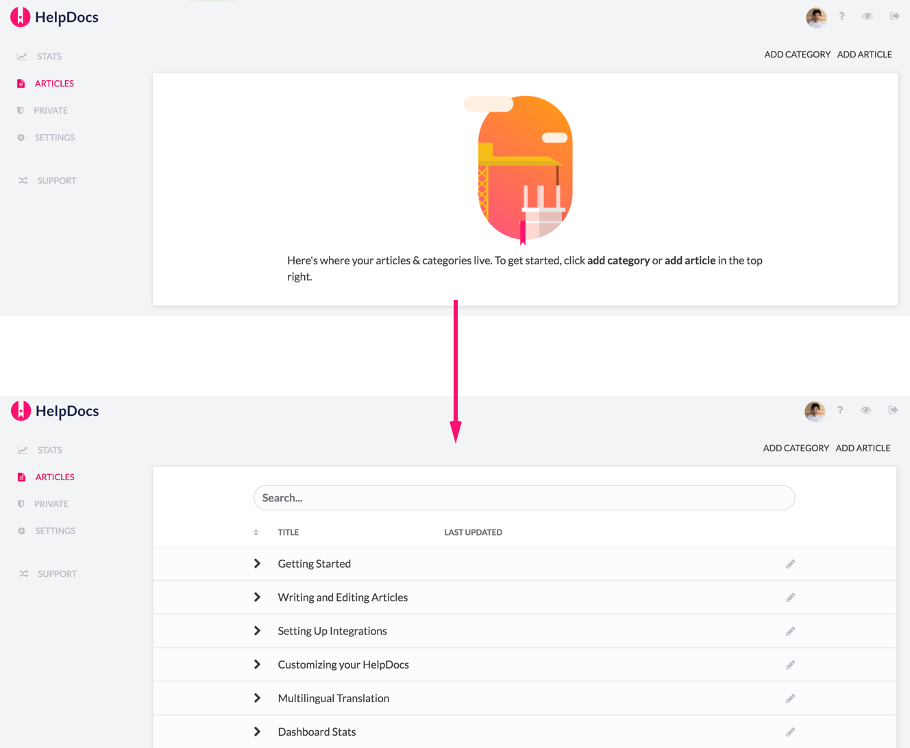
In the example above, we only show the placeholder when a user has no categories or articles. This way, we can prompt the user to get started without getting in the way.
Once a category or article is created it'll load a table on top of the placeholder.
Using placeholder images and text is an easy way to encourage action without getting in the way, something tooltips and popups tend to do.
Using steps to onboard customers
A few months ago I decided I'd write my will. Yes, those things you're meant to fill out when you're old and decrepit. I found out about a startup called Farewill who made it easy and painless.
What really impressed me was the onboarding.
Instead of forcing the user to fill out everything immediately, they encouraged you to add detail gradually and sent helpful email reminders over the course of a few months.
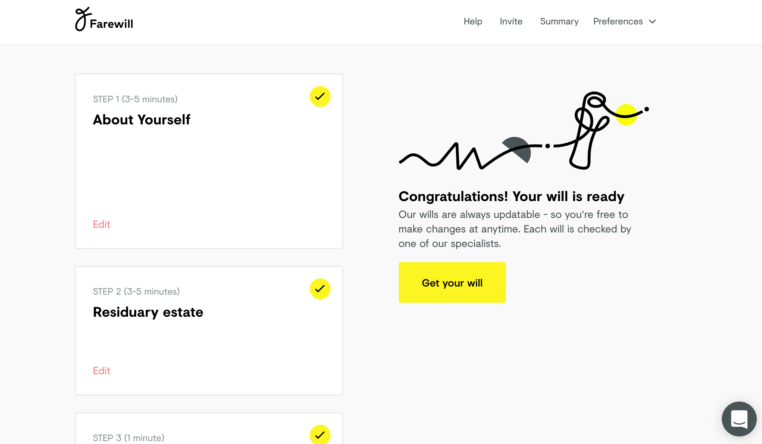
This shows how knowing your market is super useful. Making a will is a slow process, and by breaking it down into simple steps like above, they make it easy to understand and less stressful.
Had they bugged me with emails over a week or given me one long list of things to fill in and I'd feel stressed out.
If you require a large amount of information from the customer or it's just a slow onboarding, it might be worth breaking down the process into chunks and reminding them to finish.
Time to get out the way?
We've all downloaded or signed up for an app and rage clicked to get out the onboarding. You might be scaring off your users before they even start by feeding them too much information at once.
By calming down our onboarding process we managed to increase engagement and conversation from trial to paid. Maybe it's time to get rid of prompts instead of adding more.
I'd love to know your thoughts on onboarding and where you think the line is between being no help at all and being too helpful. Lemme know in the comments!