The crisp Autumn air is definitely setting in now. Heading to the gym in the early morning, I’ve already had to crack out the de-icer to defrost the windscreen, so that can only mean one thing…it must be time for another product updates post!
Over the past couple of months, the engineers have been hard at work on some awesome new things. Not only do we have a shiny new marketing website—something I think they did to keep me sweet—but we have fixes and features galore.
Offline Docs with PDF Downloads
First up is a feature we hadn’t thought much about until a few requests came in a couple of months ago.
Feature Focus: Download PDFs from Matt Aunger on Vimeo.
To be honest, we didn’t see offline documentation as a massive priority. Most of our customers’ customers favorite features—Search, Multilingual, Lighthouse etc.—are online tools. So offline felt a little odd…until we stopped to think about it.
The beauty of downloading your articles as PDFs is you’re no longer reliant on a WiFi signal, or even a computer itself. You can share physical copies—formatted in a beautiful and readable way—in boardroom meetings, training sessions, or shipped as digital assets on an unconnected device.
Your knowledge base is your user manual, and now you can take it anywhere!
Click here to go to the article on how to get started with our Download to PDF feature.
Magic! 🧙♂️
Lucidchart integration
Lucidchart is a cloud-based diagramming tool that is super simple to use for you and your team. You can create flowcharts, complex technical diagrams, and collaborate on them with your team, without the steep learning curve of other diagramming software.
HelpDocs LucidChart Integration from Jarratt Isted on Vimeo.
It’s pretty awesome! 🙌 And it works super well when it comes to creating diagrams for knowledge bases.
We noticed some of our customers using Lucidchart diagrams in their articles, and we were certain we could improve the experience from them.
So we did! And we’ve given it to everyone!
We’ve made it super easy to connect with Lucidchart, insert diagrams, and even get to the right editing section of Lucidchart’s dashboard. Click here to head to the article to get started.
CSV Imports
We already support automatic migrations from Helpjuice, Zendesk Guide, Intercom Articles and Help Scout Docs, but are always on the lookout for ways to make it easier to migrate existing content from other services.

CSV imports have been on the back burner for a while. Many services offer the ability to grab content as a CSV dump, so we know being able to import that will make removing a lot of friction.
It’s super easy to do, too!
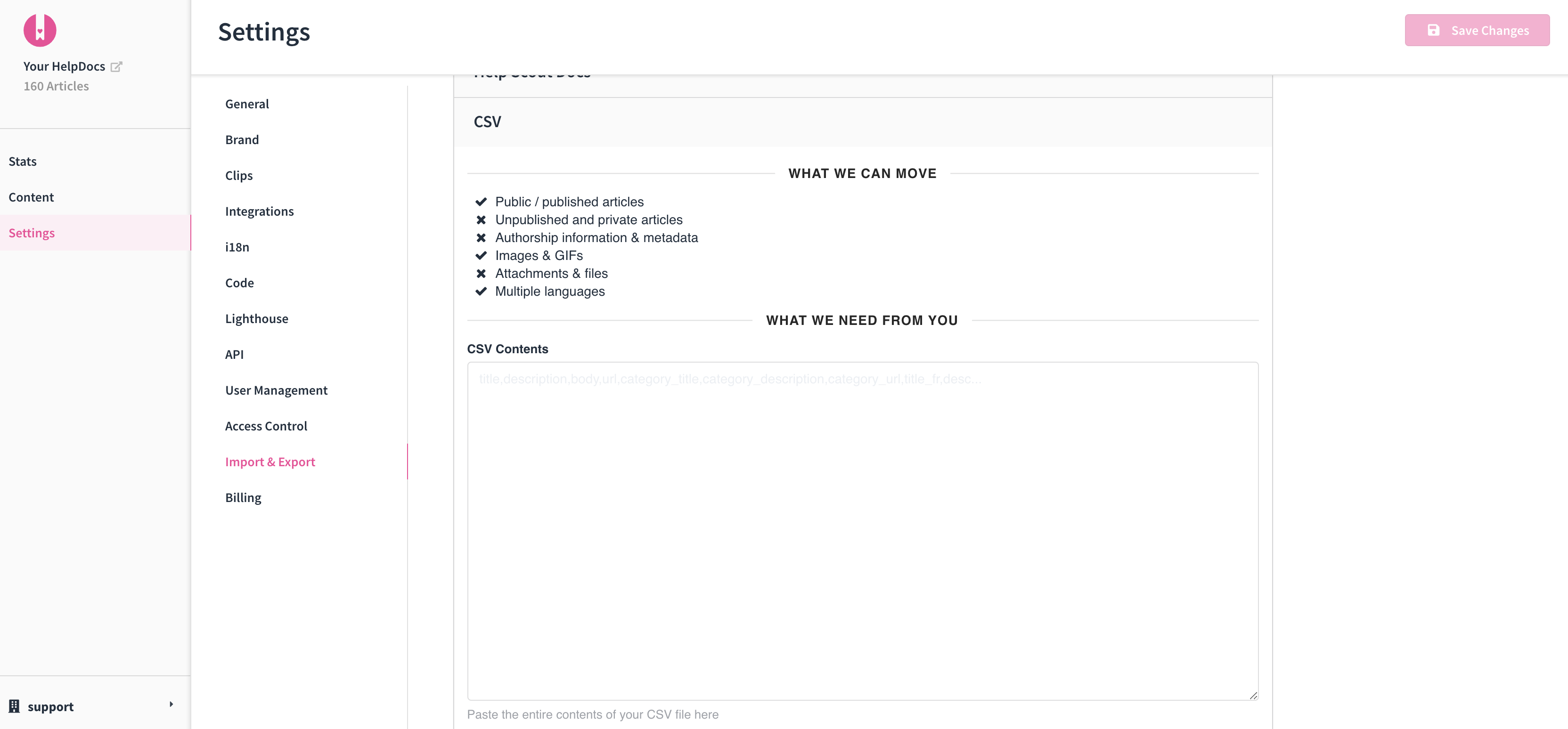
If you have a CSV file, open it in a text editor and copy the contents. Then head to Settings > Import & Export and paste the whole thing into the ** CSV Contents** box.
Make sure you read the warnings and then click I’ve read the warnings, migrate my account.
Export to CSV and Zip
On a related note, we've also added buttons so you can export your knowledge base to CSV, or to a big ol' .zip file.
You can find them alongside the previously mentioned Download PDF button, just below the Import section of Import & Export.
OpenGraph fallback image
If you’ve ever shared articles or links online, you’ll have no doubt succumbed to the frustrating effect of OpenGraph, adding random images. We’ve all seen—and probably shared—links where the image is a mugshot of the author of the article.

It’s because OpenGraph finds the first image attached to a link and assumes that is a fair representation of the content within the link. In the event there’s no custom image, you end up some random image—usually a grinning author—forever embedded in your social feed like a dodgy tattoo. 🤷
We’ve always hated that, and our solution was to use the company logo you uploaded when you first opened your HelpDocs account as a fallback image.
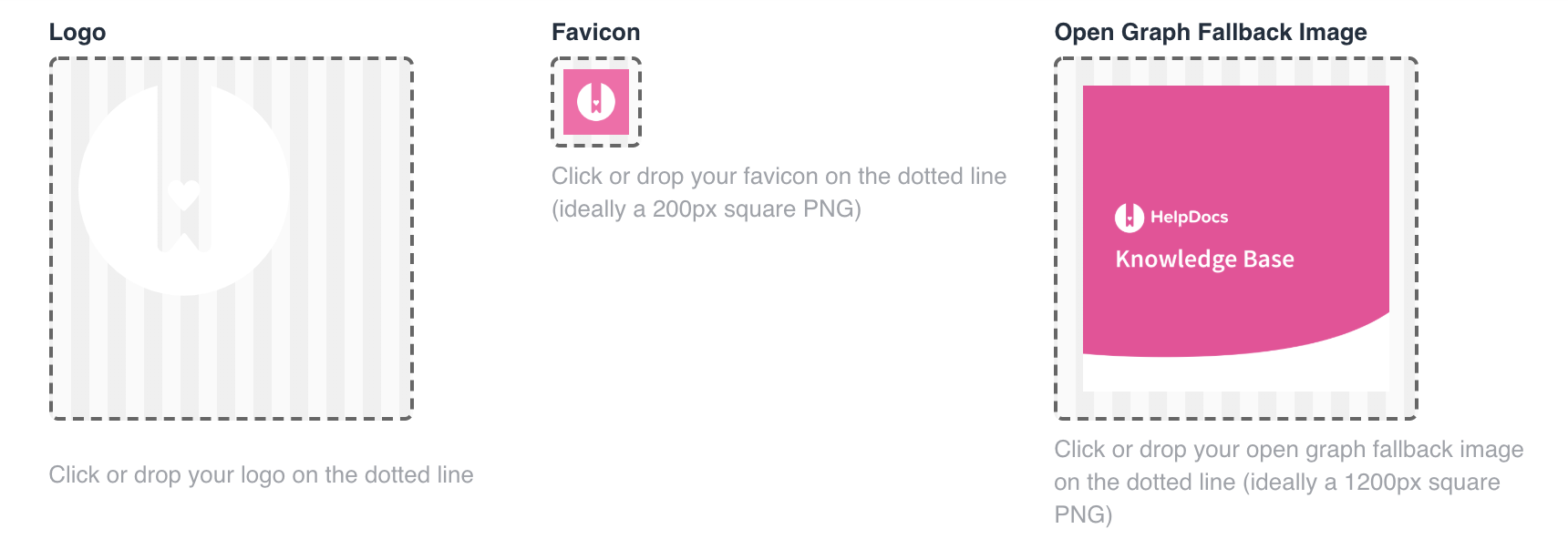
Now, we want to give you the power to choose, so you can override the fallback image with whatever you want.
All you need to do is head to Settings > Brand, and under Open Graph Fallback Image click or drag in an image. 👍
A few tips:
- Keep your image 1200px by 1200px
- Use .png
- Try to keep any important text well contained in the middle of the image (to avoid it being cropped out)
Feedier integration
The team at Feedier got in touch to let us know about their awesome integration.
With this integration, you can add a Feedier carrier to your knowledge base and get feedback from your visitors using engaging, fun surveys with tons of options baked in like offering rewards or connecting up mailing lists.
To get started, head to the Feedier dashboard (or click here). From there, select one of your Carriers and click Share. Select to share either the Engager widget or the Score widget, and copy all the code given to you.
Head back to HelpDocs, to Settings > Integrations and select Feedier. From there, just paste in your code and click Save. And that’s all there is!
A Brand New Marketing site
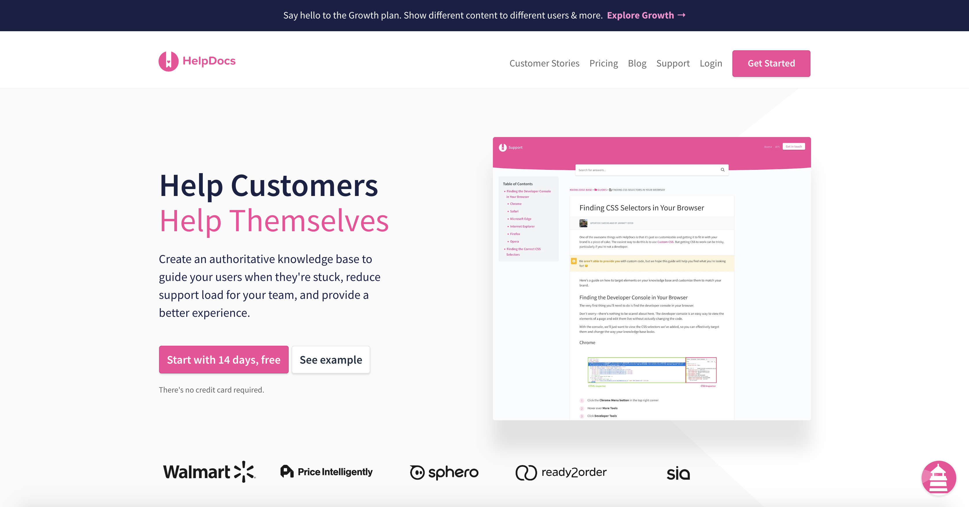
The eagle eyed among you might have noticed this already, but we’ve undergone a serious overhaul of our marketing website.

This includes making things like monthly/yearly billing more clear on pricing plans, more clarity on what’s included in each plan, and providing more detail about how HelpDocs actually works.

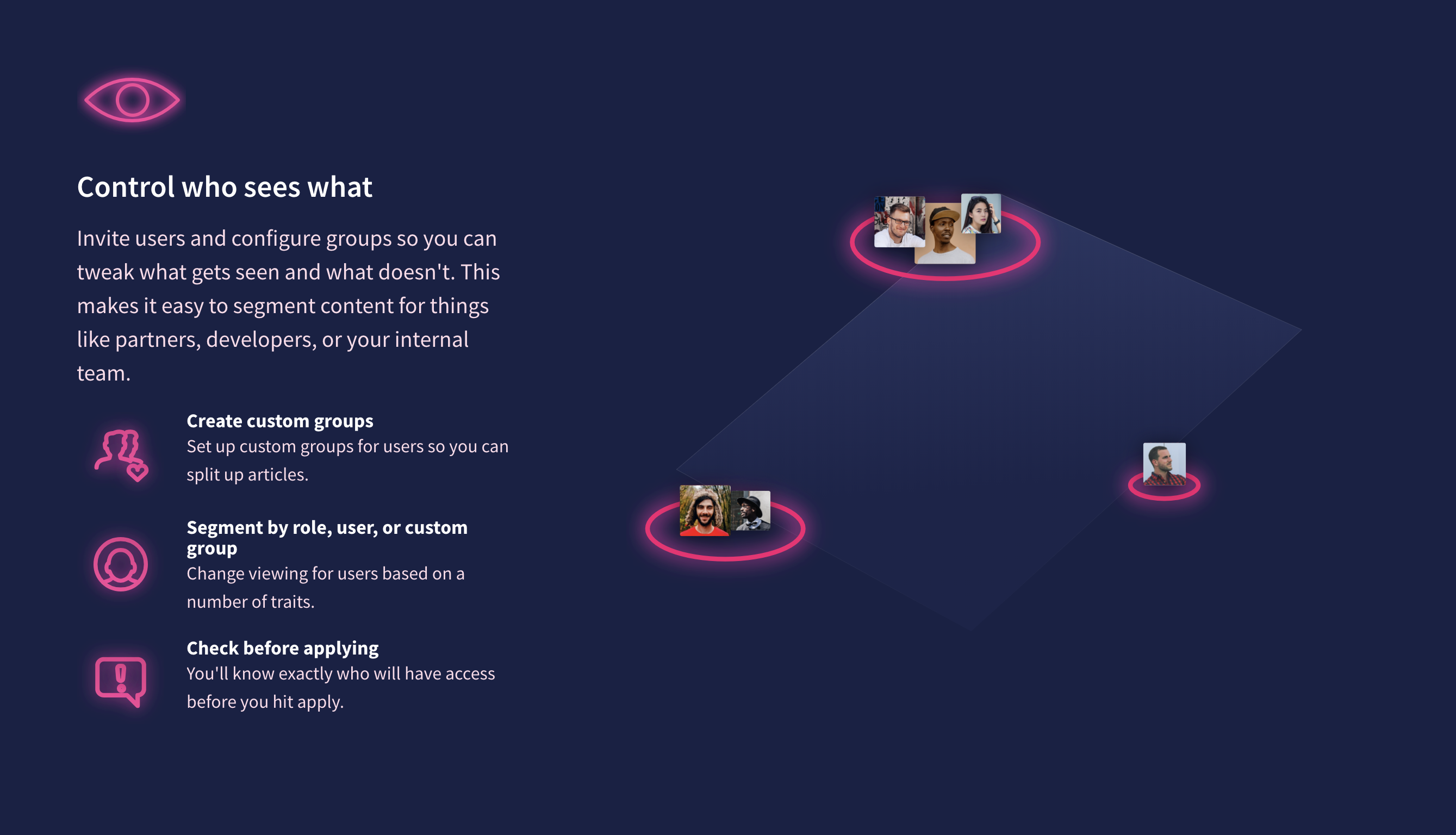
Alongside this, we’ve gone ahead and providing a separate page to go a little more in-depth into our Growth plan features, which provide the most powerful enterprise knowledge base software ever conceived by a sentient being—too much? I might be over-egging it a tad 😄.
Jarratt worked tirelessly on shipping this stunning update, and I think we can all agree they've done a fantastic job. 👏
New Things
As usual, we’ve shipped a bunch of smaller additions to the HelpDocs software over the past couple of months, from user activity indicators to a couple of new self-management functions.
-
See when users are online (and if not, when they were last active). Want to see the last time your team were actually online? A surprising number of our users did. So we built a simple indicator—which was anything but simple to get right. We spent a bunch of time thinking about what constitutes an “active” user, all to bring you a little green dot and a time indicator! I know, we spoil you.
-
Transfer ownership of your account to another user. So you've been promoted—Congrats 🎉🍾—and now you're tasked with transfering ownership of your hard-built knowledge base to someone else. Well, because we know you don't really want to have to submit a support ticket and wait around, we’ve added the ability for the owner to do it themselves. You are most welcome! 😄
-
Contact form submissions now include the language code in the email subject. When you get a contact email, the more information you have the better. Now, when you get an email from the contact form we include what language code of the article the customer was viewing, inside the subject line. 😎
-
Previews refresh in the same tab each time. So, we've realised all click Preview > Open New Tab behaviour is, well, incredibly irritating. Opening a new tab after every change to an article is a good way to a messy and confusing browser. Instead, we figure we'd make it simple, so now clicking Preview simply refreshes the tab that already has your preview in it.
-
Download PDF invoices. Keeping your finance teams happy can be difficult at times. Keeping track of invoices and receipts on top of everything else...I mean, who even has time for that? Thanks to our Articles to PDF feature, it made sense to repurpose the underlying tech and make it easier to keep the numbers people happy, and allow downloadable PDF invoices. It’s a small thing, but will make it super easy to get your accountants off your back. 😬
Improvements & Updates
- Scream if you wanna go faster 🎢. Fetching, loading, and writing articles in the dashboard is even faster. Who likes waiting, anyway?
- Focus, young Padawan. Link to other articles in a jiffy. We now focus on the search bar right away so you can find other articles to link to without clicking.
- Give your mouse a break. Editing the article title takes half as many clicks (that's 1 instead of 2). There's no need to click done anymore.
- Abandon migration. Migrations don't always go smoothly, so in the case you've been waiting far too long, you can now click abort.
- Size me up. Images now get a cute little label next to them inside the text editor. It'll tell you how high and wide it'll appear.
- A little something for your accountants. As much as we all hate accounting, it's a necessary evil. We've made it a little less evil by redesigning our invoices so they're prettier and faster. If you're tech savvy, it might excite you to learn we made it entirely in CSS grid.
- Through the Front glass. Everyone in your Front team can now view full articles inside the plugin.
- Frame by frame. The text editor now supports Vimeo embeds, so come forth pixels.
- Mejor integracion. Support lots of languages? We now display them better in the Intercom Messenger integration.
Fixes
-
Pasted code getting separated into multiple code blocks. There was an issue using the pre-formatted code blocks, where pasting would result in multiple blocks instead of just one. This wasn’t ideal, so we fixed it!
-
Better support for longer articles. While we recommend articles are short and concise, sometimes there's no getting around it. The trouble is, this can have a massive impact on load times and the customer experience. So, on those occasions where you want to have thousand-word articles, we've made it a lot easier to work with. We've improved performance on larger articles, and just made things work.
-
Unable to invite a user who already exists on account. It is no longer possible to invite a user who is already invited to your HelpDocs account.
