How to Strive for a More Accessible Knowledge Base
Knowledge Bases are jam-packed full of useful information—but can everyone digest it? Dive into how and why to make your Knowledge Base a more accessible destination for customers.

Accessibility is a fundamental part of the web but can seem like an impossible task.
Over the years, the web has grown from a few GeoCities sites to billions of interlinked pages. As the web grew, so did the technology.
As people rapidly adopted new technology, more and more developers were able to participate in building for the web—whether it was professionally or as a hobby.
Many of the tedious and repetitive development tasks were automatically taken care of, and some accessibility features were built-in. Unfortunately, not all, though.
Accessibility is not a priority for some folks on the internet. As the technology grew, ignoring accessibility as part of the design was more commonplace. Ignoring accessibility meant people with disabilities couldn't correctly access content on the web—despite the fact there's already a framework in place.

While we still have a long way to make the web accessible, it has become better recently. For example, you've probably noticed things like YouTube automatic captions which aren't always 100% accurate but allow creators to add closed captioning to their videos with zero effort.
Developers, marketers, technical writers, and customer happiness team members alike should be putting accessibility at the forefront of their work rather than making it an afterthought.
We think Knowledge Base accessibility is not only a fantastic way to serve all users but a priority if you want search engines to give you love.
Here are some tips to make sure all users can get self-serve help.
What Does Accessibility on the Web Mean?
It's all well and good to say things should be accessible on the web—but what does web accessibility mean? It means making your webpage easy to use for many users.
It includes making sure the page loads quickly for users without a stable internet connection. Or about making sure the visually impaired can use a screen reader to understand the page they're browsing.
Many users might struggle to use a webpage for a variety of reasons. By making your webpage (or in this case Knowledge Base) semantic—which is a fancy way of saying well structured—you can give most users a great experience.
Ensuring Your Knowledge Base Template is Accessible
If you're using a hosted solution for your Knowledge Base with a pre-built template, it should already be accessible. However, if you're going all in and building your own Knowledge Base, you'll want to make sure you're considering the different HTML elements available.
At HelpDocs, when we build a new template we strive to meet accessibility standards so our customers don't need to worry about going under the hood to meet criteria for their users.
An Accessible Structure
What is it about a Knowledge Base that needs to be accessible? It's mainly about the HTML elements used and how they're labeled.
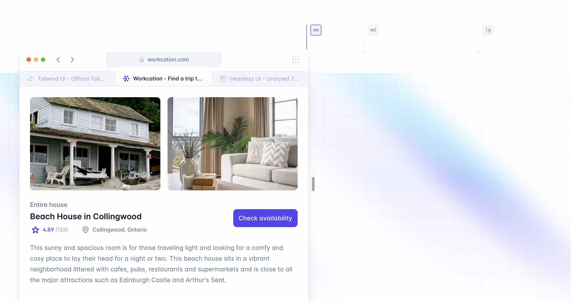
Let's look at an example. If you're building a Knowledge Base from scratch, you'll want a search field. If you're unfamiliar with HTML you might not know that search fields usually use an input element. By default it looks like this:
Not the best looking right? Under the hood, it isn't either. If a screen reader looked at this it'd mention it was a text field you could type in but not what it was for. Now by adding a simple label (an aria-label) the screen reader can tell the user what the text field is for:
<input aria-label="Search for answers..." placeholder="Search for answers">
It's elements like these being properly labeled that can make an accessible Knowledge Base. There's a load of other elements I could dive into but you get the gist.
If elements aren't properly thought about, they can affect users and the SEO of your entire self-serve solution—a place many of your users will end up when they need you most.
Quickly Load Images
Earlier I also mentioned it accessibility includes making sure the content is available for users with slow internet speeds. For a Knowledge Base template to be quick and easy to load you'll want to make sure you're cutting down on large images.
These could range from big backgrounds to small icons. When it comes to loading a Knowledge Base quickly everything counts.
You can do this either by reducing the size of the files using a compressor like ImageOptim or using a different format altogether. JPG files tend to be the smallest or you can use an SVG (Scalable Vector Graphic) that renders from XML instead.
You could also consider a format called WebP introduced by Google that reduces the size of images even more. I'm not able to see the differences in the quality in the images below despite them being totally different sizes and faster or slower to load.


Optimize for Mobile Devices
Another thing you'll want to consider is how mobile responsive your Knowledge Base template is—especially since more than 50% of web traffic comes from mobile devices.
You can make sure your template is mobile-friendly by introducing a hamburger menu when the screen size is too small to display them together. You can also use libraries like Bootstrap or Tailwind CSS to make it easier to resize elements rather than manually creating classes.
Another thing to think about is scaling down the quality of images when a user is loading your Knowledge Base on a mobile device.
It's more likely they're in a rush and don't want to pinch and zoom in on images as much. Not a fixed rule for sure but worth considering.
While you're not building a mobile app, the article below by Daniel Devesa Derksen-Staats—an iOS Engineer on the accessibility team at Spotify— has some key takeaways you can use when considering your Knowledge Base's mobile accessibility.

Adopting New Accessibility Features
When you build a Knowledge Base template it's unlikely you're going to remember all of the tricks to make it totally accessible. At some point, you'll need to launch it and improve it as feedback comes in.
As the web grows and more people build for it, the better and more sophisticated the tools become.
A recent example of this is the ability to create a dark mode for your website.
Before you had to override settings based on the user's settings manually. Now you can add some CSS and change the entire page into a more eye-friendly version for users at night or users who prefer reading things with that contrast.
Making Knowledge Base Articles Accessible
Knowledge Base articles make up the core of the self-serve experience. Yet there could be ways you're missing out on users by having less than ideal accessibility inside.
Images with Descriptions
Earlier I touched on the way images could be reduced in size to ensure fast loading speeds even on sluggish internet speeds.
Adding alternative descriptions (sometimes referred to as alt text) to your images is also important for making your content accessible. In HelpDocs it's pretty simple to add alt text but whatever software you're using you'll want to do your best to describe the images.
If you're not using a hosted software solution and you're writing your docs from a tool like Github you can add alt text using markdown.
What makes a good alt description? Let's look at an example.
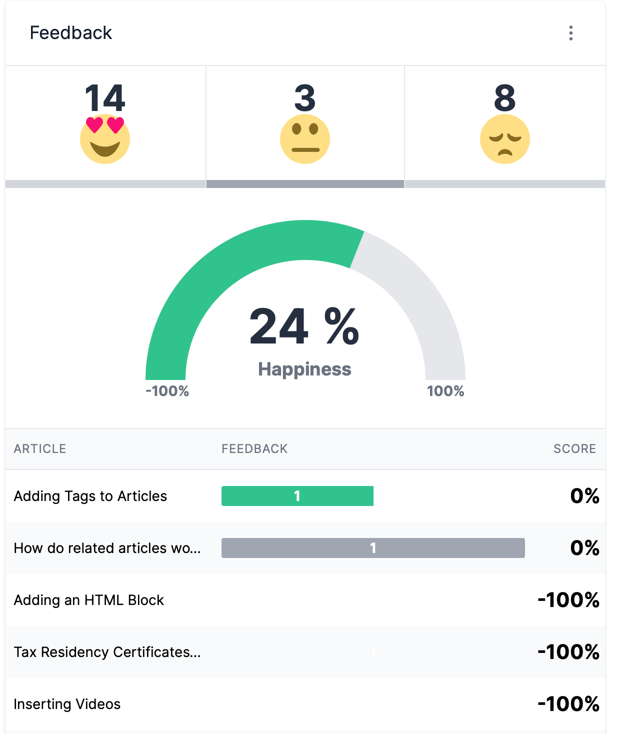
The screenshot above shows the Feedback section of Stats with some numbers.
With alt text you want to try and describe the image without too much detail since screen readers cut off alt text at around 125 characters—there's not much to play with.
Since there's a lot of text in the image above I'll simply describe the layout and what's included. There's no way I'll get all the information inside 125 characters. Something like this would be a good start:
The feedback section of Stats. From left to right it features 3 emoji going from elated, neutral, to sad. Below is a chart and below that is a table.
If you want to learn even more about getting good at alt text, I've dropped a link to a helpful article below.

Add a Table of Contents
Being able to navigate your Knowledge Base article quickly and efficiently isn't just great for all your users but it's great for accessibility too 🤩
By adding a Table of Contents, you're helping readers who use a screen reader skip their software reading out the entire article and go right to the part they're looking for with ease.
If you're not using software with this built-in, you can use a library like tocbot that generates a table of contents. This is precisely what we use for the table of contents inside this blog post 💪
Provide Captions in Embedded Videos
If you're showing readers how to navigate your app or showing off how to unpack your product, video is an engaging way to do it. And if you have someone speaking in the video you'll want to make sure it's accessible for everyone.
Nowadays if you upload your video somewhere like YouTube it'll automatically give the user an option to turn on captions which is a fantastic time and money-saving feature that's great for people who are deaf or hard of hearing.
It's also great for places where it's not appropriate to turn on the sound (although there's always that one person on the train, am I right? 😒).
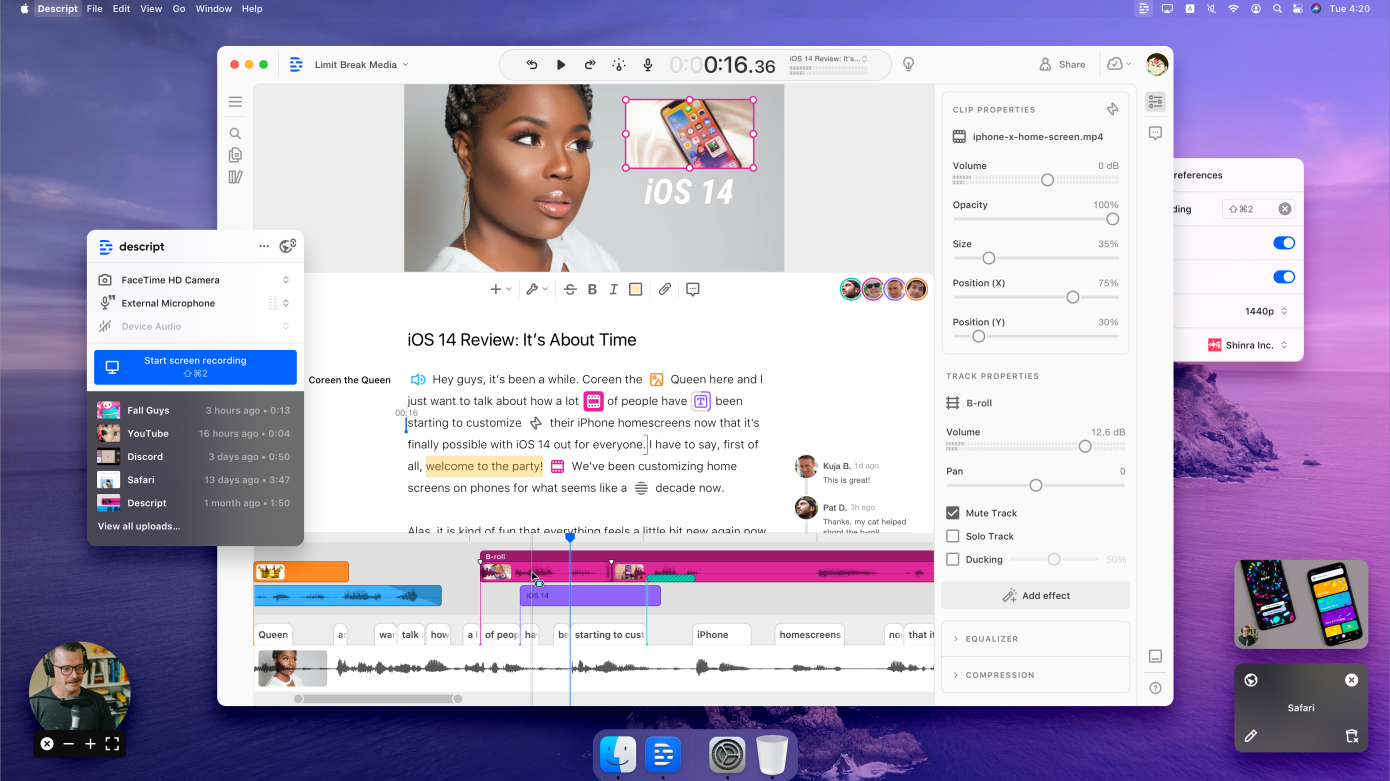
You can use tools and services to transcribe your videos. I use Descript, software that automatically transcribes your videos and lets you edit the video with the transcription. Pretty neat.

Break It Up
I've written about the Psychology of a Knowledge Base article in the past and it's useful when it comes to accessibility.
Breaking content up into small chunks instead of having long paragraphs makes it easier for everyone to understand, especially those with learning difficulties like dyslexia or ADHD.
Consider adding bullet points, ordered lists, and interactive content like an embeddable to make your article come to life.
Tools to Measure & Improve Your Knowledge Base Accessibility
So you're striving to make your Knowledge Base an excellent place for all to read and digest information. But how can you understand if you've done a good job or not?
Here are a few tools you can use to give yourself a grade on accessibility.
Google PageSpeed Insights
The PageSpeed Insights tool is useful for developers to understand how accessible and fast their site loads. You can use it to understand how accessible your Knowledge Base is.
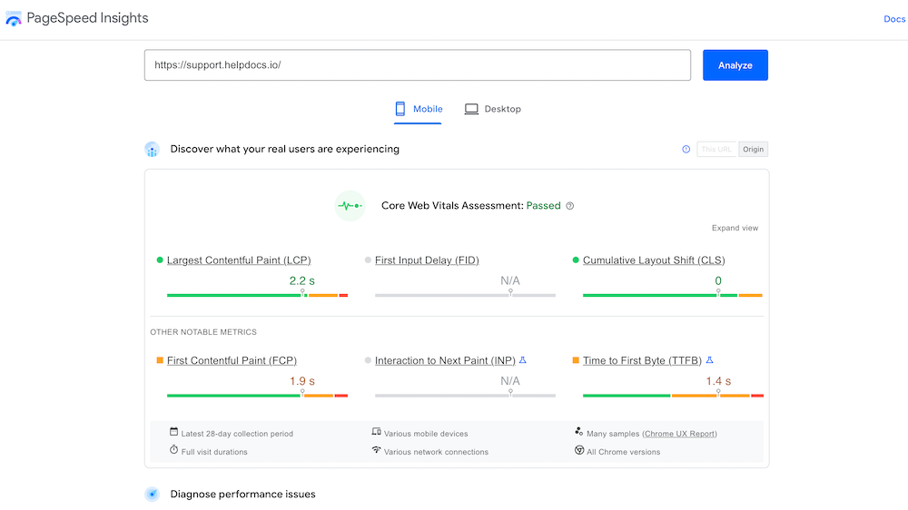
While the tool isn't perfect it does offer some insight quickly and easily. You can use it right away by typing in your Knowledge Base URL over here.
WAVE Web Accessibility Evaluation Tool
The WAVE tool is super handy for drilling down into the nitty-gritty of your web page.
Once you type in your webpage it'll show you what a screen reader sees and all the elements that make up your Knowledge Base behind the scenes.
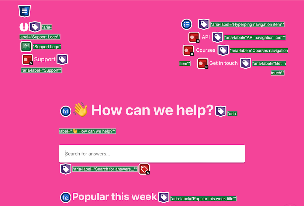
It'll let you know where you can improve and give you some helpful documentation alongside the messages so you're not left alone to guess what to do about it.
Stark
If you're a designer, developer, or product manager and looking to redesign or rebuild your Knowledge Base template with accessibility in mind, Stark is a fantastic tool.
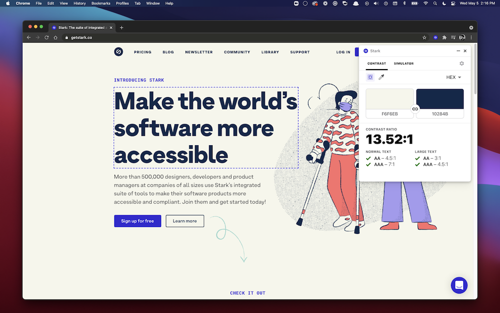
With plugins for software like Figma, Sketch, and Chrome, it's easy for you and your team to check contrast issues, text size, and simulate vision difficulties.
Let's Strive for More Accessible Knowledge Bases
The power of a Knowledge Base shouldn't be underrated. Self-serve help gives millions the ability to help themselves no matter their skill level and ability.
By making accessibility a priority, we can ensure our customers can use our products with ease. With more tools and updates to the web coming each year, it's certainly tough to keep up.
By adding valuable descriptions, structuring your templates and articles with easy navigation, and using tools to measure your success, you'll be able to make strides in the usability of your Knowledge Base.
My advice is to do your best and keep accessibility top of mind. Your customers will thank you 🥰