Feature deep dive: Building a glanceable readability panel
How we turned a readability grade nobody acted on into a panel you can take in at a glance, why we swapped formulas for LIX, and what it means for the people reading your docs.

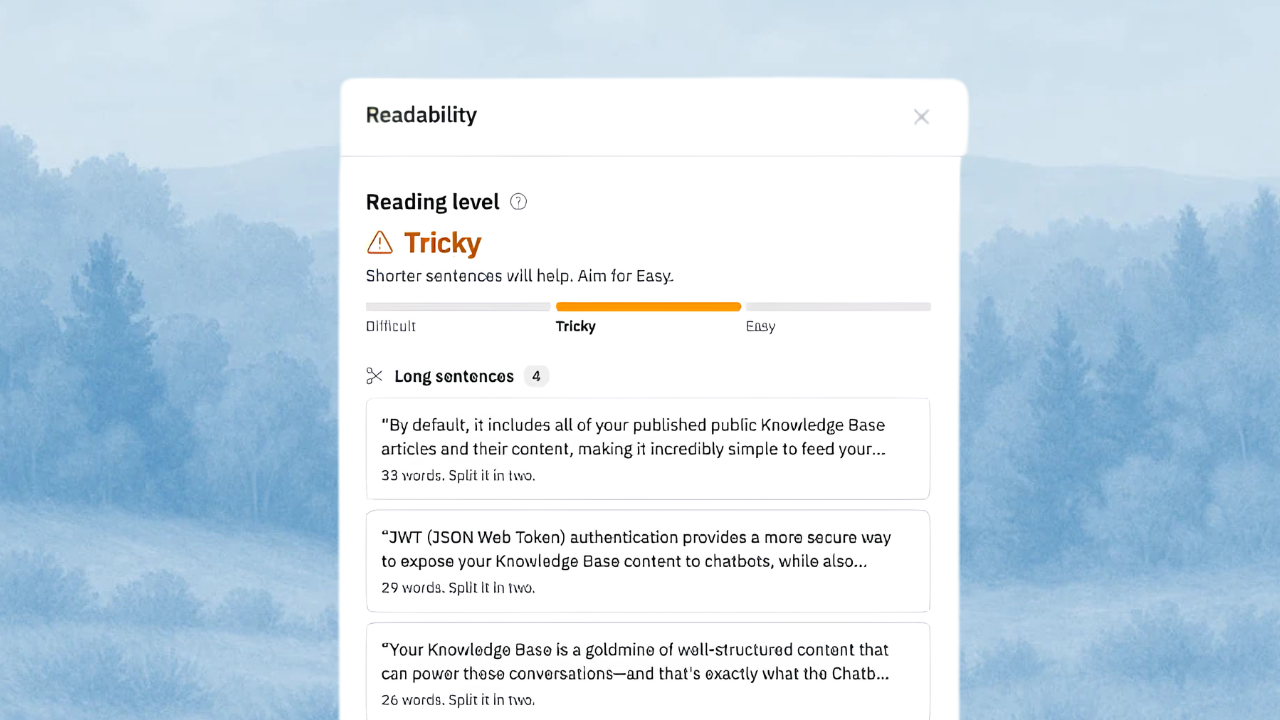
For years the HelpDocs editor showed a readability grade to try and combat help articles that required a PhD to understand. It was a number in a tooltip, like "Grade 11". It was technically correct, and almost nobody did anything with it.
It mostly just sat there, looking an angry shade of yellow for most people.
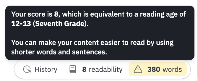
That's the problem with a number on its own. It tells you something is off, but not what, or where, or what to do next. So we rebuilt it as a Readability panel that shows you exactly what to fix and takes you straight to it.
Here's a little behind the scenes of how we got there.
Designing for 47 seconds
We started with how people actually pay attention, because the panel has two audiences: the person writing the article, and the person reading it later.
Gloria Mark at UC Irvine has been timing how long people stay on one screen before switching since 2003. Back then it averaged about two and a half minutes. Unsurprisingly, that's gone down.
Across Gloria's studies from 2016 to 2020, it was down to 47 seconds. That's not a clinical "attention span". It's how long people last before something else pulls them away, which is exactly the situation your writers are in when they're juggling a ticket queue and an article draft.
And with AI, well, I get the impression it may be even less than 47 seconds now.
Nielsen Norman Group's analysis of real browsing found that on an average page, people have time to read at most 28% of the words, and 20% is more likely.
Their eye tracking studies keep finding the same thing: people scan, skimming the start of lines and the headings, rather than reading top to bottom.
So we set ourselves a rule: everything in the panel has to make sense in a glance. If you open it between two other tasks, you should know where the article stands and what to do first before you get pulled away.
What glanceable looked like in practice
Most of the work was taking things away.
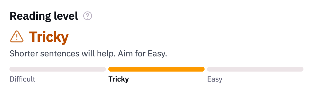
- Three words instead of a number. Every article is Easy, Tricky, or Difficult. You don't need to know what "Grade 11" means to know which of those you want. It also keeps it from being mixed up with Improve with AI's 0 to 100 score, which measures something broader.
- One tip, not a lecture. Under the level is one short line telling you what's holding the article back: long sentences or long words.
- Grouped issues, biggest first. Issues are grouped by kind (long sentences, long paragraphs, missing headings, passive voice, and wordy words), each with its own icon. Inside each group, the longest sentences and paragraphs come first, so the biggest wins are always at the top.
- Three at a time. On a long article, each group shows the first few with a Show more link. A list of 60 things to fix is a list nobody starts.
- Copy you can read in one breath. Every hint is a few words: "Split it in two." "Say who does it." "Use 'use'."
We also cut things that were fun to build. At one point there was a little dot showing exactly where the article sat on the scale.
In testing, it turned out to be the kind of thing that nags at you while you write, because people will do ANYTHING to get that dot at the highest point which, well, misses the point, so it went.
Taking you straight to the problem
A list of issues is only half the job if you then have to hunt for each one. In the Block editor, click any issue and the editor scrolls to it. While the panel is open, every issue is underlined in your article. Fix one, and it quietly disappears from the list.

That small loop of seeing it, clicking it, fixing it, and watching it go is what makes the panel feel like progress rather than homework.
Why we switched to LIX
The old grade used the Automated Readability Index, a formula from the 1960s that turns characters per word and words per sentence into a US school grade.
And it's fine for English. It's a lot less fine for a help center written in French, German, Hebrew, and Japanese, which plenty of HelpDocs customers have.
We moved to LIX, a formula created by Swedish researcher Carl-Hugo Björnsson in 1968. It's refreshingly simple (and has a cool name 👅: average sentence length, plus the share of words longer than six letters.
Because it doesn't depend on English syllables or school grades, it travels well across European languages.
It still needed some tuning for docs:
- Bold text, link text, and inline code don't count as long words. In a help article, "Configuration" in bold is usually the name of a button your reader needs to find, not jargon.
- German, Dutch, and Finnish get gentler bands. Those languages build long compound words as a matter of course, so the same text would otherwise always look harder than it is.
- Some articles don't get a level. Under 100 words there isn't enough text to judge fairly. Languages written without spaces, like Chinese, Japanese, and Thai, don't have "long words" in the same sense. Those articles still get the list of issues, just no level.
Long sentences, long paragraphs, and missing headings are checked in every language. Passive voice and wordy words are English only for now.
Light enough to forget about
A writing tool that slows down the editor is worse than no tool. Everything runs in your browser, so nothing about your article is sent anywhere.
The panel only loads the first time you open it, and checking a 10,000-word article takes a few hundredths of a second. While the panel is closed, it waits until you pause typing before checking again.
How it helps your customers
Your customers usually arrive at your help center in the middle of something: stuck on a setting, halfway through a task, or with a support chat open in another tab. They'll scan for the answer and leave the moment they find it, or the moment they decide they won't.
Shorter sentences, broken-up paragraphs, and clear headings are what make that scan work. Every issue in the panel is one less place for a reader to lose their thread.
Try it
Readability is in the article editor on every plan. Open any article and click the issues chip under the editor.