Landing in a new destination is always a little daunting. How should I get to my hotel? Do I need cash? How should I greet someone? Luckily signs and interactive maps point you in the right direction, and when they fail there’s always someone there to help out.
Take away the signs, maps, and people and you’re pretty stuffed. Too many signs or people, though, and things start to get head-scratchingly confusing.
This is why the first experience for a user is so important (aka onboarding). Too little help and there’s a small chance a user will get the hang of things. Too much help gets irritating and makes matters worse.
So what’s the right balance? And when should you reach out to people? I’ve a lot to learn about making a great first impression, but here’s what I’ve learned in the last few years.
Subtle at the start
There’s a lot of information out there that suggests bombarding your users with a tutorial to follow is the best way to help them get started. I disagree.
I, for one, click through tutorials like there’s cake at the end of it (like, really fast). I wonder if anyone reads these things and takes in the information. If there’s one thing I’ve learned by going through a lot of airports recently is that people really don’t like being told what to do.
Please wait until the seatbelt signs have been turned off? Let’s all stand when the plane parks. You’ll need to take your water out of your bag for security? Let’s take this massive bottle of water through. I could go on, but I’ll spare you.
As support, product, and tech people we love to think of users as complacent people. Who wouldn’t love to spend 5 minutes learning about our amazing product? Oh, they might not click on this. They totally need to click on this.
But if people don’t like being told what to do in the real world, the problem is even worse when it comes to being a new user with your product. Let us tap, drag, and mash everything until we know what we’re doing. Or at least, have clicked everything.
One way to build with this human behavior in mind is to highlight important steps, but in the background.
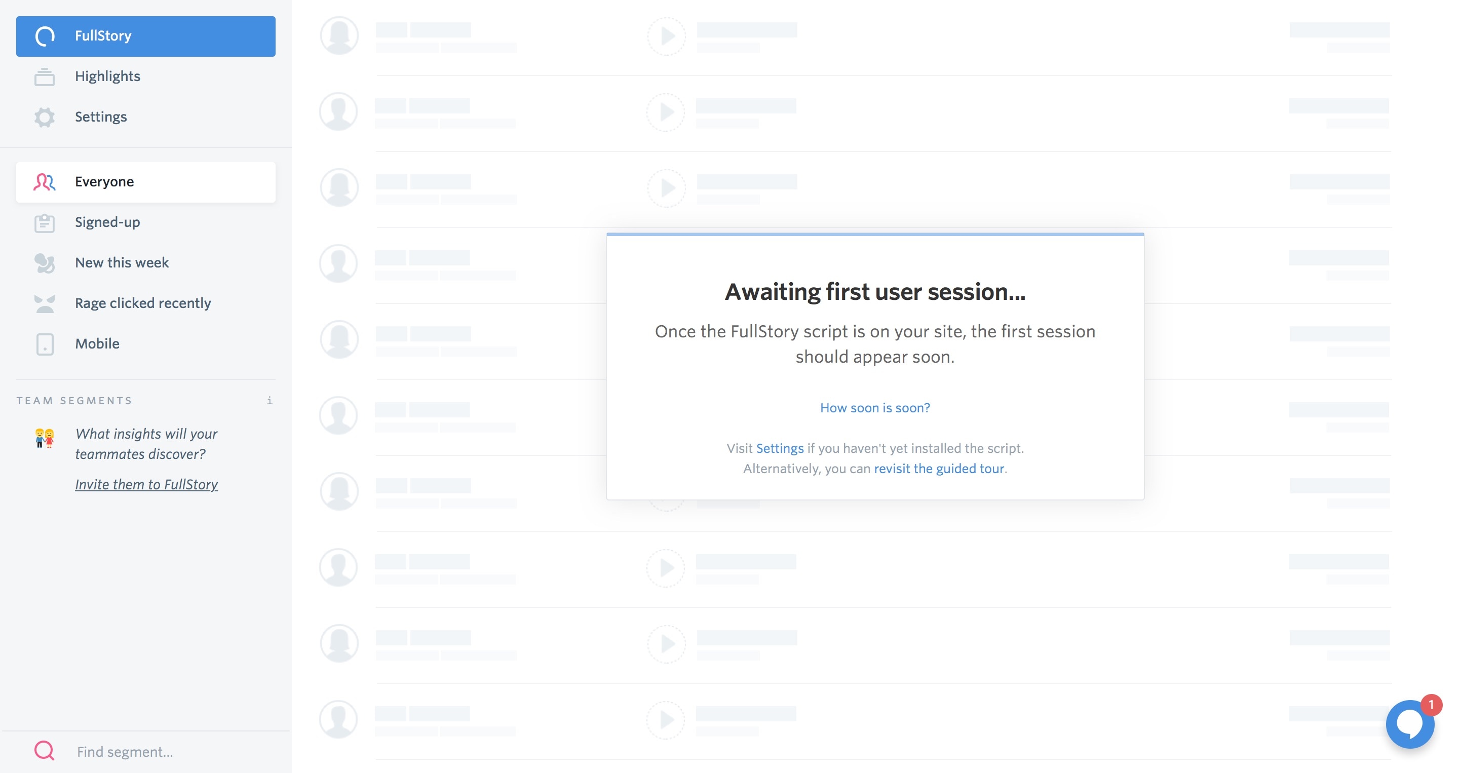
An example of this is using placeholders—sometimes called ‘Empty State’. One of my favorite placeholders is Fullstory’s. It gives you useful information without getting in the way of clicking furiously.

If you think about it, there’s around an hour of time where you’re clicking around and getting familiar with the product. It’s then you should reach either through a messenger or through email.
Segment based on user type
Not every user of your product is the same, so why send them the same stuff?
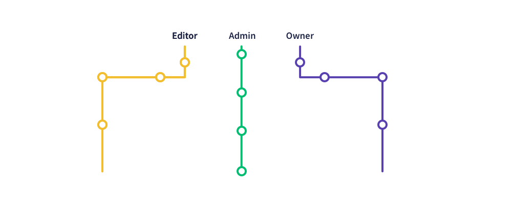
If users can have roles in your product, one easy way to give different users the information they might need/want is to segment based on this.
For example, it’s unlikely someone with the role Editor is going to want to fiddle around with settings, so we send them stuff about writing and editing articles, not customizing their knowledge base.

If you don’t have an easy way to segment based on something like a role, it could be useful to segment based on their usage. If we didn’t have roles, I might segment based on something like activity.
I know that writers are usually customer support reps or product managers. That information that help me direct the information I show them. For example, tips and tricks about writing and editing docs, customer support, and product management would be useful, whereas technical engineering posts probably aren’t that interesting.
Just try getting in the users shoes. The mistake most make when setting up onboarding is assuming they have a lot of free time and they’d love to hear from you, so when you do reach out make sure it’s useful at that time and to that person.
Point towards your knowledge base
I know, it was bound to happen. A knowledge base product harping on about the usefulness of a knowledge base. Predictable, right?
But pointing to your knowledge base can save you and your customers a bunch of time and waiting around. If they know self-serve resources exist—and you make them easy and obvious to get to—they’ll likely use them and become happier for it too.
Having pointers to your knowledge base baked into your live chat, onboarding, support email, and app can help keep customers on the road to succeeding without being limited by timezones and reply times.
Adapt and evolve the first experience
Once you first set a campaign as live, start segmenting users, adapt the product for subtle hints, and bake your knowledge base into the process, you’ll have no clue whether it’ll go well.
But as you start talking to users, start getting replies, feedback, and start seeing it affect subscription rates, you’ll get a better idea.