Video is so difficult. It's something I try to avoid working on.
It's pretty brutal. It takes hours to get a frame right and get the transitions to work well together. Otherwise it looks pretty crappy.
Every September I sit down and watch the WWDC event hosted by Apple. And every single time I drool at the amazing videos they create. They’re full of emotion and so well executed. Can’t be that difficult to try and reproduce right?
Turns out I couldn’t be more wrong 😅
Every year I get the urge to hone my skills and make something wonderful. But I end up getting sucked into another rabbit hole trying to learn a tricky skill in a short amount of time.
In the video above there's footage of waves, water sound effects. They've got Jellyfish swimming in the ocean and Apple Maps superimposed. For such a short video a lot of work went into it.
And it's overkill for a knowledge base article. As much as I'd like to have some snazzy videos it's not worth the time and effort.
Luckily with constraint comes creativity 🤓
I wanted to create good quality videos for our knowledge base without spending days on them. The goal was for them to be short and to the point but also fun to watch.
Ditching Speciality Tools
If you've ever looked into making videos you'll notice all the tutorials push you to using After Effects.
And to be honest I think it sucks. For beginners like me anyway.
I find it so difficult to use. Getting the canvas in the centre of my screen was a challenge. Trying to animate some text was almost impossible.
After watching hours of tutorials I still wasn't getting it. I needed to find something easier to use. Something with less features. I didn't need 3D effects, camera panning, or advanced clipping.
I wasn’t looking to become a videographer. I just wanted to make some pleasant, short, and informative videos for customers.
After discussing my trauma with Jake they suggested I give Screenflow a go.
Good choice!

Creating a Format
Time was not on my side by this point. I'd spent hours trawling through videos just to abandon ship and try something different.
I decided to create a format so I could produce multiple videos in a short space of time. All it needed was an introduction and then a screencast. Nothing fancy.
It couldn’t be long because people tend to skim help documentation rather than spend time reading and watching. If it was too short it wouldn't show the feature properly.
I also wanted it to be watchable on silent. I very rarely have my Mac sound turned up and I'm the kinda person to read the automated captions on YouTube videos.
First Impressions: The Introduction
The first step was creating a short introduction I could copy and paste into other Screenflow files.
I wanted it to contain our logo and the title of the video. If it was a video about an integration I wanted it to include the other company's logo too.
Luckily with Screenflow it’s easy to get transitions set up. Here’s a screenshot of the file with the introduction.

With this all set up it was as easy as opening the file and copying the contents over to my new video. Then I just changed the title in the text box and voilà. The introduction was done for an unlimited amount of future videos.
The Screencast
Now the juicy part. Showing off the product with the screencast.
I’ve seen a lot of startups “screen record” for their videos.
I put this in quotes because they always seem a little off. They’re not quite what you’d get if you recorded your screen. They seem to cut screenshots and use transitions to create a sort of fake recording.
Take a look at this Sketch video. You might notice the cursor never seems to become pointed like it usually would for links. Looks simple but isn't at all.
A video like this clearly took a lot of time to put together. I opted to use two tricks I figured out I could use to make my videos a little more fancy.
The whole screen trick
To remove the ugly desktop icons (I have stacks of random stuff on my desktop 😟) you can make the browser take up the entire screen.
I think this gives the viewer more context about where exactly you are in the app and makes it less distracting. But the downside is that it looks pretty dull.
New desktop trick
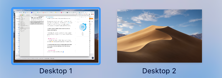
Another trick is adding a new desktop so you only have window on there. Then I use HiddenMe (free on the Mac store) to hide all the ugly desktop icons.

You can then position the window so you can show off the background. I like to think this gives the video a little more style.
Making it Shine 🌟
I like to think having fluid transitions and zooming between elements on the video makes it more appealing.
Here's a very meta video on how I use transitions in Screenflow. My favourite transition type to create something that feels fun and fluid is Exponential Ease-In & Out.
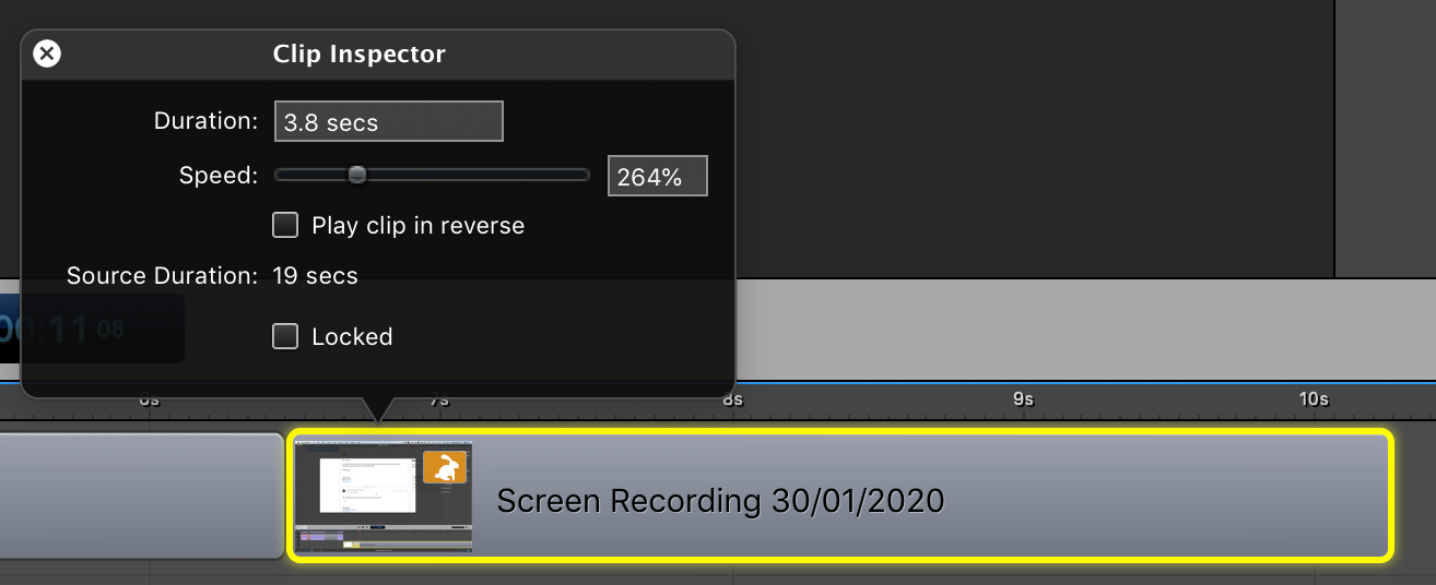
Another neat trick I found: double click on the timeline element and reduce the duration. For slow clicking or complicated bits of the app I think it's easier for people to digest the content if it's faster.

Putting it All Together 🥪
I figured out how to make a quick introduction and how to make the screencasts feel a little less dull. Last was getting it uploaded properly which was harder than I thought it'd be.
There's a ton of options when exporting video and I found choosing between them confusing.
I decided that if my video was less than 5 seconds long I'd export it as a GIF. I didn't wanna have to make people click play for such a short clip. Being short should make it a smaller file size too.
Exporting as a Video
Luckily for me Screenflow ships with integrations so you can upload straight to your video hosting provider. We use Vimeo which lets us customize the player 🖌️
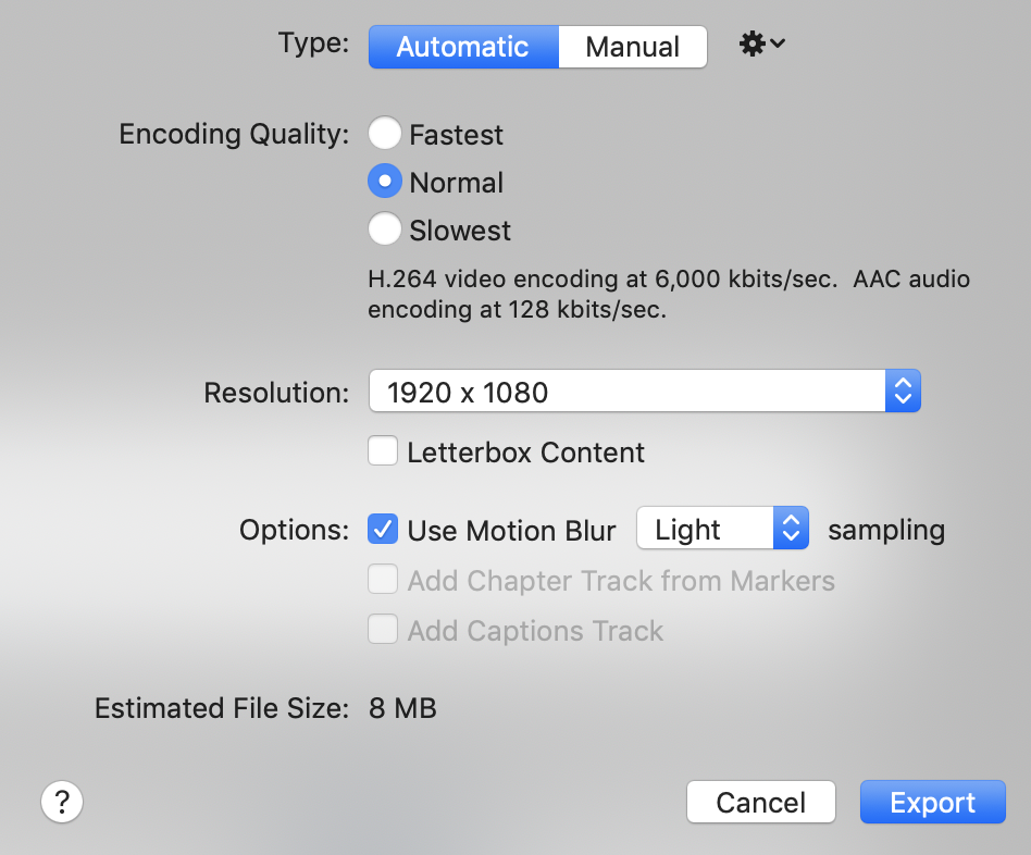
When I export videos I untick Letterbox Content and set Motion Blur to Light. I think this gives it a nice smooth effect when the mouse moves across the screen.

Exporting as a GIF
I'm glad making GIFs has made some progress. I remember when the best you could get was a grainy disaster that kinda looked like some abstract moving art.
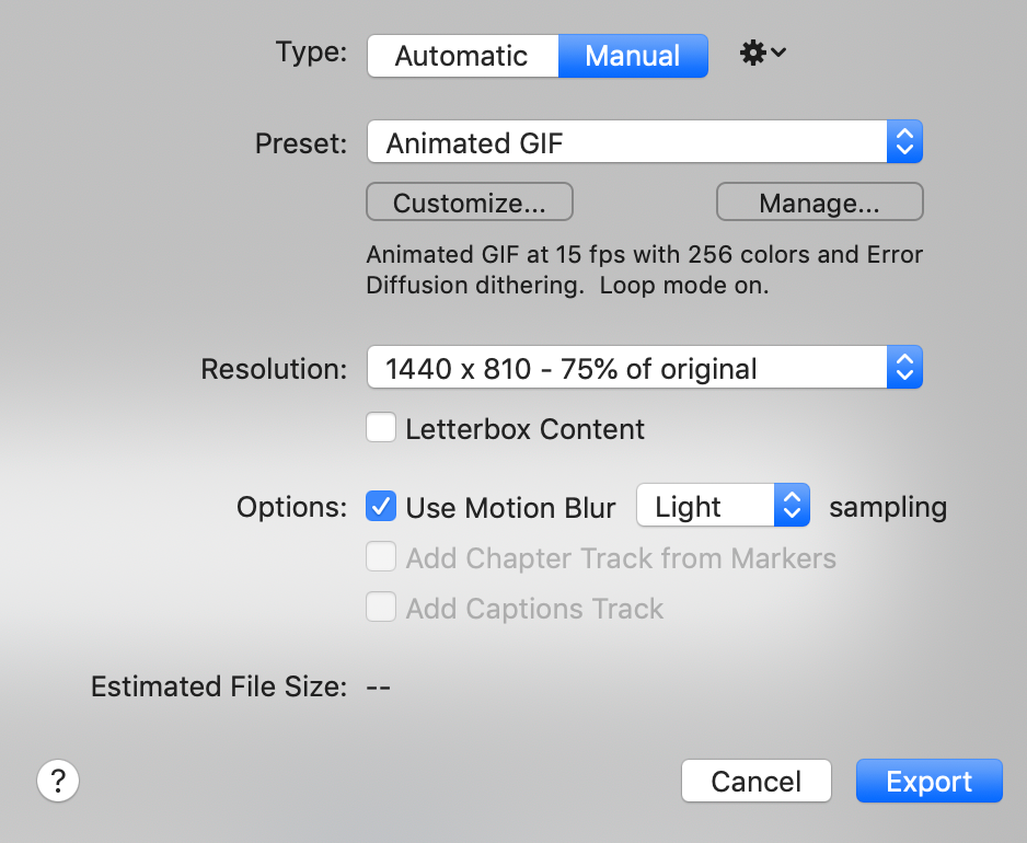
To magic your video into a GIF in Screenflow all you have to do is head to Export > Manual and select Animated GIF from the Preset menu.
I tend to reduce the resolution as well so the file size is smaller. 50% - 75% should cut it.

If you don't have Screenflow or don't want to spend the time on setting it up I'd recommend checking out LICEcap. It makes it extremely easy to record good quality GIFs without the fluff.
Inserting Videos into our Knowledge Base
When adding videos to articles I'm always sure it makes sense without the video since a lot of people don't wanna spend the time clicking play. Clear instructions in written format always comes before a fancy video for me.
Take a look at the article below and you'll see what I mean:

Hopefully you'd be able to connect the Doorbell integration without video.
Is it Worth it?
There's no doubt video has been a huge learning curve for me. Getting them to look good in a short space of time without professional experience is tough.
I'd like to think it gives visual learners a chance to get insight into how to use our software without having to strain to read our knowledge base articles.
Short answer—it really depends on the article. 😆