Building a new marketing site from scratch is daunting. There I am with a blank screen and a gazillion possibilities. The job sounded simple: convey HelpDocs and its purpose to new visitors.
But as many designers and developers know, it’s never that simple.
I think everyone finds a certain kind of joy when it comes to building something. The process with its challenges & bumps along the road and the final result when you get to stand back and look at what we’ve created.
When it comes to building, I’m a sucker for trying making things look pretty. Always a lurker on Dribbble I can’t help but try and improve upon my previous designs.
I suppose the exciting part of design is that it’s always changing. What looks great today may just look hideous next year.
This year I got the opportunity to rebuild our marketing site. After 6 months, it was looking a little tired and didn’t really reflect our progress with the app and brand.
All-in-all the new site only took around 4 days to complete as we had most of the groundwork laid already. Here’s what I learnt in the hopes that these tips might help you when you build your own marketing site.
Scout out design ideas
Like a home designer scans through magazines and tirelessly touches an endless amount of material, a web designer must find inspiration from other web designers.
You’ve probably got a bank of companies inside your head who you think do design good n’ stuff. For me, I admire Stripe (I think everyone does, though), ActionBar, and Dovetail for their homepages.
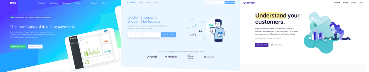
Obviously don’t copy them but take a look at how their homepages flow. It can be incredibly difficult to work out how to lay out your homepage from scratch.
Most consist of a Hero section at the top with an image and some sort of heading, tagline, and signup button or form. Then a customer bar, and then features with explanations.
As I mentioned earlier, I’m a Dribbble lurker. It can be a great place to scout out homepage ideas, but most often than not I’m there scouting out colors. Knowing which colors go with what is one skill I’m still to learn, but taking a look at how other designers use colors can be incredibly useful.
Detaching yourself from your company
As a co-founder, I know HelpDocs inside out. I know what it does, I know why it’s great, and I know why you should subscribe. But that’s not exactly useful for a visitor to our site.
A visitor has no idea, they likely don’t fancy sticking around and unless you can make a great first impression they’re off.
This is why I had to look at our new marketing site like a new visitor. Questions like:
- What would I think if I landed on this page and knew nothing about the product?
- What’s the experience like when I first load my site? Is it slow? Is it exciting or eye catching? Does the copywriting make any sense?
- Does the vibe go with our brand? Is it a good representation of who we are?
If it’s not obvious what a product or service does and why they should use it on the first load, it’ll be struggle to get anyone to sign up.
Having said that, you don’t want to be locked away trying to become a wordsmith and push out something amazing. Something good enough will do.
In the end, I tried about 3 different headings and tag-lines but the original one just stuck.
Heading 1: Help Customers Successfully Use Your Product
Tagline 1: Educate your users with a super simple knowledge base that’s built for teams just like yours.
This is the one I went for in the end. The whole point of a knowledge base is to help customers succeed and keep your customer support team from drowning in a pile of tickets. In turn, that’ll make them happier and reduce churn—but that’s kinda implied.
Heading 2: Provide Answers, Keep Customers
Tagline 2: Great out-the-box knowledge base software to keep support volume down and make sure customers can help themselves.
Seemed a little short and while having a knowledge base certainly reduces churn, it just seemed a little…aggressive. Scaring people off seems a little silly.
Heading 3: The Knowledge Base for Product-Focused Teams
I was worried this one would alienate a lot of the leads and customers we have. Many of our users are eCommerce sites, services, and local businesses.
Build on a framework that does all the heavy lifting for you
Frameworks are so helpful because they take out a lot of the hard work. There’s really no point in creating your own column system and rows if you don’t have to. Some may argue that it dramatically reduces site speed, but that wasn’t my main concern (I’ve written a little bit about how we sped it up a little further on in the post).
I think the biggest mistake you can make is trying to do everything yourself, particularly if you have a time limit. I didn’t have long to push this out as we’re a small team of 3 and there’s a pending list of tasks to be done.
If you’re looking for frameworks, there are some extremely useful one out there to give you a helping hand. Here are some popular options:
In this rewrite, I transitioned from Bootstrap over to Semantic UI. Why? I love all of their elements and placing a theme on the top of their framework is incredibly easy. There’s cards, easy grids, navbars—heck, even animations built into buttons for you.
Again, don’t make it harder on yourself than it has to be.
The most exciting part is that after writing a theme for our React app (they have a version for React here) I was able to use exactly the same theme for our marketing site. So the buttons you see in our app are exactly the same you see on our marketing site. Neat, huh?
Have fun with CSS animations (but don’t burn people’s laps)
After reading into CSS animations a few months ago I knew I needed to incorporate them into HelpDocs. They’re so simple to create and fun to play around with. If you want to learn more, head over to this awesome CSS Tricks post.
I soon learned the trick to doing CSS animation properly is to make sure it’s not too taxing on the user’s browser. As soon as I land on a website that makes my fan go off, it makes me a little annoyed and I start to worry about my battery (which always seems to be at 10% anyway).
Don’t go overboard with your animations.
Making them too long, too wild, or having many going on at the same time makes a browser very sad and slow.
By the way, if you’re looking for a library for complex animations that don’t make your visitors’ laps burn I’d suggest animateplus.com by the very talented Benjamin De Cock (he works at Stripe, y’know).
Making a site fly: Compressing images and SVGs
I use Sketch to export my SVGs (who has time to actually write them?!) and it’s pretty handy.
Only thing is, it adds a whole lotta markup I really don’t need that’ll just make my SVGs far bigger than they need to be. I didn’t realize how much I could reduce them by just stripping useless stuff out.
I started doing this manually until I found a great tool to do it for me: SVGOMG. All you do is plop in your SVG, decide how precise you want it to be, and export it again.
The majority of my SVGs ended up being > 50% smaller and looked exactly the same. By reducing hundreds of SVGs I reckon the marketing site is a lot speedier than it was originally.
But it doesn’t stop at SVGs. Nope, I went all in trying to reduce the load times. Meet Gift of Speed’s PNG compressor. This one’s pretty obvious—it reduces the size of your PNGs. Again, it’s amazing how much size you can shave off without affecting quality one bit.
Phil—our awesome engineer—suggested a tool this week which I’ve fallen in love with. ImageOptim has a Mac app that allows you to drag in an image (PNG, SVG, or JPG), optimize it, and replace it (in the same location). So useful.
Make your website accessible
After listening to a visually impaired user talk about the frustrations of the web in a user experience design university lecture, I’ve tried to make our websites easier to access for visually impaired customers.
It’s easy to forget to do this, but it doesn’t take a whole lot of effort.
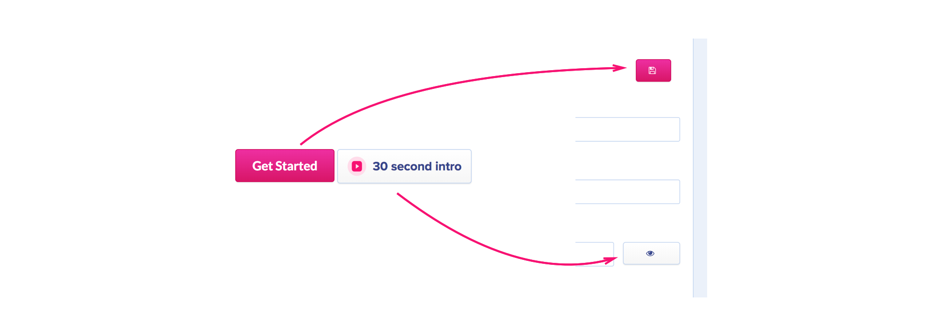
All I did was add alt tags to every image and element on the page. For instance, on the Get Started button I added the alt tag alt=’Sign up for a free trial’ and on the hero image of a book I added alt="Book with categories flying out". It really doesn’t need to be complicated, but helps users a lot.
So what does the alt tag actually do?
Well, it allows screen readers to read out the website—images & elements included. So it’s best to try and describe what the element does or what the image is.
You should also wrap your emoji in a span with a role and aria label like Léonie suggests in this article:
<span role="img" aria-label="Snowman">☃</span>
Audit, optimize, repeat
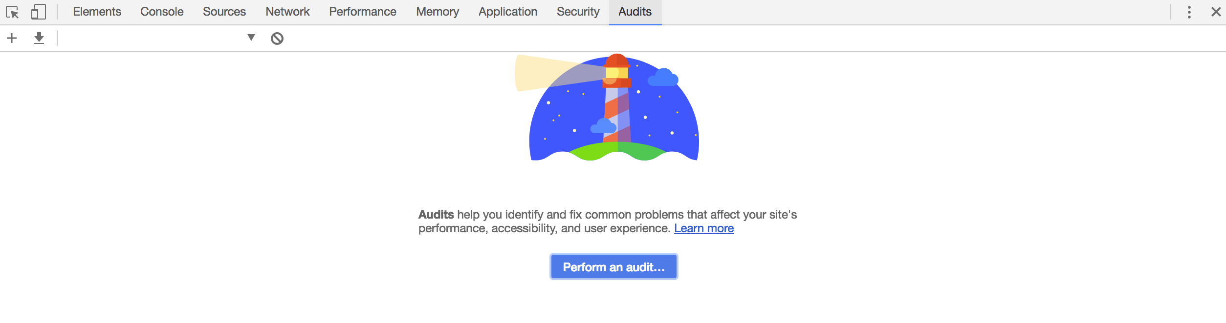
After playing around with Chrome dev tools (is that weird?) I came across a tab I hadn’t seen before: Audits. I’m so glad I did.
By clicking Perform an audit, you can get Google to analyze your web page. It gives you points based on how your website performs, how well it adopts progressive web technologies, how accessible it is, and how well you’re following best practices on the web.
I found it pretty useful and managed to clean up a few things before the site got shipped. One image turned out to be 2000px wide and was only displayed at 200px, so cutting it down to size made a huge difference to performance.
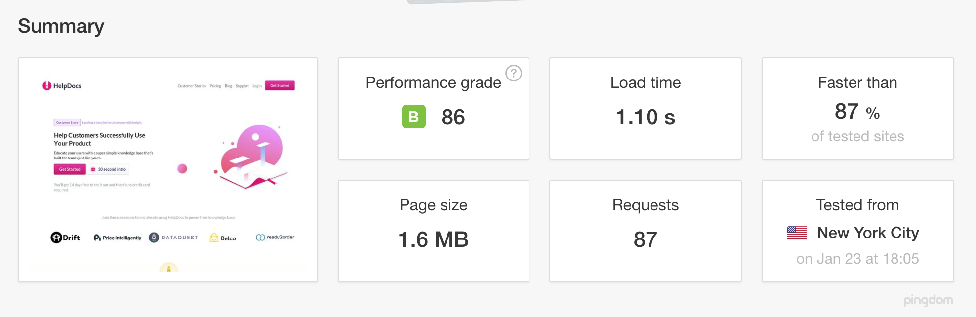
After pushing the site to production, I used Google’s PageSpeed Insights and GTMetrix to gather even more data on how to make our site perform even better.
It now loads in 1.10s which is apparently 87% better than other sites tested (based on a Pingdom test in New York). Pretty fun fact, right?
Don't forget to have fun
There we have it, those are all the things I learned. Although thinking about it now I missed one out—have fun. I’m proud of what I built but it was creating it that was the best bit.
If you have any tips on how you optimized or planned your own site, I’d love to hear them in the comments below.